Dashboard Designer: Visualization Tiles (v2019.2+)
A visualization is a graphical representation of data that can be designed directly on the Dashboard canvas without first creating a report. The figures below are a small sampling of the visualizations that can be built directly on the Dashboard.
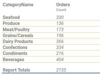
Tabular visualization
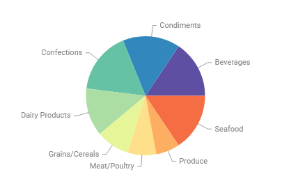
Pie chart visualization
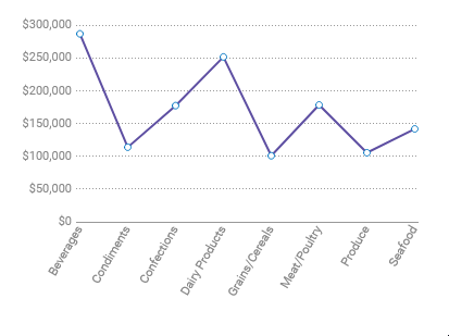
Spline chart visualization
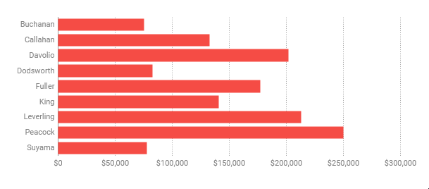
Bar chart visualization
To add a new Visualization Tile to a Dashboard, review the Dashboard Designer article. Add tiles with the  New Tile menu.
Creating Visualizations
- Add a new visualization tile to the canvas.
- Select the Chart Type from the Content tab of the Tile Properties Pane on the right side of the screen. When a new visualization tile is added to the canvas, Bar will be selected by default. The documentation section on Visualizations includes detailed information about the different chart types and how to build them. Dashboards also support an additional Tabular visualization type.
- Next, add data to the visualization by dragging-and-dropping a Data Object from the
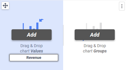
 Data Field Pane on the left side of the screen to the tile. Once at least one Data Object is on the tile, the Data section of the Tile Properties Pane‘s Content tab will also allow Data Object selection.Drag the Data Objects either to the Values section on the left side of the tile, or to the Groups section on the right side of the tile. Groups represent the labels of the chart, whereas the Values represent the quantities that will be charted. For example, to create a bar chart that shows total Revenue for each Employee, the Data Object
 OrderDetails.Revenuewould be added as a Value andEmployee.LastNamewould be added as a Group.
 or
or 
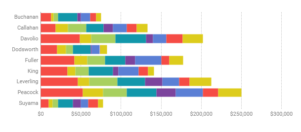
Some visualization types (Tabular, Bar, Column and Line) allow multiple Groups to be added. When a chart has multiple Groups, it can categorize the displayed Values. Additional groups can be added by dragging the Data Object to the tile, or clicking on the Add button in the Content tab. For example, to see the total Revenue for each Employee by Category,
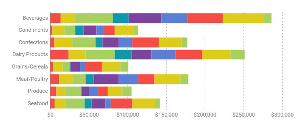
 Category.CategoryNamecould be added as a second group.The figure below shows a single group bar chart on the left and a multi-group bar chart on the right. Every color change in each bar in the chart on the right represents a different category’s contribution to that employee’s total revenue.


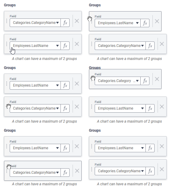
Multiple Groups can be re-ordered which changes how the values are categorized. Drag the Groups in the Content tab and move them up or down to reorder them. Using the same example above, but changing the order of the Groups, the chart changes to show each Employee’s contribution to the Total Revenue for each Category:

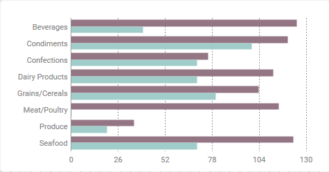
Some visualization types (Tabular, Bar, Column, Line, KPI) allow multiple Values to be added to the chart. This adds another quantity to the display. For example, a bar chart showing the number of units in stock and the number of units on order side-by-side can be made by having both
Products.UnitsInStockandProducts.UnitsOnOrderas Values. Additional values can be added by dragging the Data Object to the tile, or clicking on the Add button in the Content tab of the Tile Properties Pane.
Multiple Values can be re-ordered which changes how the values are ordered. Drag the Values in the Content tab and move them up or down to reorder them.

Tip
When adding multiple values to a KPI visualization, choose values which have the same number formatting as only one format can be chosen for the whole visualization tile. For example, include only currency or date values in the same tile.
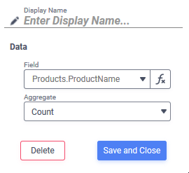
- Then, in the Data section of the Content tab of the Tile Properties Pane, further customization of the input data can be applied. Click on either the Group or Value to open the popover.


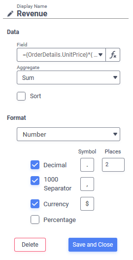
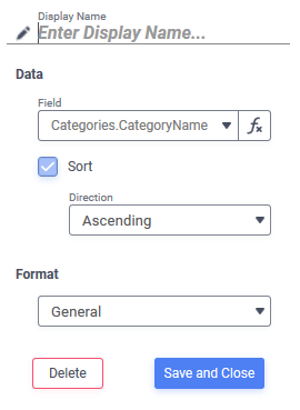
From left to right: the Values popover from a tabular visualization, the Groups popover from a tabular visualization and the Values popover from a pie chart - Formulas can be applied to both the Groups and the Values, including aggregate functions (for Values only) by clicking the Formula Editor
 icon.
icon. - Values can be given a friendly name in the Display Name field. This name is displayed prominently in KPI visualizations, chart legends and tabular visualization column labels. Groups in Tabular Visualizations may also be given a Display Name.
- An Aggregate can be chosen from the dropdown (Sum, Average, Count, Distinct Count, Min, Max or None) which will aggregate the Values. For example, to get the total Revenue for each Employee, choose Sum. Functions not included in the list can be added with the Formula Editor.
- Tabular Visualizations have two additional properties that can be changed:
- Groups and Values can be sorted in either ascending or descending order by checking the Sort checkbox. When checked, the Direction dropdown appear allowing selection of sorting in Ascending or Descending order.
- Checking the Hide Detail checkbox below the list of Values hides the individual rows from the table and shows only the aggregated category summary.
- Formulas can be applied to both the Groups and the Values, including aggregate functions (for Values only) by clicking the Formula Editor
- Formatting such as color themes, chart titles, X- and Y-axis labels, legends and number formatting can be customized in the Style tab of the Tile Properties Pane.
- Advanced features such as automatic data reloading, sorting, changing the axes values, and applying Filters can be customized in the Advanced tab of the Tile Properties Pane.
Note
Modifying the groups, values, aggregates or changing between tabular and other chart types, or changing the Hide Detail property of a tabular visualization will require a Refresh of the tile’s contents.
Tile Properties Pane
Controls for building and interacting with the Visualization tile are contained in the Tile Properties Pane on the right side of the Dashboard Designer.
Content
The Content tab for Visualizations is further broken down into two areas: Chart Type and Inputs.
Chart Type sets the type of visualization displayed. The documentation on Visualizations includes detailed information about the different chart types and how to build them. Dashboards also have the Tabular type which is unique to the Dashboard Designer. Tabular Visualizations display data in a categorized table format.
Choose from the different categories:
 Tabular
 Bar and Column Type
 Bar
Bar Stack Bar
 Stack Bar 100
 Pareto
 Column
 Stack Column
 Stack Column 100
 Pie and Other Types
 Pie
Pie Donut
Donut Pyramid
 Funnel
 Line
Line
-
 Line
Line Spline
 Line Area
 Spline Area
-
 Stacked Area
 Zoom Line
 Radar
Radar
-
 Scatter
 Scatter
 Zoom Scatter
 Key Performance Indicator (KPI)
The Data section is where the Groups and Values for the visualization are configured. To add Groups or Values, click the corresponding  Add button, or drag-and-drop a Data Object from the
  Data Field Pane on the left side of the screen to the tile.
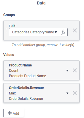
Groups represent the categorization of data on the report. Values represent the quantities of each of those categories. For example, a column chart showing the total revenue per employee could use Employees.LastName as the Groups and a formula which calculates the sum of OrderDetails.Revenue for the Values.
Formulas may be entered for either the Groups or Values by clicking on the corresponding Group or Value and then on the Formula Editor icon. The Formula Editor article contains more information about how to use Formulas.
Groups and Values may be re-ordered by clicking on the reordering handle  icon and dragging-and-dropping them. Re-ordering Groups changes how the values are categorized. Reordering Values changes the order multiple values appear in the visualization.
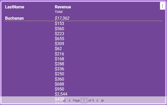
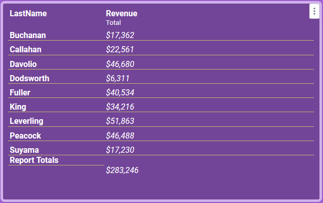
For a Tabular Report, checking the Hide Detail checkbox will remove the tabular data from the report and show only the aggregate summary. For example, the tile on the left below shows the detail rows, and they are hidden in the tile on the right.
Style
The Style tab for Visualizations is further broken down into additional areas depending on the type of visualization in the tile. They are: Color, Labels, Number Format, Tabular Text, Fit and Tile.
The Color section applies to all visualization types and is where the general appearance of the visualization is set.
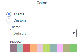
- A theme can be chosen from the list,
- A linear range of colors can be specified (available for all types except Tabular visualizations), or
- A custom arrangement of colors may be chosen.
- Checking the 3D checkbox will apply a three-dimensional effect to the visualization.
The Tabular Text section applies only to Tabular visualizations and is where the font type and color are set.
The Fit section applies only to Tabular visualizations.
- v2021.1.6+ Setting a Minimum Column Width prevents columns of the table from shrinking below a set number of pixels wide. If all of the columns are wider than the space available in the tile, a horizontal scrollbar appears. The default value is 100.
The Labels section applies to all of the chart types except Tabular. Labels on the visualization such as a title, axis labels, data points and a legend are configured here. These label choices will vary depending on the type of visualization.
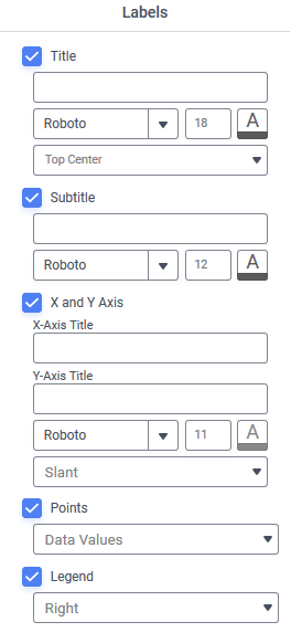
- Title: when checked, will add a title to the visualization and allow formatting of the font, size color and position of it
- Subtitle: when checked, will add a subtitle under the main title and allow formatting of the font, color and alignment of it
- X and Y-Axis: when checked, will add labels to the horizontal (X) and vertical (Y) axes and allow formatting of the font, color and position of them. Only available for column, bar, spline, line (except Radar) and scatter visualizations. For visualization types other than bar and tabular, an additional dropdown box will appear to set the orientation of the data labels. This tells the application what to do if there is not enough space in the tile to display the whole label. Choose from:
- Auto: allow the application to select the best orientation for you based on available space in the tile
 Slant: rotate the labels 45-degrees along the axis
 Wrap: texts wraps to a new line
 Stagger: values are staggered along two lines so they don’t overlap
 Rotate: rotate the labels 90-degrees along the axis
 None: do not apply any change to labels, they may overlap
- Points: when checked, will add data points to the visual elements. Not available for Tabular or KPI visualizations. Different types will have different choices available:
Choice Visualization Category Description None All Does not display data points on the chart. Series Values Bar, Line, Pie Displays the value of the Values Percent of Series Values Pie Displays the percentage of the whole represented by this value. Data Labels Pie Displays the names of the Groups represented each segment of the chart. Data Labels with Data Values Pie Combines the behavior of both Data Labels and Series Values modes to place both pieces of information in the label. - Legend: when checked, will add a legend to the visualization located on the tile according to the choice made in the dropdown box, either Right or Bottom.
The Number Format section sets the way that numbers are displayed for Bar and Column, KPI and Line charts. It works very similar to the other number formatting options throughout the application.
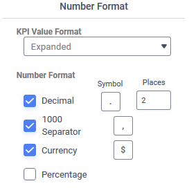
- Decimal: when checked, will force a specified number of decimal places to be displayed. The symbol inserted between the whole and fractional part of the number can be specified, as well as the number places after the symbol.
- 1000 Separator: when checked, will separate thousands places with the specified symbol
- Currency: when checked, will display the specified currency symbol in front of the value
- Percentage: when checked, will display a percent sign (%) after the value
- KPI Value Format applies only to KPI visualizations to set how the value is presented in the tile. Choose from:
- English Short Scale

- Scientific Notation

- Expanded

- English Short Scale
The Tile section is where tile appearance can be changed. The settings here override the Canvas Format defaults.
- Check Background to set a background color for the tile. Click Color to open the color selector and choose a background color. Unchecking the Background checkbox makes the tile transparent.
- Check Tile Header to set a background color for the tile’s header. Click Color to open the color selector and choose a background color. Unchecking the Tile Header checkbox makes the header background transparent.
Note
The Tile Header options are only shown if the Tile Header is visible on the canvas.
- Check Shadow to show a slight shadow effect around the tile.
- Check Border to apply a border to the tile.
- Check Customize Border to set the properties of each of the four tile borders individually. Leave unchecked to have the border properties applied equally to the four sides.
- Click Color to open the color selector and choose a border color.
- Width sets the border width in pixels.
- Round sets the roundness of the corners.
Advanced
The Advanced Tab for Visualizations is further broken down into two areas: Refresh and Navigation (Tabular only) or Data Display (Other Chart Types).
Refresh contains one checkbox, to enable automatic refreshing of the data in the Dashboard Viewer. Check the box and then set the number of seconds in between report refreshes. Uncheck the box to disable automatic report refreshing.
Navigation applies only to Tabular charts and contains one additional control Allow searching that will add a search box at the bottom of the tile.
The Data Display section applies to the other chart types and has additional controls for how the chart is formatted:
- Use the Sort By dropdown to apply a secondary sort to the chart that will affect the order Values are added to the visualization. Choose from Ascending or Descending order by selecting from the dropdown.
- None adds the Values in the order they are returned from the data source.
- Data Labels sorts the data based on the Groups in the visualization
- Data Values sorts the data on the Values in the visualization
- Check the Limit Values checkbox to set a Min and Max value for the axes labels. If the Values in the chart exceed these settings, the settings are ignored.

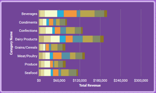
Bar visualization with no Limit Values set 
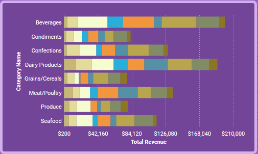
The same bar visualization with Min set to 200 and Max set to 210,000. Note the change in bar size and the labels along the X-axis. - Check the Exclude Values checkbox to exclude Values Less Than or Greater Than these settings from appearing in the chart.
- Click the Advanced Filters button to open the Visualization Advanced Filters Wizard. Similar to the Report Designer’s Filter Wizard, this wizard allows Filters to be applied to this visualization tile. Advanced Filters created here do not show up in the Dashboard Designer‘s Filters menu, nor do they appear in the Dashboard Viewer‘s Filters pane. Advanced Filters created here are applied before the Dashboard Designer or Dashboard Viewer is launched and can be used to limit the amount of data returned from the data source, which can be useful when working with very large amounts of data to improve Dashboard performance.
 or
or 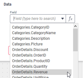
 Tabular
 Bar and Column Type
 Bar
Bar Stack Bar
 Stack Bar 100
 Pareto
 Stack Column
 Stack Column 100
 Pie and Other Types
 Donut
Donut Pyramid
 Funnel
 Line
Line
 Spline
 Line Area
 Spline Area
 Stacked Area
 Zoom Line
 Radar
Radar Scatter
 Zoom Scatter
 Key Performance Indicator (KPI)
 Slant: rotate the labels 45-degrees along the axis
 Wrap: texts wraps to a new line
 Stagger: values are staggered along two lines so they don’t overlap
 Rotate: rotate the labels 90-degrees along the axis
 None: do not apply any change to labels, they may overlap


