Advanced Reports: Using the Toolbar (pre-v2021.1)
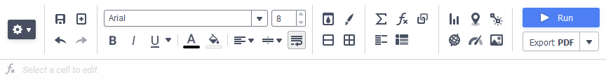
The toolbar contains the buttons and menus used to modify the report. Modifications can include aesthetic formatting, inserting formulas and images, linking reports, and much more.
Your system administrator has the ability to hide or show specific menu options and toolbar items. Some items may not be available to you.
For application versions pre-v2019.2:

The toolbar begins with the Settings dropdown menu sometimes referred to as the cog wheel menu. This menu controls changes, such as renaming and filtering, that affect the entire report. All other buttons on the toolbar require that a cell (or cells) in the design grid be selected.
-
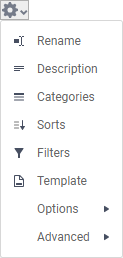
 Rename: Allows you to change the name and folder where the report will be saved.Enter a new name for the report, or choose a different folder. The name must be unique.
 -
Description: Allows you to enter or change the description of the report or formula description (if enabled).
-
Categories: Allows you to change the Categories which are included on the report. The article on Categories has more information.
-
Sorts: Allows you to change the Sorts on the report. The article on Sorts has more information.
-
Filters: Allows you to change the Filters on the report. The article on Filters has more information.
-
Template: Allows you to setup document templates and forms. The article on Templates has more information.
-
Options: Allows you to change behavior of the report. The article on Options has detailed information about each option.
-
General: Allows you to change things such as report export types, filter execution windows and page formatting. Review the General Options article for full details.
-
Report Viewer: Allows you to change things such showing the report grid, the toolbar and interactive filters and sorts in the report viewer. Review the Report Options article for full details.
-
Execution Caching: Allows you to setup Execution Caching options for this report. This is an advanced feature, contact your system administrator for assistance with it.
-
Custom: Allows you to set any Custom Options on the report. This is an advanced feature, contact your system administrator for assistance with it.
-
-
Advanced: Allows you to change advanced properties of the report.
-
Joins: Allows you to define how categories on a report are related to one another. The article on Joins has more information.
-
Parameters: Allows you to define reusable system variables, called Parameters, on the report. The article on Report Level Parameters has more information.
-
Show Generated SQL: Allows you to view the generated SQL query which retrieves the data used on the report. The article on Show Generated SQL has more information.
-
 Rename: Allows you to change the name and folder where the report will be saved.Enter a new name for the report, or choose a different folder. The name must be unique.
 Description: Allows you to enter or change the description of the report or formula description (if enabled).
 Categories: Allows you to change the Categories which are included on the report. The article on
  Sorts: Allows you to change the Sorts on the report. The article on
  Filters: Allows you to change the Filters on the report. The article on
  Template: Allows you to setup document templates and forms. The article on
  General: Allows you to change things such as report export types, filter execution windows and page formatting. Review the
  Report Viewer: Allows you to change things such showing the report grid, the toolbar and interactive filters and sorts in the report viewer. Review the
  Execution Caching: Allows you to setup Execution Caching options for this report. This is an advanced feature, contact your system administrator for assistance with it.
 Custom: Allows you to set any Custom Options on the report. This is an advanced feature, contact your system administrator for assistance with it.
 Joins: Allows you to define how categories on a report are related to one another. The article on
  Parameters: Allows you to define reusable system variables, called Parameters, on the report. The article on
 Saving Reports
The report can be saved by clicking the Save  icon. Depending on system configuration, the report may also be saved when it is executed.
Undo/Redo
Any action on a report can be undone by clicking on the Undo  icon or pressing Ctrl + Z on the keyboard.
Undone actions can be redone by clicking Redo  icon or pressing Ctrl + Y on the keyboard.
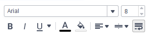
Font & Alignment Options
The text of each cell can be formatted using dropdown menus and buttons in the toolbar. A cell or multiple cells must be selected for these tools to be used.
For application versions pre-v2019.2:
Font
- To change the font, use the searchable dropdown menu. The font names appear in the style that they represent.
- Text size can be controlled using the up and down arrows on font size spinner.
- The Bold , Italics and Underline icons make the selected font bold, italicized, and underlined, respectively. Clicking the icon will turn it slightly gray to indicate the function is turned on.
 , Italics
 and Underline
 icons make the selected font bold, italicized, and underlined, respectively. Clicking the icon will turn it slightly gray to indicate the function is turned on.
Color
- To change the text color, click the Foreground Color icon to show the foreground color selector. Select a color or enter an RGB value. Hexadecimal HTML color codes may be added in the Hex textbox, or decimal values may be entered into each of the R, G and B textboxes ranging from 0–255. Click the Reset button to revert to the default color. A preview of the active foreground color appears below the Foreground Color icon.
- To change the cell background color, click the Background Color icon to show the background color selector. Select a color or enter an RGB value. Hexadecimal HTML color codes may be added in the Hex textbox, or decimal values may be entered into each of the R, G and B textboxes ranging from 0–255. Click the Reset button to revert to the default color. A preview of the active background color appears below the Background Color icon.
 icon to show the foreground color selector. Select a color or enter an RGB value. Hexadecimal HTML color codes may be added in the Hex textbox, or decimal values may be entered into each of the R, G and B textboxes ranging from 0–255. Click the Reset
  button to revert to the default color. A preview of the active foreground color appears below the Foreground Color icon.
 icon to show the background color selector. Select a color or enter an RGB value. Hexadecimal HTML color codes may be added in the Hex textbox, or decimal values may be entered into each of the R, G and B textboxes ranging from 0–255. Click the Reset
 For application versions pre-v2019.2:
- To change the text color, click the Foreground Color icon to show the foreground color selector. Select a color or enter a hexadecimal RGB value. Click the Clear icon to revert to the default color. A preview of the active foreground color appears below the Foreground Color icon.
- To change the cell background color, click the Background Color icon to show the background color selector. Select a color or enter a hexadecimal RGB value. Click the Clear icon to revert to the default color. A preview of the active background color appears below the Background Color icon.
 icon to revert to the default color. A preview of the active foreground color appears below the Foreground Color icon.
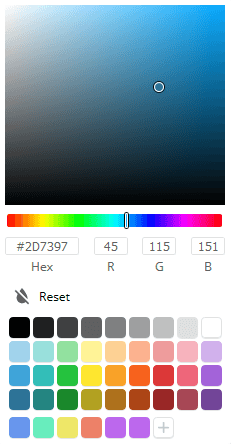
Note
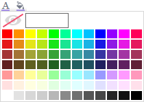
The colors on the bottom row of the new color picker can be set via extensibility by a system administrator on a system-wide basis or they may be available for user preference.
For application versions pre-v2019.2:
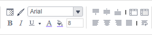
Alignment
- Text can be aligned to the left, center, right or justified in the cell using the respective horizontal alignment icons. First, click the Horizontal Alignment Selector icon, and then choose from Left , Right , Center or Justified alignment. The horizontal alignment selector icon will change to show the currently selected alignment mode.
- Text can be aligned to the top, center, or bottom in the cell using the respective vertical alignment icons. First, click the Vertical Alignment Selector icon, and then choose from Top , Middle or Bottom alignment. The vertical alignment selector icon will change to show the currently selected alignment mode.
- Clicking on the Wrap Text icon will cause text longer than the width of a cell to wrap to new lines instead of being cut off by the cell’s boundary.

 , Center
  or Justified
  alignment. The horizontal alignment selector icon will change to show the currently selected alignment mode.
 , Middle
  alignment. The vertical alignment selector icon will change to show the currently selected alignment mode.
 icon will cause text longer than the width of a cell to wrap to new lines instead of being cut off by the cell’s boundary.
For application versions pre-v2019.2:
- Text can be aligned to the left, center, right or justified in the cell using the respective horizontal alignment icons.
- Text can be aligned to the top, center, or bottom in the cell using the respective vertical alignment icons.
- The Wrap Text icon will cause text longer than the width of a cell to wrap to new lines instead of being cut off by the cell’s boundary.


Formatting Cells
Cells can be formatted in the Cell Format Window. To open the window, first click on a cell and then click the Format Cell  icon. The window has three tabs: Number, Border, and Conditional.
Comprehensive cell formatting information including how to use each of the three tabs can be found in our Cell Formatting article.
Cell formatting can be copied using the Format Paintbrush tool. Select the cell you want to copy, click the Format Paintbrush 
Merge/Split Cells
Multiple cells can be merged together by first selecting the cells and then clicking the Merge Cells  icon. This is helpful when adding a chart to a report or when creating a heading, for example.
Conversely, merged cells may be split back up by selecting the cell to be split and the clicking the Split Cells  icon. Only cells which have been merged can be split.
AutoSum
To quickly get a total on a Data Field, place the field in a Report or Group Footer and click the AutoSum  icon. Alternatively, a sum can be created with the aggSum or Sum functions. See Formulas for more information.
Note
Do not use AutoSum on a cell with an aggregate formula such as aggSum.
Images
An image from your computer can be added to a cell using the Insert Image  icon.
icon.
Functions
Complex calculations can be done using Formulas. A formula can be added to a cell by keying it in manually or using the Formula Editor. To open the Formula Editor click the Formula Editor  icon.
icon.
Detailed information about formulas and how to use them can be found in the Formulas Section of the product documentation.
Chart Wizard
A chart visualization may be added to the report by first clicking on a cell and then clicking on the Chart Wizard  icon to launch the chart wizard. Full details about chart types and how to use the chart wizard can be found in the article on Charts.
Gauge Wizard
A gauge visualization may be added to the report by clicking on a cell and then clicking on the Gauge Wizard  icon to launch the gauge wizard. Full details about gauges and how to use the gauge wizard can be found in the article on Gauges.
Suppress Duplicates
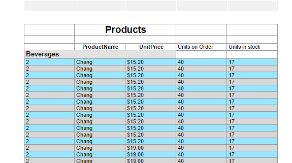
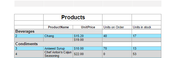
You can suppress duplicate values of a Data Object from being displayed. Select the cell and click the Suppress Duplicates  icon.
icon.
For example, the two reports below are identical, except the second image has suppressed duplicates for the customer column.
CrossTab Wizard
A CrossTab Report can be added to the report by clicking on the CrossTab Wizard  icon.
icon.
Linked Reports (aka Drilldowns)
A “subreport” can be linked to data on the current report by creating a link or drilldown to another report. Click on a cell and then click the Link Reports  icon to link a report to that cell. Review the Drilldowns article for full details on how to create a report link (drilldown).
Linked Action Event
Action Events are custom programs which can be activated by certain actions on a report. This is an advanced feature. Consult with your system administrator about which action events are available in your system. To add an Action Event to a cell, first click the cell and then click the Linked Action Event  icon.
icon.
GeoChart Wizard
GeoCharts are a way to visualize geographical report data. To insert a GeoChart into a cell, first select the cell and the click on the GeoChart Wizard  icon.
icon.
GeoCharts are a legacy feature, and have been replaced with the Google Maps feature. More information about the GeoCharts feature can be found in the GeoCharts article.
Google Maps Wizard
Google Maps are a way to insert interactive maps in a report to visualize geoghraphical report data. To insert a Google Maps visualization into a cell, first select the cell and then click on the Google Maps Wizard  icon.
icon.
More information about using this feature can be found in the Google Maps article.
Run Report

Clicking on the Run Report button will execute the report and display the result in the Report Viewer. Depending on system configuration, clicking Run Report may also save the report first.
Execution Caching
If Execution Caching is enabled for a report, the Cache Status icons will appear in the toolbar next to the Run Report and Export buttons. A report can only be run when the cache is valid.
-
Cache Invalid: the cache is invalid or out of date. Click this icon to update the cache.
-
Cache Valid: the cache is valid.
 Cache Invalid: the cache is invalid or out of date. Click this icon to update the cache.
 Cache Valid: the cache is valid.
Export
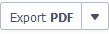
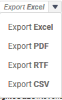
To export the report as a downloadable file, click on the Export PDF button. You can also click on the More  icon to select from the additional exportable file types.
The system administrator can make only certain file types available, so the menu may look differently depending on how your installation is configured.
Formula Bar

A formula may be added to cells by directly entering them into this formula bar. Click the Formula Editor icon in the bar to open the Formula Editor for assistance building the formula.
Just as when entering formulas directly into cell content, formulae should be prefixed with an equals sign.
Examples
={Orders.OrderDate}
=AggCount({Products.ProductName})
=[A5]
Additional Resources
For more information about formulas, review these articles: