GeoCharts
Note
The system administrator can restrict access to this feature, therefore it may not be available in all environments. Contact the system administrator for more information.
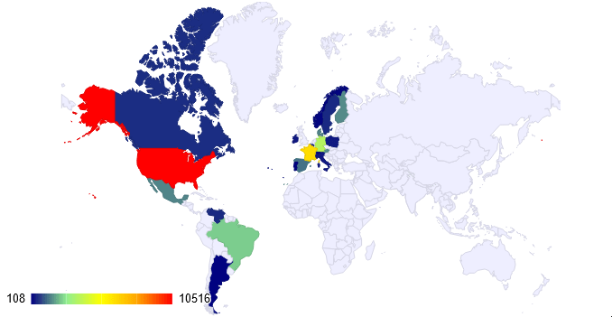
A GeoChart can be displayed in an Advanced Report to give a basic visual representation of geographic data.
Add a GeoChart Visualization
To add a GeoChart to an Advanced Report:
- Select a Group Header, Group Footer, Report Header or Report Footer cell.
- Open the GeoChart Wizard:
-
(pre-v2021.1) Click the GeoCharts Wizard
 icon in the toolbar.
 -
(v2021.1+) Click the Insert icon on the toolbar, then click GeoChart
-
(pre-v2021.1) Click the GeoCharts Wizard
 icon in the toolbar.
 icon on the toolbar, then click
 The GeoChart Wizard has three tabs: Type, Locations and Data outlined below.
Type
In the Type tab, select the initial view, size, colors, and if a legend should be displayed.

- Use the Base Map dropdown to select the location that initially displays on the map. Select the world, a region or a country name.
- In the Dimensions group, select the size of the GeoChart by either:
- Check the Fit to Cell checkbox, which will cause the map to fill its containing cell.
- Enter the height and width (in pixels). This requires that Fit to Cell be unchecked.
- Drag-and-drop the resizing handle at the bottom-right corner of the preview. This requires that Fit to Cell be unchecked.
- The Color dropdown determines the palette of colors that will color/shade the map. Choose from:
- Theme — a variety of named color themes are available (e.g. Coral, Election, Forest, etc…)
- Linear Range — choose a beginning (minimum) color and an ending (maximum) color. The application will automatically blend from the beginning to ending color. Click the color selector icons to open the color selector to choose the colors.
- Check the Show Legend box to display a legend in the bottom-left corner of the map.
Click Next to advance to the Locations tab.
Locations
In the Locations tab, specify which geographic locations should display on the map.
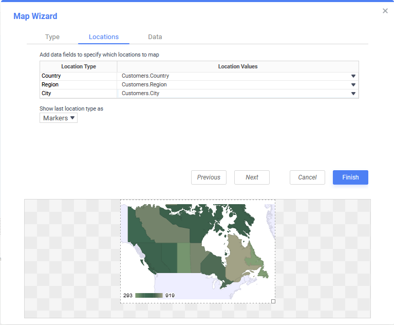
- Use the three Location Values dropdowns to select the cells that contain the geographic information for the corresponding Location Type on the map. To utilize Region information, such as states/provinces, Country information must be provided. Similarly, City information requires Region and Country information.
Region Naming Scheme
Geographic naming schemes must be consistent within each level. Countries can be named by either their country code abbreviation, English name, or regional name. But do not mix schemes or the application may not interpret the data correctly.
- Country — select a data cell with country names if the Base Map and data comprises multiple countries. This level is required if the Region or City names may be ambiguous between countries. For example, Vancouver is ambiguous between Vancouver, British Colombia, and Vancouver, Washington.
- Region — This is for country subdivisions such as States, Provinces, or Districts. This level is required if the City names may be ambiguous between regions. For example, Portland is ambiguous between Portland, Oregon and Portland, Maine.
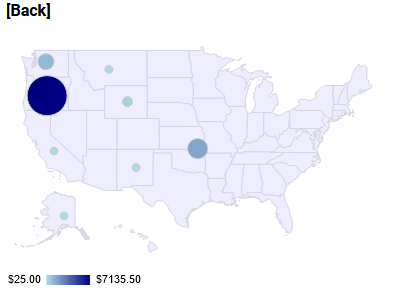
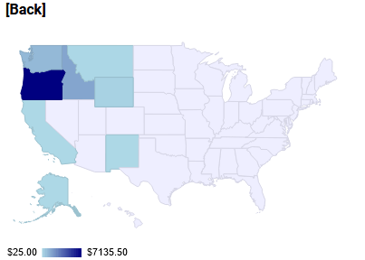
- City — GeoCharts have no boundary data for cities, so they are shown as circular markers.
- The Show last Location type as dropdown specifies how to display the data at the most specific Location Type where a Location Value is set. Choose from:
-
Markers — circular markers will appear.
Note
City level data will always be displayed as markers. If city level data will be the most specific, always choose Markers.
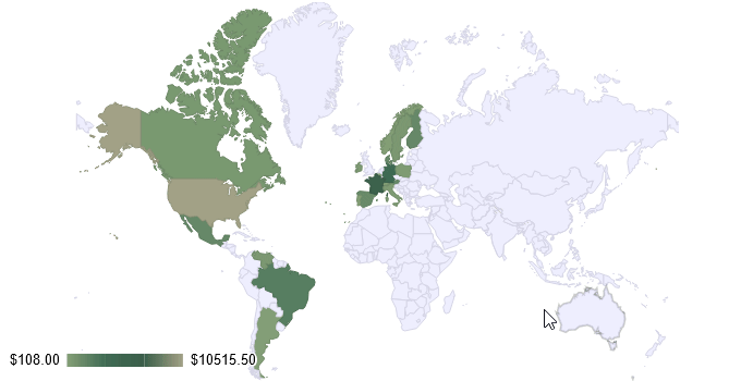
- Regions — the entire region will be shaded with a color.
See the examples below:
Show last location type as set to Markers Show last location type as set to Regions -
Markers — circular markers will appear.
Click Next to advance to the Data tab.
Data
In the Data tab, specify which data determines the color of each Location Type and the size of each marker.
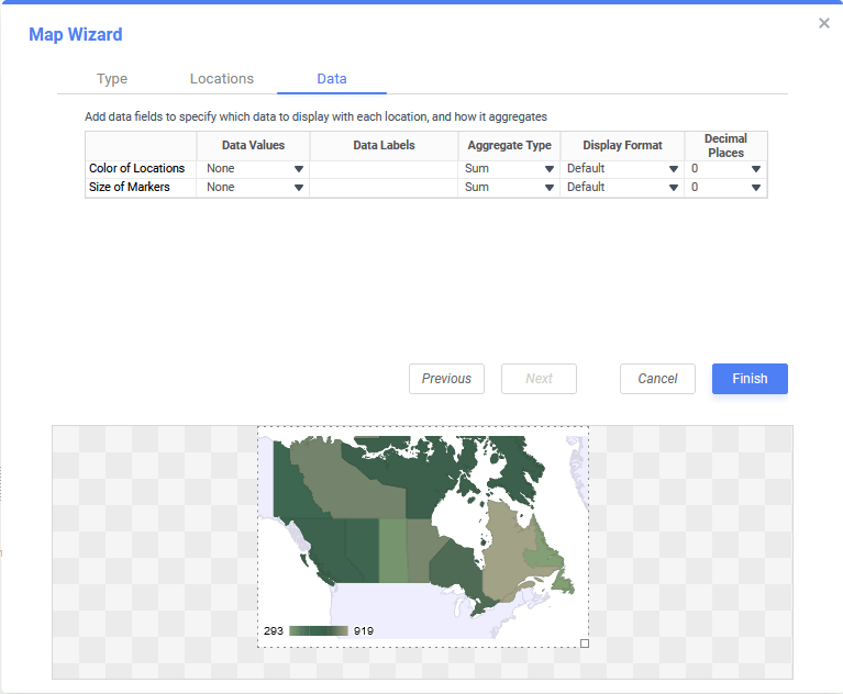
For both Color of Locations and Size of Markers, set the values below. Color of Locations is required, while Size of Markers is optional.
- Use the Data Values dropdown to specify what cell on the report determine the color and size of each marker. Setting a cell for the size of marker is optional.
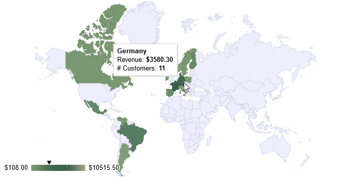
- Enter a brief description in the Labels field. The labels appear in tooltips when hovering over the regions.
- Select an Aggregation Type from the dropdown to choose how the Data Values will be summarized. Choose from:
- Sum — display the additive total of all data in the data value
- Avg — display the average (arithmetic mean) of this data value
- Count — display the number of rows in this data value. For example in the data set {1, 2, 3, 3, 4, 4} the count is 6.
- Distinct Count — display the number of unique rows in this data value. For example in the data set {1, 2, 3, 3, 4, 4} the distinct count is 4.
- Min — display the smallest or earliest value of this data value
- Max— display the largest or latest value of this data value
Tip
To use fixed-size markers instead of dynamic size:
- Select a report cell containing a fixed numeric value, as written with a preceding equal sign (=). For example:
=10. - From the Aggregate Type dropdown, select Avg.
- Select a Display Format from the dropdown to format the data value in the tooltip. Choose from:
- Default — displays the values without any formatting. (e.g. 1234.5678)
- Currency — prepends the US Dollar sign ($) to the values. (e.g. $1234.5678)
- Percent — multiplies the data value by 100 and appends a percent sign (%) to the values. (e.g. 123456.78%)
- Scientific Notation: displays the values in scientific notation. (e.g. 1.23456789E3)
- Choose from 0–6 Decimal Places to display on the data value from the dropdown.
Click Finish to add the completed visualization to the report.
Interacting with GeoChart Visualizations
On the first run, it may take a few minutes for the map to populate with data and for the data to be aggregated.
Hover the mouse over a shaded region to display additional information in a tooltip.
If configured, click on the shaded regions to drill down into more detail. Click [Back] to zoom back up a level.
Note
When an Advanced Report containing a GeoChart visualization is exported to an output file type that supports visualizations (i.e. PDF, RTF or Excel) the map will be reset to the default view defined in the Type tab of the wizard.