Report Viewer
Executing an Advanced Report or CrossTab Report presents the data output in a paged, interactive format called the Report Viewer. Paging through, searching, filtering, sorting, conditional formatting chart and map interactivity are all available in the Report Viewer. Changes made to the report can be saved to the original report, a new report or a customized “user report”. Basic report viewing is also supported on mobile devices.
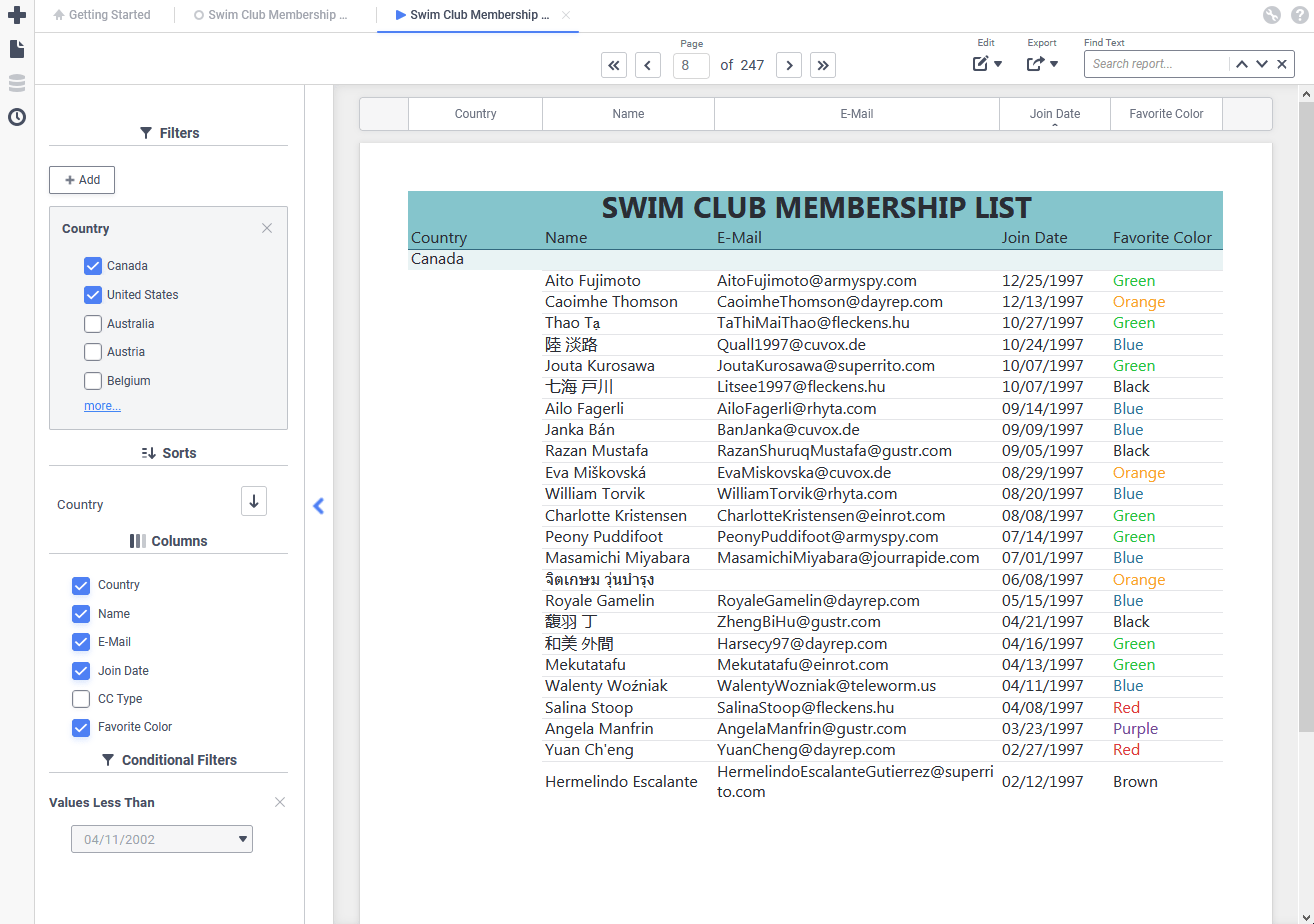
The interactive Report Viewer (v2021.1+)
The interactive Report Viewer (pre-v2021.1)
To run a report in the Report Viewer either:
- From the Report Designer, click
 on the toolbar. Depending on system configuration, this will also save the report.
 - From the Report Tree, select the report then either:
- click the Run icon (if available), or
- click the Menu icon or right-click and then Run Report.
- click the Run
 on the toolbar. Depending on system configuration, this will also save the report.
 icon (if available), or
 icon or right-click and then
  Run Report.
The Report Viewer opens in a new tab, indicated by the viewer  icon. Making any changes in the Report Designer requires running it again in a new Report Viewer tab.
Prompting Filters and Parameters
Some reports may contain filters or parameters that prompt for a value to be provided when the report is run. In this case, a dialog will appear asking for a value to be displayed.
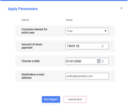
Prompting parameter dialog
- For each parameter or filter, enter a value into the Value field by either:
- entering the value directly into the text field
- choose a value from the dropdown list, if available.
- click the Formula Function icon to select a value based on a formula function, if available.
- click the Date Selector icon to choose a date, if the parameter expects a date value
- Click Run Report to execute the report with the provided values, or Cancel Run to cancel the report’s execution.
 icon to select a value based on a formula function, if available.
 icon to choose a date, if the parameter expects a date value
For filters, the report builder has the option of choosing what fields and controls are available in the prompt. The full filter dialog may appear, or a simplified version with or without the ability to change the filter operator may appear.
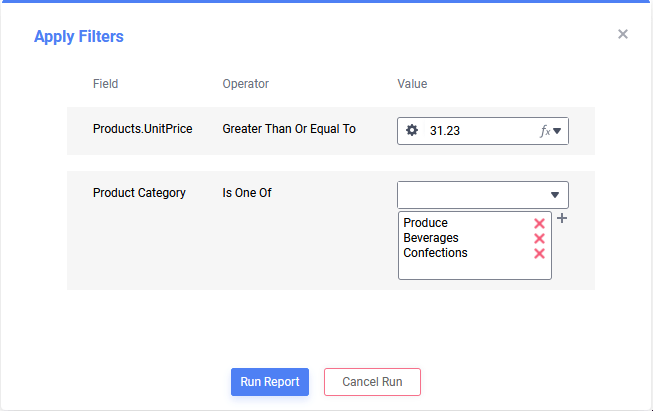
Simple prompting filter dialog without operator. This is considered “without operator” because the operator cannot be changed in this dialog.
If the filter has an Is One Of operator, values may be selected from the top dropdown in the Value column. A value may be manually entered and then added by clicking on the Add Value
 icon.
icon.
Anatomy of the Report Viewer
The Report Viewer is divided into three sections: the toolbar, the interactive dock and the canvas.
Toolbar
Use the toolbar for paging or searching through the report’s contents, saving changes made to the report in the Viewer and exporting the report to a downloadable file such as PDF, Excel, RTF or CSV. The system administrator can enable or disable certain features, including the entire toolbar, so not all options shown below may be available.
Tip
Select the correct version number from the Viewing content for dropdown in this article to show only the relevant options.

Report Viewer toolbar (v2021.1+)
Report Viewer toolbar (pre-v2021.1)
- Clear Options (pre-v2021.1) — clear any changes to the report made with the features described in the Interacting With Reports and Customizing Report Output – Creating User Reports sections below.
- Clear All — clear changes made with the conditional formatting/filtering popup dialog, unhide any hidden columns, reset custom column widths, remove active column sorts
- Clear Styling Changes — clear only styling changes made with the conditional formatting/filtering popup dialog to the report
- Clear Column Changes — unhide all hidden columns, reset custom column widths and remove any active column sorts
- Save Changes (pre-v2021.1) — save any changes to the report made with the features described in the Interacting With Reports and Customizing Report Output – Creating User Reports sections below.
- Save Changes to Report — save any changes back to this report
- Save Changes as New Report — save any changes as a new report with a new name and folder
- Save Changes as User Report — save any changes made to the report as a user report
- Delete User Report — delete the user report if one exists
- Export (pre-v2021.1) — export the report as a downloadable file such as PDF, Excel, RTF or CSV. Not all file types may be available depending on report and system configuration.
- Truncated Results Displayed (pre-v2021.1) — the report was generated with a partial data set and may contain incorrect calculations and aggregates. Click the icon to load more data:
- Generate +number — get the next number of data rows and add them to the existing report
- Generate All — to get the reminder of the data set.
- First Page — skip to the first page of the report
- Previous Page — turn back one page
- Next Page — advance one page
- First Page — skip to the last page of the report
- Find… — search the report data for text entered into this field. Text that matches the search will be highlighted. Use the Search Up and Search Down icons to move between results that match the search text.
- Showing x Results (v2021.1+) — the report was generated with a partial data set and may contain incorrect calculations and aggregates. Click the link to load more data:
- Load x more Records — get the next x of data rows and add them to the existing report
- Load All Data — get the remainder of the data set
- Edit (v2021.1+) — save or clear any changes to the report made with the features described in the Interacting With Reports and Customizing Report Output – Creating User Reports sections below.
- Save Changes…
- to This Report — save any changes made back to this report
- as New Report — save any changes made to the report as a new report with a new name and folder
- as User Report — save any changes made to the report as a user report
- Clear Changes
- Styling Only — clear only styling changes made with the conditional formatting/filtering popup to the report
- Column Only — unhide all hidden columns, reset custom column widths and remove any active column sorts
- Delete User Report — delete the user report if one exists
- Clear All — clear changes made with the conditional formatting/filtering popup dialog, unhide any hidden columns, reset custom column widths, remove active column sorts
- Save Changes…
- Export (v2021.1+) — export the report as a downloadable file such as PDF, Excel, RTF or CSV. Not all file types may be available depending on report and system configuration.
- Find Text (v2021.1+) — search the report data for text entered into this field. Text that matches the search will be highlighted. Use the Search Up and Search Down icons to move between results that match the search text. Click the Clear icon to remove the search from the report.
 Clear Options (pre-v2021.1) — clear any changes to the report made with the features described in the
  Save Changes (pre-v2021.1) — save any changes to the report made with the features described in the
  Truncated Results Displayed (pre-v2021.1) — the report was generated with a partial data set and may contain incorrect calculations and aggregates. Click the icon to load more data:
 First Page — skip to the first page of the report
 Previous Page — turn back one page
 Next Page — advance one page
 First Page — skip to the last page of the report
 and Search Down
  icons to move between results that match the search text.
 Edit (v2021.1+) — save or clear any changes to the report made with the features described in the
 icon to remove the search from the report.
Interactive Dock
The interactive dock optionally contains filters, sorts and column view controls. The dock can appear on the left or right side of the Report Viewer by default. It can also be disabled on a per-report or per-system basis.
The Interactive Dock is displayed on the left side of the window in this figure
The dock contains different modules based on the system and report settings: columns, filters, sorts and conditional filters.
Click the Open Dock  (pre-v2021.1)
  (v2021.1+) icon to open the dock to manage the modules and their settings. Click the same icon to hide the dock.
Filters

Interactive filters added to the report will appear in this section. They are added in the Report Designer for exclusive use in the Report Viewer. Changes made to the filters can be saved as a user report.
Some filters may appear as soon as the dock is opened, others can be added as needed with the Add  icon (pre-v2021.1) or Add button (v2021.1+).
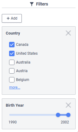
Filters module (v2021.1+) with two filters: a multiple choice filter for Country, and a range slider for Birth Year
To remove an interactive filter, click the Remove Filter
 (pre-2021.1) or
  (v2021.1+) icon.
Sorts

The sorts on the report optionally are exposed in this module, available to be switched from ascending or descending order.
To change the direction of a sort, click the corresponding Sort Ascending  or Sort Descending
  icon.
icon.
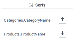
Sorts module (v2021.1+) with two sorts: a descending sort on Categories.CategoryName and an ascending sort on Products.ProductName
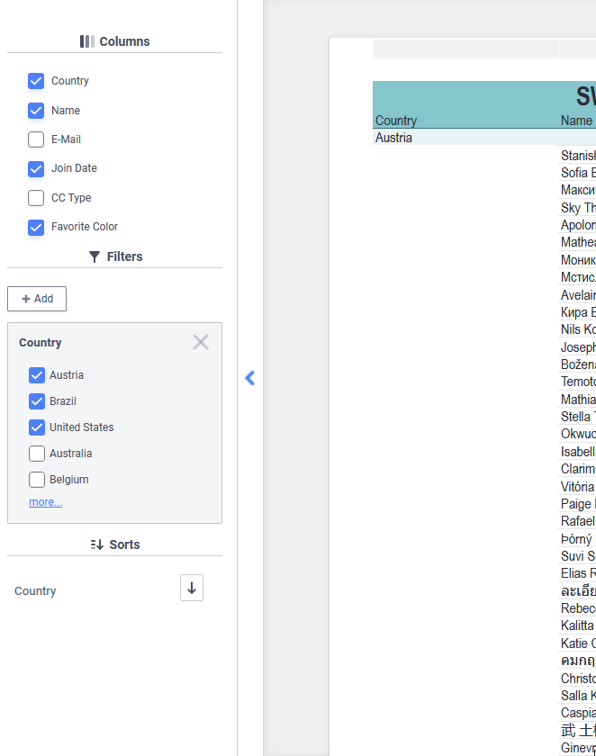
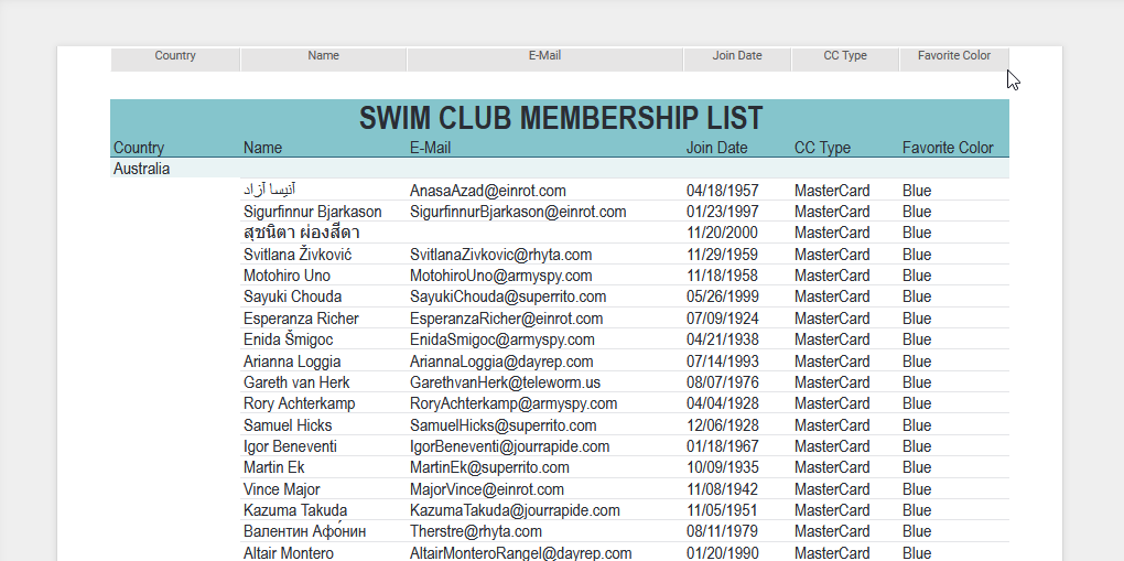
Columns

Selectively hide or unhide columns from an Advanced Report’s output by checking or unchecking the corresponding checkboxes. The visibility of columns can be saved as a user report.
Note
This module is unavailable if a CrossTab appears on the report.
The E-Mail and CC Type columns are hidden from the report but Country, Name, Join Date and Favorite Color are visible
Conditional Filters
Conditional Filters are those added to the Report Viewer with the conditional formatting/filtering popup dialog. Conditional filters can be saved to a user report.
Conditional formatting/filtering popup dialog
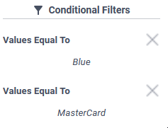
Conditional Filters module (v2021.1+) with two filters: one enforcing the color choice to be blue, the other credit card type to be MasterCard
To remove a conditional filter, click the Remove Filter
(pre-2021.1) or (v2021.1+) icon. The module will disappear once all conditional filters have been removed from the report.
Canvas
The canvas is the main viewpoint for the data presented in the report. The canvas consists of the column headers which appear as boxes above the report layout, and the report layout/data itself.
Mouse hovering over the column headers/control boxes at the top of the report canvas pre-v2021.1
See Managing Data Columns below for information about interacting with the column headers. See Interacting With Reports for information about interacting with the data, charts and maps that appear on the report’s layout.
Interacting With Reports
There are a number of ways to interact with reports in the Report Viewer. Available options depend on how the report was designed and the type of content in it.
Tip
If the report has Linked Action Events, there may be more interactive features than aren’t listed in this article. Consult with the system administrator or the user who designed the report for more information.
Drilling Into Data
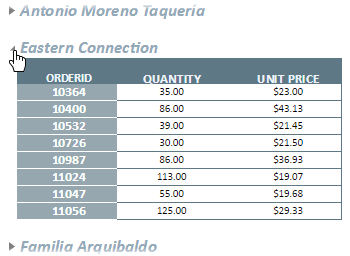
Some reports allow drilling down into cells or charts to see additional data related to the field selected. If a cell or chart has a linked report (a.k.a. drilldown), click on one of the values to see the related data.
Linked Reports are actually other reports that can be interacted with or even export to a file. Linked Reports may even have drilldowns of their own!
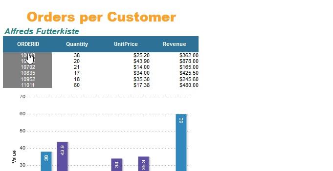
Clicking on an Order ID drills down into the line items included on that order with a linked report. Note the mouse cursor changes to a hand versus an arrow indicating that the order ID is clickable.
Expanding Collapsed Rows
Some reports have collapsed rows that can be seen by expanding them. Collapsed rows are indicated by the Open Rows  icon. Click on the icon to expand the row. Click the icon again to collapse it. Right-click the icon to open a menu to do the following:
- Expand / Collapse — expand or collapse the outer group
- Expand / Collapse Group — expand or collapse the group and any inner groups
- Expand / Collapse All — expand or collapse all outer and inner groups on the report
Expanding a data row
Visualization Features
Visualizations have a number of interactive features depending on the type of chart. For example, line charts and bar charts allow hiding series, axes can be turned on or off for multi-axis charts and the slices of pie charts can be pulled out and rotated . Charts can also show some additional information in a tooltip when hovered over. Heatmaps may optionally display up to 5 additional data series in a tooltip when hovering over a cell.
See Styling Charts below for additional information about changing a chart’s style in the viewer.
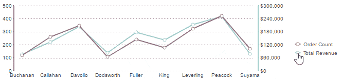
Toggling a chart series on or off
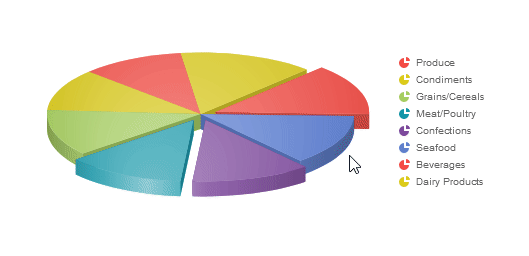
Rotating a pie chart and pulling out its segments by clicking on them
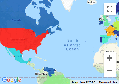
Drilling Into Maps
Google Maps are fully interactive geographic visualizations. Review the Interacting with Google Maps Visualizations section of the Google Maps article for full details.
Drilling down from country, to state, county and street address level by double-clicking on the Google Map
On a GeoChart, click on a highlighted region to drill down into the region. Click [Back] to return to the previous view. Learn more in the Interacting with GeoChart Visualizations section of the GeoCharts article.
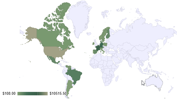
Drilling down from world view to the United States, then selecting Washington state, then viewing the map detail for the cities Seattle and Kirkland on a GeoChart
Customizing Report Output – Creating User Reports
The Report Viewer allows for changes to the style, formatting and data presented on the report. These changes can be saved to the original report, to a new copy of the report, or as a user report. Review Toolbar above for details how to save report changes.
A user report is a customized version of a report that is specific to a specific end user. User report changes are saved separately from the report design, and will only show when that user runs the report themselves. These can be useful for making changes to read-only reports. More information about user reports can be found in the User Preferences and Context Sensitive Help article.
Note about cookies
User reports may be stored locally in the web browser. Clearing the browser cache will remove any user report customization. Contact the system administrator for additional information.
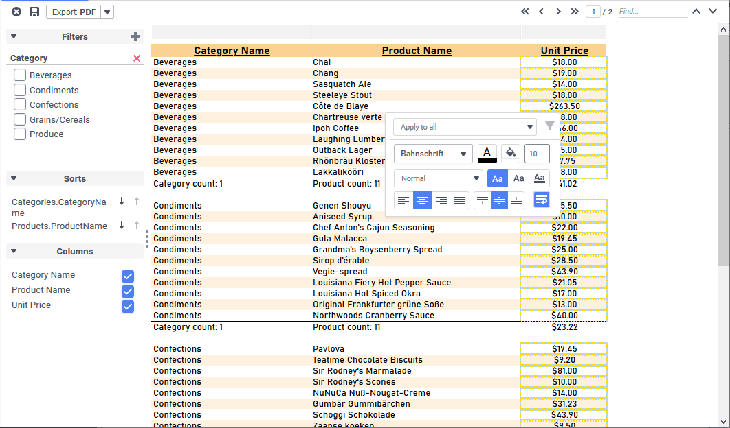
Styling Data
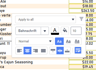
Right-click a cell to open the conditional formatting/filtering popup. Use this dialog to set custom formatting based on the data meeting certain criteria.
Right-clicking a cell to change its styling
For group cells with dynamic data from fields or formulas, use the Conditional Filter list (default value is Apply to all) to apply styling to only the data that meet a certain condition. For each of the following options, styling applies to the cells of the same type in the group that meet the specified condition:
Tip
Select a condition before changing the styling.
- Apply to all — apply universally to all of the cells in this column
- Apply to equal values — All cells with the same value as the clicked cell
- Apply to unequal values — All cells with different values than the clicked cell
- Apply to greater values — All cells with values greater than the clicked cell (larger number, later date, or alphabetically subsequent)
- Apply to greater than or equal values — All cells with values greater than or equal to the clicked cell
- Apply to lesser values — All cells with values less than the clicked cell (smaller number, earlier date, or alphabetically preceding)
- Apply to less than or equal values — All cells with values less than or equal to the clicked cell
The styling options available are:
- Font
- Font Size
- Text Color
- Background color
- Text decoration
- Horizontal and Vertical Alignment
- Wrap Text
 Font
Font Font Size
 Text Color
 Background color


 Text decoration


 Horizontal and

 Vertical Alignment
 Wrap Text
Styling applies to all cells of the same type in the column; affected cells are outlined by a goldenrod border.
Conditional Filters
Clicking the  Conditionally Filter icon will add a new conditional interactive filter to the report and open the Interactive Dock (if not already open), filtering the detail rows by the criteria selected in the dropdown. This icon is only active for choices other than Apply to All. See Interactive Dock and Conditional Filters above.
Styling Charts
Note
The Chart Options menu is supported for all chart types except heatmaps.
Right-click a chart (or click the Chart Options  icon on mobile) to open the Chart Options menu. Using this menu you can swap to a different Type of chart, change the color Theme, change the location of the Legend, and change the Sort order of the data series. These settings can be saved as a user report.
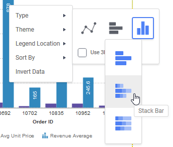
Changing a column chart to a stacked bar chart with Chart Options menu
- Type — change the chart from one type to another as in the Type tab of the Chart Wizard. Only charts of the same series type may be selected. That is, if the chart is a multi-series type of chart only other mutli-series charts may be selected.
- Theme — change the color palette of the chart as in the Colors section of the Chart Wizard’s Appearance tab.
- Legend Location — change the location of the legend
- Sort By — change the sort order on the chart as in the Other Options section of the Chart Wizard’s Data tab.
- Invert Data — swap the data fields on the X and Y axes
Managing Data Columns
Each column on the report has a light gray column header/control box. These headers can be optionally turned on or off from the Report Designer. Changes made here can be saved as a user report.
Change the width of the columns by clicking and dragging the line between column headers left or right.
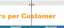
Resizing a column
To hide a column, either:
- right-click the column header, then click Hide Column from the menu
- use the Interactive Dock’s Columns module to uncheck the column (not available for CrossTabs)
 Hide Column from the menu
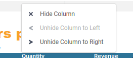
Right clicking a column to hide it
To unhide a column, either:
- right-click the column header, then click either Unhide Column to Left or Unhide Column to Right from the menu
- use the Interactive Dock’s Columns module to check the column (not available for CrossTabs)
 Unhide Column to Left or
  Unhide Column to Right from the menu
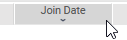
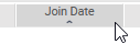
Some columns may have an additional column sort that is either active when the report is executed, or can be made active by clicking on the column header. Column sorts are applied after the sorts defined in the Report Designer’s Sorts dialog. If there are multiple columns with column sorts defined, only one may be active at any given time.
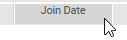
Clicking the column header will cycle through the available options: no column sort, ascending column sort, descending column sort.
Column header (pre-v2021.1 on top, v2021.1+ on bottom) with no column sort applied
Column header (pre-v2021.1 on top, v2021.1+ on bottom) with an ascending column sort applied
Column header (pre-v2021.1 on top, v2021.1+ on bottom) with a descending column sort applied