-
Reporting
-
-
- Advanced Options
- Advanced Reports: Categories (pre-2021.1)
- Advanced Reports: Design Grid (pre-2021.1)
- Advanced Reports: Joins
- Advanced Reports: Report Designer (pre-2021.1)
- Advanced Reports: Report Options
- Advanced Reports: Sections (pre-v2021.1)
- Advanced Reports: Sorts
- Advanced Reports: Using the Toolbar (pre-v2021.1)
- Cell Formatting
- Report Wizard
- Report Wizard: Categories
- Report Wizard: Filters
- Report Wizard: Layout
- Report Wizard: Name
- Report Wizard: Options
- Report Wizard: Sorts
- Show all articles ( 7 ) Collapse Articles
- Advanced Reports: CrossTabs
- Advanced Reports: Templates
- Building Your First Report
- Chained Reports
- Conditional Row Suppression
- Dealing with Duplicate Values
- Display Page Numbers
- Filters
- Keyboard Shortcuts
- Linked Reports (Drilldowns)
- Navigating the Application
- No Data Qualified Options
- Report Types
- Report Viewer
- Sorting by Aggregates
- User Preferences and Context Sensitive Help
- Show all articles ( 6 ) Collapse Articles
-
-
- Chart Advanced Features: Area
- Chart Advanced Features: Bar 2D
- Chart Advanced Features: Bar 3D
- Chart Advanced Features: Bubble
- Chart Advanced Features: Column 2D
- Chart Advanced Features: Column 3D
- Chart Advanced Features: Combination 2D
- Chart Advanced Features: Combination 3D
- Chart Advanced Features: Doughnut 2D
- Chart Advanced Features: Doughnut 3D
- Chart Advanced Features: Funnel
- Chart Advanced Features: Heatmap
- Chart Advanced Features: Line
- Chart Advanced Features: Pareto 2D
- Chart Advanced Features: Pareto 3D
- Chart Advanced Features: Pie 2D
- Chart Advanced Features: Pie 3D
- Chart Advanced Features: Pyramid
- Chart Advanced Features: Radar
- Chart Advanced Features: Samples
- Chart Advanced Features: Scatter
- Chart Advanced Features: Spark Column
- Chart Advanced Features: Spark Line
- Chart Advanced Features: Spline
- Chart Advanced Features: Spline Area
- Chart Advanced Features: Stacked Area
- Chart Advanced Features: Stacked Bar 2D
- Chart Advanced Features: Stacked Bar 3D
- Chart Advanced Features: Stacked Column 2D
- Chart Advanced Features: Stacked Column 3D
- Chart Advanced Features: Zoom Line
- Chart Advanced Features: Zoom Scatter
- Show all articles ( 22 ) Collapse Articles
- Bar Charts
- Chart Data Layout Types
- Charts and the Chart Wizard
- Displaying Null Values in Charts
- Gauges
- GeoCharts
- Google Maps
- Heatmap Charts
- Key Performance Indicator (KPI)
- Line Charts
- Pareto Charts
- Pie, Doughnut, Pyramid, and Funnel Charts
- Scatter and Bubble Charts
- Spark Charts
- Tabular Visualizations
- Show all articles ( 5 ) Collapse Articles
-
-
-
- Dashboard Designer (v2019.2+)
- Dashboard Designer: Existing Report Tiles (v2019.2+)
- Dashboard Designer: Filters (v2019.2+)
- Dashboard Designer: Image Tiles (v2019.2+)
- Dashboard Designer: Parameters (v2019.2+)
- Dashboard Designer: Samples (v2019.2+)
- Dashboard Designer: Text Tiles (v2019.2+)
- Dashboard Designer: URL Tiles (v2019.2+)
- Dashboard Designer: Visualization Tiles (v2019.2+)
- Dashboard Viewer (v2019.2+)
- Exporting Dashboards (v2019.2+)
- Show all articles ( 1 ) Collapse Articles
-
-
- ExpressView: Aggregating/Summarizing Data (v2021.1+)
- ExpressView: Exporting (v2021.1+)
- ExpressView: Filtering (v2021.1)
- ExpressView: Formula Columns (v2021.1+)
- ExpressView: Grouping (v2021.1+)
- ExpressView: Introduction (v2021.1+)
- ExpressView: Sorting (v2021.1+)
- ExpressView: Visualizations (v2021.1+)
-
-
- Aggregate Functions
- Arithmetic and Geometric Functions
- Database and Data Type Functions
- Date Functions
- FilterValue and General Format Best Practices
- Financial Functions
- Formatting Functions
- Formula Editor
- Internal Parameters
- JSONExtract Function
- List of Functions
- Logical Functions
- Other Functions
- String Functions
- What are formulas?
- Show all articles ( 5 ) Collapse Articles
-
-
Administrators
-
- Advanced Joins
- Amazon S3 File Storage
- Application Settings
- Automatic Database Discovery
- CData Drivers
- Config File XML & API Setting Reference (General Nodes)
- Config File XML Reference (All Nodes but General)
- Configuring Remote Report Execution Host for Azure App Service Deployments
- Considerations When Sizing an Exago System
- Database Aggregation
- Evaluating Exago - Linux
- Evaluating Exago - Windows
- Exago Installation Manifest
- Execution Caching
- Exploring Exago Technology
- Hidden Flags
- Inline Frame or JavaScript API?
- Installing and Configuring the REST Web Service API
- Installing Optional Features
- Managing the dbconfigs.json File
- Manual Application Installation
- Moving Files Between Storage Management Databases
- Multi-Tenant Environment Integration
- Multiple Data Models
- Report-Level SQL Objects
- Scheduling Reports
- Security Checklist
- Set Up Exago in a Web Farm
- Step 1: Install and Configure
- Step 2: Integrate
- Step 3: Install and Configure the Scheduler Service
- Step 4: Administration Console and API
- Step 5: Extensions
- Storage Management: Custom Implementation
- Storage Management: Database Schema
- Storage Management: Getting Started
- Storage Management: Introduction
- Storage Management: Transitioning from Legacy Storage Methods
- Storage Management: Utility (v2020.1)
- Storage Management: Utility (v2021.1+)
- Table-Valued Functions
- Technical Specifications
- User Identification
- Using SQLite Data Sources
- Vertical Table Support
- Windows Registry Changes
- Show all articles ( 36 ) Collapse Articles
-
- What's New in Version 2021.2
- Performance Enhancements in Version 2019.1
- Support and Maintenance Policy
- Time Zone Calculation Enhancements in v2019.1
- Updating Recommendations
- Updating to the Latest Version (Potentially Breaking Changes)
- What's New in Version 2019.1
- What's New in Version 2019.2
- What's New in Version 2020.1
- What's New in Version 2021.1
-
- Constants and Enumerators
- Executing Reports with the API
- List of REST Endpoints
- REST - Batch
- REST - Config Settings
- REST - Data Joins
- REST - Data Objects
- REST - Data Sources
- REST - Folders
- REST - Functions
- REST - GetExecute
- REST - Getting Started
- REST - Introduction
- REST — Parameters
- REST - Role Security
- REST - SchedulesV2
- REST - Server Events
- REST - Sessions
- REST - Storage Management
- REST Updates
- Using JSON
- Show all articles ( 11 ) Collapse Articles
-
- .NET API Documentation
- .NET API General Reference
- .NET Sample Code
- Constants and Enumerators
- Introduction to the .NET API
- List of .NET API Resources
- Load Reports in the .NET API
- Supply SQL for New Reports in the API
- Using the Administration Console and Exago API
- WebReports.Api
- WebReports.Api.Common
- WebReports.Api.Composite.Chained
- WebReports.Api.Composite.Dashboards
- WebReports.Api.Data
- WebReports.Api.Reports
- WebReports.Api.Roles
- WebReports.Api.Scheduler
- WebReportsDebug.xml
- Show all articles ( 8 ) Collapse Articles
-
- Configuration File Options and Optimizations
- High Availability
- Incremental Loading
- Intro to Performance and Scaling
- Measuring Database Network Latency
- Monitoring Database Schema
- Monitoring Scheduler Load
- Monitoring: Setup
- Monitoring: System Overview
- Special Cartesian Processing
- Tracking Execution Frequency with Monitoring
- Show all articles ( 1 ) Collapse Articles
-
- Adding Custom Items to the Report Tree
- Adding Fonts to Exago
- An Overview of Exago Extensions
- Application Themes
- Assembly Data Sources
- Create a Custom ExpressView Theme
- Create a Custom ExpressView Theme (v2021.1+)
- Custom Context Sensitive Help
- Customizing Getting Started Content
- Displaying User Messages
- Exago Theme Maker
- Excel: Grouping on Separate Worksheets
- Getting Started with Application Themes
- HTML Tag Sanitization
- Multi-Language Support
- Remote Execution
- Report and Folder Storage/Management
- Scheduler Queue
- SessionInfo
- Styling Exago
- Styling the Home Page
- Themes
- Show all articles ( 12 ) Collapse Articles
-
- Global Event: OnAfterLoadReportsList
- Global Event: OnAfterReportExportSuccess
- Global Event: OnConfigLoadEnd
- Global Event: OnConfigLoadStart
- Global Event: OnDataCombined
- Global Event: OnDataFieldsRetrieved
- Global Event: OnExceptionThrown
- Global Event: OnExecuteSqlStatementConstructed
- Global Event: OnExportCsvCell
- Global Event: OnFilterSqlStatementConstructed
- Global Event: OnGetUserPreferences
- Global Event: OnLoadReportParameters
- Global Event: OnOkFiltersDialog
- Global Event: OnOkParametersDialog
- Global Event: OnParameterSqlStatementConstructed
- Global Event: OnRenameFolderEnd
- Global Event: OnRenameFolderStart
- Global Event: OnReportExecuteEnd
- Global Event: OnReportExecuteInit
- Global Event: OnReportExecuteStart
- Global Event: OnReportFailValidation
- Global Event: OnReportSaveStart
- Global Event: OnScheduledReportComplete
- Global Event: OnScheduledReportExecuteStart
- Global Event: OnScheduledReportExecuteSuccess
- Global Event: OnSetUserPreferences
- Global Event: OnWebServiceExecuteEnd
- Introduction to Server Events
- List of Server Events
- Show all articles ( 19 ) Collapse Articles
-
-
How To
-
- .NET and REST APIs
- Batch REST API
- Custom Aggregate Functions
- Custom Columns and CrossTabs
- Custom Dialogs
- Custom Filter Functions
- Custom Functions
- Custom Interactivity via HTML & Action Events
- Customizing Color Picker
- Dashboard Updates in v2021.1
- Data Formatting
- Date Check Custom Functions
- Dynamic Rank Custom Function
- Filters
- Folder Management
- High Availability
- JavaScript API
- JavaScript API Filters
- Joins for Admins
- Linux Installation
- Multi-Tenanting
- Multiple Data Models, Cloned Data Objects & Vertical Tables
- Parameters
- REST Web Service API Setup & Security
- Roles
- Scheduler Configuration
- Security Settings
- Server Events
- Share by Link
- Storage Management Customization
- Storage Management Migration
- Storage Management Overview
- Storage Management Permissioning
- Stored Procedures
- Time Zone Handling
- Troubleshooting for Admins
- Upgrading
- v2018.2 User Preferences
- v2019.1 Configuration Changes
- v2019.1 Small Enhancements
- Visual Integration and Localization
- Show all articles ( 31 ) Collapse Articles
-
- User Support Lab - 3D Charts
- User Support Lab - Advanced Grouping
- User Support Lab - Chained Reports
- User Support Lab - Chart Data Layouts
- User Support Lab - Complete Report Design
- User Support Lab - Conditional Formatting
- User Support Lab - Crosstab Reports
- User Support Lab - Dashboards v2019.2
- User Support Lab - ExpressView
- User Support Lab - Filter by Formula
- User Support Lab - Filters
- User Support Lab - Formatting Tips and Tricks
- User Support Lab - Formulas
- User Support Lab - Formulas in ExpressView
- User Support Lab - Interactive Reports
- User Support Lab - Joins for Report Writers
- User Support Lab - Key Performance Indicators (KPIs)
- User Support Lab - Linked Reports a.k.a Drilldowns
- User Support Lab - Mapping
- User Support Lab - Multi-Series Charts
- User Support Lab - New Features v2018.2
- User Support Lab - No Data Qualified
- User Support Lab - Repeating Data
- User Support Lab - Report Scheduler
- User Support Lab - Report/SQL Relationship
- User Support Lab - Templates
- User Support Lab - Themes
- User Support Lab - Train the Trainer
- User Support Lab - Train the Trainer Advanced Reports
- User Support Lab - Train the Trainer ExpressView
- User Support Lab - Using ExpressView as a Data Discovery and Troubleshooting Tool
- Show all articles ( 21 ) Collapse Articles
-
- Adding a SQL Datasource
- Configuring a Stored Procedure Pt 1
- Configuring a Stored Procedure Pt 2
- Configuring a Table or View Pt 1
- Configuring a Table or View Pt 2
- Configuring IIS
- Configuring the REST Web Service [Linux]
- Configuring the REST Web Service [Windows]
- Configuring the Scheduler [Linux]
- Configuring the Scheduler [Windows]
- Installing Exago on Linux [Apache]
- Installing Exago on Linux [NGINX]
- Installing Exago on Windows
- Installing REST [Linux]
- Installing REST [Windows]
- Installing the Scheduler [Linux]
- Installing the Scheduler [Windows]
- Integration Example
- Introduction to Technical Training Series
- Programmable Object Settings
- Roles
- Storage Management Permissioning and Setup
- Show all articles ( 12 ) Collapse Articles
-
- Basic Training 01. Introduction
- Basic Training 02. ExpressView
- Basic Training 03. Advanced Reports
- Basic Training 04. Sections
- Basic Training 05. Formatting
- Basic Training 06. Formulas
- Basic Training 07. CrossTab Reports
- Basic Training 08. Charts
- Basic Training 09. Filters
- Basic Training 10. Conditional Formatting
- Basic Training 11. Dashboards
- Basic Training 11a. Dashboard Visualizations
- Basic Training 12. Practice Exercises
- Show all articles ( 3 ) Collapse Articles
-
-
Resources
Gauges
A Gauge gives a visual representation of the scale of a value. Refer to the Examples at the end of this article.
Gauge Wizard
To add a gauge to an Advanced Report:
- Select a cell on the design grid where the gauge will reside. Gauges can be placed in any section of the report except for the Page Header and Page Footer sections.
- Open the Gauge Wizard:
- (pre-v2021.1) Click the Gauge
 icon in the toolbar.
 - (v2021.1+) Click the Insert icon on the toolbar, then click Gauge
- (pre-v2021.1) Click the Gauge
 icon on the toolbar, then click
 The Gauge Wizard will appear. The Gauge Wizard has two tabs: Appearance and Data, detailed below.
Appearance
In the Appearance tab, choose the style and size of the gauge.
Type
Select the Type of gauge that will appear:
- Angular — the indicating needle sweeps from left (minimum) to right (maximum) along a curved dial
- Linear — the indicating needle sweeps from left (minimum) to right (maximum) along a horizontal line
- Bulb — value is indicated by the presence of a single color, similar to a flag or semaphore. The value is shown below the bulb.
- Thermometer — value is indicated by the thermometer tube filling from the bottom (minimum) to the top (maximum)
Dimensions
Select the size (Dimensions) of the gauge by either:
- Drag-and-drop the resizing handle at the bottom-right corner.
- Check the Fit to Cell checkbox and resize the chart cell on the Design Grid.
- Enter a custom Height and Width in pixels directly into the corresponding inputs
 at the bottom-right corner.
Note
Angular gauges have a minimum width of 120 px.
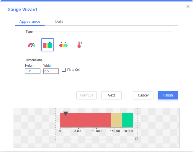
The Appearance tab of the Gauge Wizard. A linear gauge 106 pixels tall and 277 pixels tall is selected.
Click Next to advance to the Data tab.
Data
Use the Data tab to choose the value presented in the gauge, the range of values and the coloring of those values.
Value and Range
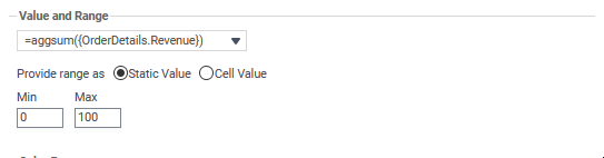
- From the top dropdown, choose a cell with a numeric value that determines the gauge’s indicator position. In the example above, a cell with the formula
=aggsum({OrderDetails.Revenue})that computes the sum of all order revenues is selected. - Specify the range (minimum and maximum) values by choosing one of the Provide range as options. The Min and Max values must be numeric.
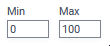
- Static value — specify explicit numeric Min and Max values
- Cell value — choose cells on the report that represent the Min and Max values
Tip
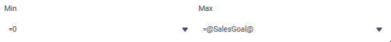
To create a “semi-static” gauge, include a cell on the report with the desired static value preceded with an equals sign. In the example above, the gauge’s minimum value will be 0 and the maximum value will be whatever the value of the
@SalesGoal@parameter is at the time of report execution.
- Static value — specify explicit numeric Min and Max values
Color Ranges
- Choose a Color by method to determine how the color breakpoints will be applied to the gauge’s dial:
- Percentage — breakpoints are calculated as a percentage of the data values with the smallest value at 0% and the largest value at 100%
- Static Value — breakpoints in color happen at explicitly defined values of the data
- Cell Value — breakpoints in color happen at value changes that occur in cells on the report
- Add or Remove color breakpoints, and select the locations of the breakpoints. Breakpoints values must be in ascending numeric order. There are three breakpoints by default.
Note
Thermometers only have one color.
- Click Add to add additional breakpoints to the end of the list. Click Remove to remove the breakpoint at the end of the list.
- Enter a hexadecimal color code into the text field, or click the Color Chooser icon to select a color for each breakpoint.
- Click Add
- Click Finish to close the Gauge Wizard and add the visualization to the report.
 to add additional breakpoints to the end of the list. Click
  Remove to remove the breakpoint at the end of the list.
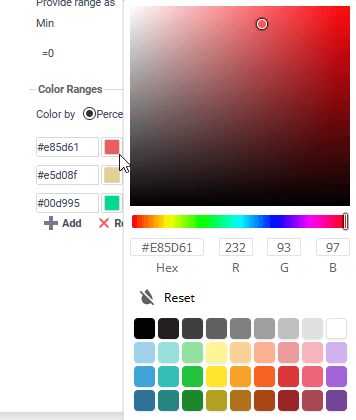
Examples
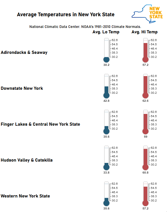
Thermometers indicating the average minimum and maximum average temperature for regions of New York State
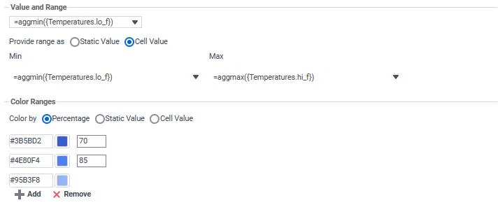
Gauge Wizard dialog settings for the NYS Average Temperatures example
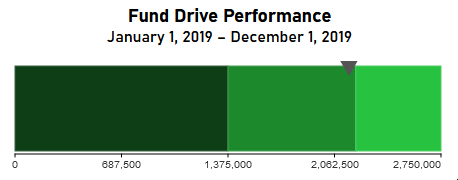
A linear gauge that shows the performance of a fundraising campaign for an organization
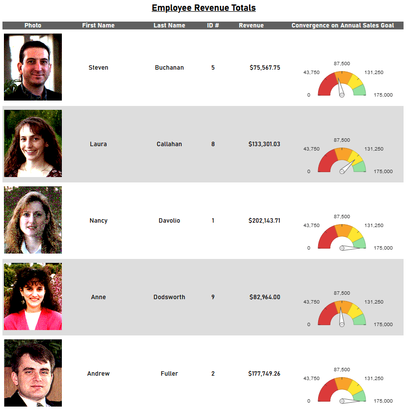
A report with employee revenue totals and an angular gauge that shows how close to their annual goal they came
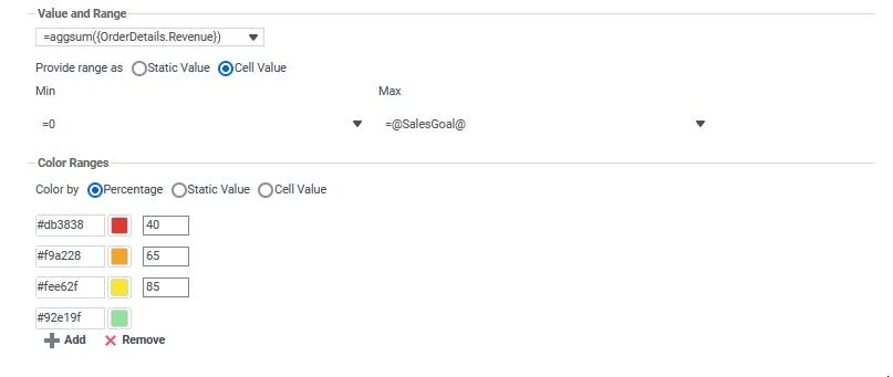
Gauge Wizard dialog settings for the Employee Revenue Totals example
4 out of 5 stars
| 5 Stars | 0% | |
| 4 Stars | 100% | |
| 3 Stars | 0% | |
| 2 Stars | 0% | |
| 1 Stars | 0% |