Create a Custom ExpressView Theme
Caution
This article applies to the ExpressView Designer in versions pre-v2021.1. For building a custom ExpressView theme in v2021.1+, refer to the new Create a Custom ExpressView Theme (v2021.1+) article.
Starting in v2017.1, administrators can provide custom ExpressView themes for their users. Themes are made by using the ExpressView Designer, by editing and supplying custom JSON files from a template, or by using the Exago Theme Maker.
The ExpressView Designer allows you to preview themes as you are making them, but it is more limited than editing the files. You may want to get started with the designer, then make any additional changes directly in the theme files.
Using the ExpressView Designer
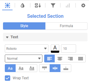
The ExpressView Designer lets you make themes in the same manner as you would style individual ExpressViews. When you select an element to style, the designer will highlight in blue all the sections that will receive the styling. Styling changes are made in the Style section of the right pane or by right-clicking a specific section of the report to be edited.
Right-click styling:
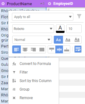
Applicable elements are:
- Each level of Group Header
- Alternating Group Colors (the Radial Menu icon)
- Each subsequent Column Header (or “Detail Header”)
- Each subsequent Detail Section
- Each level of each subsequent Group Footer
- Each subsequent Report Footer
- Alternating Detail Row colors
As of v2018.2, you can use select multiple elements to style at once by holding the Ctrl key and clicking the elements you would like to edit. For example, you can select the detail section of every column and change the font type in one stroke so that each column doesn’t have to be styled individually. Similarly, you can also select and edit all of the headers at one time.
You can also Ctrl select across different sections so that different levels of headers and the detail section can be edited at one time.
Note
Styling edits ranging across multiple sections must be done in the right pane.
To make an ExpressView theme using the designer:
- Create or open an ExpressView for editing.
- Add enough data fields and groupings to have all the elements you want to style.
- Style the ExpressView as normal. See ExpressView: Customizing Appearance.
- When finished, while holding Ctrl + Alt + Shift, click the Save
 icon.
icon. - Enter a name and optionally, a report path to save the theme.
- Click OK.
 icon.
icon.By default, the theme is saved in the Storage Management database.
In legacy versions pre-v2020.1:
The theme is saved in the indicated path in the system reports repository. It is not immediately accessible to the environment; themes can be loaded from the Reports folder once the server picks them up. However, you should move the file (indicated with an .wrtev extension) to the Themes folder instead.
Note
If you are using custom Folder Management, the theme may be immediately saved to Themes storage, depending on your implementation.
Manually Editing Theme JSON Files
You can build ExpressView themes manually by writing JSON to text files with a .wrtev file extension. Instead of building them from scratch, you may want to make themes using the Designer first, then edit the files to add what you want. Or locate the Legacy.wrtev theme, which is blank, then make a copy and use that as a template.
Editing theme files gives you some more options, namely the ability to set border colors and widths for the different elements.
First you will have to familiarize yourself with the JSON format. See Using JSON to get started.
ExpressView Theme JSON
The theme JSON is an object with the following properties:
| Name | Type | Description |
|---|---|---|
| FormatTheme | string | Optional: The name and folder path of the theme. |
| GroupHeaderFormats | array of Formats | Format of group headers, starting with the outermost group, and moving inward. |
| GroupFooterFormats | array of arrays of Formats | Format of group footers for each column, starting with the outermost group and moving inward. Columns from left to right. |
| ColumnHeaderFormats | array of Formats | Format of column headers (detail headers), from left to right column. |
| DetailFormats | array of Formats | Format of detail rows, from left to right column. BackgroundColor is ignored – use Row Shading instead. |
| ReportFooterFormats | array of Formats | Format of report footer, from left to right column. |
| RowShading | array of strings | Alternating hex colors for the detail row backgrounds. |
| GroupColors | array of strings | Alternating hex colors for the radial menu group icons; starting with the innermost group, and moving outward. |
Example
{
  "FormatTheme":         "Example",
  "GroupHeaderFormats":  [ {format}, {format} ],
  "GroupFooterFormats": [[ {format}, {format}, {format} ],
                         [ {format}, {format}, {format} ]],
  "ColumnHeaderFormats": [ {format}, {format}, {format} ],
  "DetailFormats":       [ {format}, {format}, {format} ],
  "ReportFooterFormats": [ {format}, {format}, {format} ],
  "RowShading":          [ "color", "color" ],
  "GroupColors":         [ "color", "color", "color" ]
}
Format objects define the styling for a particular element. They are described below.
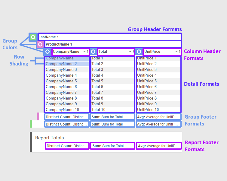
ExpressView element diagram
The following diagram shows how the properties of the theme JSON (see the example above) correspond with the elements of an ExpressView:
Format JSON
| Name | Type | Description |
|---|---|---|
| FontFamily | string | Font name (e.g. “Times New Roman”) |
| FontSize | int | Font size, in px |
| FontColor | string | Hex font color |
| BackgroundColor | string | Hex background color |
| Weight | int | 0: normal; 1: bold; 2: italic; 3: bold & italic |
| Underline | int | 0: none; 1: single; 2: double |
| HorizontalAlign | int | 0: left; 1: center; 2: right; 3: justified |
| VerticalAlign | int | 0: top; 1: center; 2: bottom |
| WrapText | boolean | Whether to wrap long text to a new line, or to cut it off |
| UniformBorder | boolean | Whether all borders are the same style |
| BorderFormatting | BorderFormat | BorderFormat object |
BorderFormat JSON
| Name | Type | Description |
|---|---|---|
| TopColor | string | Hex color of top border |
| TopWeight | int | Width, in px, of top border |
| LeftColor | string | Hex color of left border |
| LeftWeight | int | Width, in px, of left border |
| BottomColor | string | Hex color of bottom border |
| BottomWeight | int | Width, in px, of bottom border |
| RightColor | string | Hex color of right border |
| RightWeight | int | Width, in px, of right border |
Example
{
  "FontFamily": "Calibri",
  "FontSize": 14,
  "FontColor": "#FFFFFF",
  "BackgroundColor": "#4C5D60",
  "Weight": 3,
  "Underline": 0,
  "HorizontalAlign": 0,
  "VerticalAlign": 1,
  "WrapText": true,
  "UniformBorder": false,
  "BorderFormatting": {
    "TopColor": "#ededed",
    "TopWeight": 1,
    "LeftColor": "#ededed",
    "LeftWeight": 0,
    "BottomColor": "#ededed",
    "BottomWeight": 1,
    "RightColor": "#ededed",
    "RightWeight": 0
  }
}
Setting a Default Theme
If you want to make a theme the default for all new ExpressViews in the environment, change the config file setting <expressviewdefaultformattheme> to the name of the theme.