-
Reporting
-
-
- Advanced Options
- Advanced Reports: Categories (pre-2021.1)
- Advanced Reports: Design Grid (pre-2021.1)
- Advanced Reports: Joins
- Advanced Reports: Report Designer (pre-2021.1)
- Advanced Reports: Report Options
- Advanced Reports: Sections (pre-v2021.1)
- Advanced Reports: Sorts
- Advanced Reports: Using the Toolbar (pre-v2021.1)
- Cell Formatting
- Report Wizard
- Report Wizard: Categories
- Report Wizard: Filters
- Report Wizard: Layout
- Report Wizard: Name
- Report Wizard: Options
- Report Wizard: Sorts
- Show all articles ( 7 ) Collapse Articles
- Advanced Reports: CrossTabs
- Advanced Reports: Templates
- Building Your First Report
- Chained Reports
- Conditional Row Suppression
- Dealing with Duplicate Values
- Display Page Numbers
- Filters
- Keyboard Shortcuts
- Linked Reports (Drilldowns)
- Navigating the Application
- No Data Qualified Options
- Report Types
- Report Viewer
- Sorting by Aggregates
- User Preferences and Context Sensitive Help
- Show all articles ( 6 ) Collapse Articles
-
-
- Chart Advanced Features: Area
- Chart Advanced Features: Bar 2D
- Chart Advanced Features: Bar 3D
- Chart Advanced Features: Bubble
- Chart Advanced Features: Column 2D
- Chart Advanced Features: Column 3D
- Chart Advanced Features: Combination 2D
- Chart Advanced Features: Combination 3D
- Chart Advanced Features: Doughnut 2D
- Chart Advanced Features: Doughnut 3D
- Chart Advanced Features: Funnel
- Chart Advanced Features: Heatmap
- Chart Advanced Features: Line
- Chart Advanced Features: Pareto 2D
- Chart Advanced Features: Pareto 3D
- Chart Advanced Features: Pie 2D
- Chart Advanced Features: Pie 3D
- Chart Advanced Features: Pyramid
- Chart Advanced Features: Radar
- Chart Advanced Features: Samples
- Chart Advanced Features: Scatter
- Chart Advanced Features: Spark Column
- Chart Advanced Features: Spark Line
- Chart Advanced Features: Spline
- Chart Advanced Features: Spline Area
- Chart Advanced Features: Stacked Area
- Chart Advanced Features: Stacked Bar 2D
- Chart Advanced Features: Stacked Bar 3D
- Chart Advanced Features: Stacked Column 2D
- Chart Advanced Features: Stacked Column 3D
- Chart Advanced Features: Zoom Line
- Chart Advanced Features: Zoom Scatter
- Show all articles ( 22 ) Collapse Articles
- Bar Charts
- Chart Data Layout Types
- Charts and the Chart Wizard
- Displaying Null Values in Charts
- Gauges
- GeoCharts
- Google Maps
- Heatmap Charts
- Key Performance Indicator (KPI)
- Line Charts
- Pareto Charts
- Pie, Doughnut, Pyramid, and Funnel Charts
- Scatter and Bubble Charts
- Spark Charts
- Tabular Visualizations
- Show all articles ( 5 ) Collapse Articles
-
-
-
- Dashboard Designer (v2019.2+)
- Dashboard Designer: Existing Report Tiles (v2019.2+)
- Dashboard Designer: Filters (v2019.2+)
- Dashboard Designer: Image Tiles (v2019.2+)
- Dashboard Designer: Parameters (v2019.2+)
- Dashboard Designer: Samples (v2019.2+)
- Dashboard Designer: Text Tiles (v2019.2+)
- Dashboard Designer: URL Tiles (v2019.2+)
- Dashboard Designer: Visualization Tiles (v2019.2+)
- Dashboard Viewer (v2019.2+)
- Exporting Dashboards (v2019.2+)
- Show all articles ( 1 ) Collapse Articles
-
-
- ExpressView: Aggregating/Summarizing Data (v2021.1+)
- ExpressView: Exporting (v2021.1+)
- ExpressView: Filtering (v2021.1)
- ExpressView: Formula Columns (v2021.1+)
- ExpressView: Grouping (v2021.1+)
- ExpressView: Introduction (v2021.1+)
- ExpressView: Sorting (v2021.1+)
- ExpressView: Visualizations (v2021.1+)
-
-
- Aggregate Functions
- Arithmetic and Geometric Functions
- Database and Data Type Functions
- Date Functions
- FilterValue and General Format Best Practices
- Financial Functions
- Formatting Functions
- Formula Editor
- Internal Parameters
- JSONExtract Function
- List of Functions
- Logical Functions
- Other Functions
- String Functions
- What are formulas?
- Show all articles ( 5 ) Collapse Articles
-
-
Administrators
-
- Advanced Joins
- Amazon S3 File Storage
- Application Settings
- Automatic Database Discovery
- CData Drivers
- Config File XML & API Setting Reference (General Nodes)
- Config File XML Reference (All Nodes but General)
- Configuring Remote Report Execution Host for Azure App Service Deployments
- Considerations When Sizing an Exago System
- Database Aggregation
- Evaluating Exago - Linux
- Evaluating Exago - Windows
- Exago Installation Manifest
- Execution Caching
- Exploring Exago Technology
- Hidden Flags
- Inline Frame or JavaScript API?
- Installing and Configuring the REST Web Service API
- Installing Optional Features
- Managing the dbconfigs.json File
- Manual Application Installation
- Moving Files Between Storage Management Databases
- Multi-Tenant Environment Integration
- Multiple Data Models
- Report-Level SQL Objects
- Scheduling Reports
- Security Checklist
- Set Up Exago in a Web Farm
- Step 1: Install and Configure
- Step 2: Integrate
- Step 3: Install and Configure the Scheduler Service
- Step 4: Administration Console and API
- Step 5: Extensions
- Storage Management: Custom Implementation
- Storage Management: Database Schema
- Storage Management: Getting Started
- Storage Management: Introduction
- Storage Management: Transitioning from Legacy Storage Methods
- Storage Management: Utility (v2020.1)
- Storage Management: Utility (v2021.1+)
- Table-Valued Functions
- Technical Specifications
- User Identification
- Using SQLite Data Sources
- Vertical Table Support
- Windows Registry Changes
- Show all articles ( 36 ) Collapse Articles
-
- What's New in Version 2021.2
- Performance Enhancements in Version 2019.1
- Support and Maintenance Policy
- Time Zone Calculation Enhancements in v2019.1
- Updating Recommendations
- Updating to the Latest Version (Potentially Breaking Changes)
- What's New in Version 2019.1
- What's New in Version 2019.2
- What's New in Version 2020.1
- What's New in Version 2021.1
-
- Constants and Enumerators
- Executing Reports with the API
- List of REST Endpoints
- REST - Batch
- REST - Config Settings
- REST - Data Joins
- REST - Data Objects
- REST - Data Sources
- REST - Folders
- REST - Functions
- REST - GetExecute
- REST - Getting Started
- REST - Introduction
- REST — Parameters
- REST - Role Security
- REST - SchedulesV2
- REST - Server Events
- REST - Sessions
- REST - Storage Management
- REST Updates
- Using JSON
- Show all articles ( 11 ) Collapse Articles
-
- .NET API Documentation
- .NET API General Reference
- .NET Sample Code
- Constants and Enumerators
- Introduction to the .NET API
- List of .NET API Resources
- Load Reports in the .NET API
- Supply SQL for New Reports in the API
- Using the Administration Console and Exago API
- WebReports.Api
- WebReports.Api.Common
- WebReports.Api.Composite.Chained
- WebReports.Api.Composite.Dashboards
- WebReports.Api.Data
- WebReports.Api.Reports
- WebReports.Api.Roles
- WebReports.Api.Scheduler
- WebReportsDebug.xml
- Show all articles ( 8 ) Collapse Articles
-
- Configuration File Options and Optimizations
- High Availability
- Incremental Loading
- Intro to Performance and Scaling
- Measuring Database Network Latency
- Monitoring Database Schema
- Monitoring Scheduler Load
- Monitoring: Setup
- Monitoring: System Overview
- Special Cartesian Processing
- Tracking Execution Frequency with Monitoring
- Show all articles ( 1 ) Collapse Articles
-
- Adding Custom Items to the Report Tree
- Adding Fonts to Exago
- An Overview of Exago Extensions
- Application Themes
- Assembly Data Sources
- Create a Custom ExpressView Theme
- Create a Custom ExpressView Theme (v2021.1+)
- Custom Context Sensitive Help
- Customizing Getting Started Content
- Displaying User Messages
- Exago Theme Maker
- Excel: Grouping on Separate Worksheets
- Getting Started with Application Themes
- HTML Tag Sanitization
- Multi-Language Support
- Remote Execution
- Report and Folder Storage/Management
- Scheduler Queue
- SessionInfo
- Styling Exago
- Styling the Home Page
- Themes
- Show all articles ( 12 ) Collapse Articles
-
- Global Event: OnAfterLoadReportsList
- Global Event: OnAfterReportExportSuccess
- Global Event: OnConfigLoadEnd
- Global Event: OnConfigLoadStart
- Global Event: OnDataCombined
- Global Event: OnDataFieldsRetrieved
- Global Event: OnExceptionThrown
- Global Event: OnExecuteSqlStatementConstructed
- Global Event: OnExportCsvCell
- Global Event: OnFilterSqlStatementConstructed
- Global Event: OnGetUserPreferences
- Global Event: OnLoadReportParameters
- Global Event: OnOkFiltersDialog
- Global Event: OnOkParametersDialog
- Global Event: OnParameterSqlStatementConstructed
- Global Event: OnRenameFolderEnd
- Global Event: OnRenameFolderStart
- Global Event: OnReportExecuteEnd
- Global Event: OnReportExecuteInit
- Global Event: OnReportExecuteStart
- Global Event: OnReportFailValidation
- Global Event: OnReportSaveStart
- Global Event: OnScheduledReportComplete
- Global Event: OnScheduledReportExecuteStart
- Global Event: OnScheduledReportExecuteSuccess
- Global Event: OnSetUserPreferences
- Global Event: OnWebServiceExecuteEnd
- Introduction to Server Events
- List of Server Events
- Show all articles ( 19 ) Collapse Articles
-
-
How To
-
- .NET and REST APIs
- Batch REST API
- Custom Aggregate Functions
- Custom Columns and CrossTabs
- Custom Dialogs
- Custom Filter Functions
- Custom Functions
- Custom Interactivity via HTML & Action Events
- Customizing Color Picker
- Dashboard Updates in v2021.1
- Data Formatting
- Date Check Custom Functions
- Dynamic Rank Custom Function
- Filters
- Folder Management
- High Availability
- JavaScript API
- JavaScript API Filters
- Joins for Admins
- Linux Installation
- Multi-Tenanting
- Multiple Data Models, Cloned Data Objects & Vertical Tables
- Parameters
- REST Web Service API Setup & Security
- Roles
- Scheduler Configuration
- Security Settings
- Server Events
- Share by Link
- Storage Management Customization
- Storage Management Migration
- Storage Management Overview
- Storage Management Permissioning
- Stored Procedures
- Time Zone Handling
- Troubleshooting for Admins
- Upgrading
- v2018.2 User Preferences
- v2019.1 Configuration Changes
- v2019.1 Small Enhancements
- Visual Integration and Localization
- Show all articles ( 31 ) Collapse Articles
-
- User Support Lab - 3D Charts
- User Support Lab - Advanced Grouping
- User Support Lab - Chained Reports
- User Support Lab - Chart Data Layouts
- User Support Lab - Complete Report Design
- User Support Lab - Conditional Formatting
- User Support Lab - Crosstab Reports
- User Support Lab - Dashboards v2019.2
- User Support Lab - ExpressView
- User Support Lab - Filter by Formula
- User Support Lab - Filters
- User Support Lab - Formatting Tips and Tricks
- User Support Lab - Formulas
- User Support Lab - Formulas in ExpressView
- User Support Lab - Interactive Reports
- User Support Lab - Joins for Report Writers
- User Support Lab - Key Performance Indicators (KPIs)
- User Support Lab - Linked Reports a.k.a Drilldowns
- User Support Lab - Mapping
- User Support Lab - Multi-Series Charts
- User Support Lab - New Features v2018.2
- User Support Lab - No Data Qualified
- User Support Lab - Repeating Data
- User Support Lab - Report Scheduler
- User Support Lab - Report/SQL Relationship
- User Support Lab - Templates
- User Support Lab - Themes
- User Support Lab - Train the Trainer
- User Support Lab - Train the Trainer Advanced Reports
- User Support Lab - Train the Trainer ExpressView
- User Support Lab - Using ExpressView as a Data Discovery and Troubleshooting Tool
- Show all articles ( 21 ) Collapse Articles
-
- Adding a SQL Datasource
- Configuring a Stored Procedure Pt 1
- Configuring a Stored Procedure Pt 2
- Configuring a Table or View Pt 1
- Configuring a Table or View Pt 2
- Configuring IIS
- Configuring the REST Web Service [Linux]
- Configuring the REST Web Service [Windows]
- Configuring the Scheduler [Linux]
- Configuring the Scheduler [Windows]
- Installing Exago on Linux [Apache]
- Installing Exago on Linux [NGINX]
- Installing Exago on Windows
- Installing REST [Linux]
- Installing REST [Windows]
- Installing the Scheduler [Linux]
- Installing the Scheduler [Windows]
- Integration Example
- Introduction to Technical Training Series
- Programmable Object Settings
- Roles
- Storage Management Permissioning and Setup
- Show all articles ( 12 ) Collapse Articles
-
- Basic Training 01. Introduction
- Basic Training 02. ExpressView
- Basic Training 03. Advanced Reports
- Basic Training 04. Sections
- Basic Training 05. Formatting
- Basic Training 06. Formulas
- Basic Training 07. CrossTab Reports
- Basic Training 08. Charts
- Basic Training 09. Filters
- Basic Training 10. Conditional Formatting
- Basic Training 11. Dashboards
- Basic Training 11a. Dashboard Visualizations
- Basic Training 12. Practice Exercises
- Show all articles ( 3 ) Collapse Articles
-
-
Resources
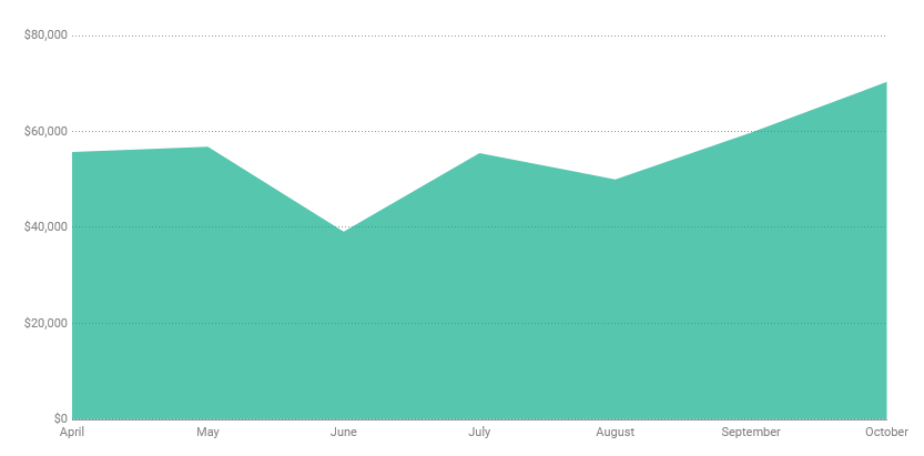
Chart Advanced Features: Samples
Area Charts
Add a Bordering Line
An area chart displays its data by shading in the area below the curve. A border can be applied to this plot, and by selectively choosing the edges the border is applied a line appears.
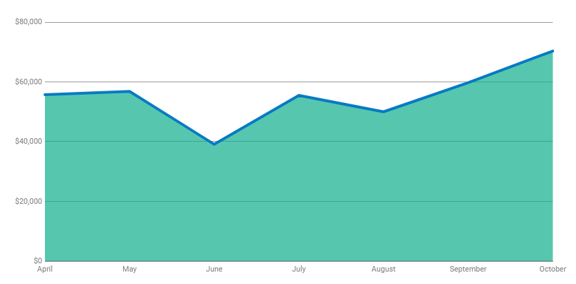
| Advanced Feature Name | Value |
|---|---|
| showPlotBorder | 1 |
| plotBorderColor | provide a hexadecimal HTML color code, or omit to use the first default chart color |
| plotBorderThickness | 4 |
| drawFullAreaBorder | 0 |
| divLineDashed | 0 |
Bar and Column Charts
Display a Background Image
This example utilizes a few advanced features to provide a partially transparent background image, and an additional feature to narrow the width of the columns.
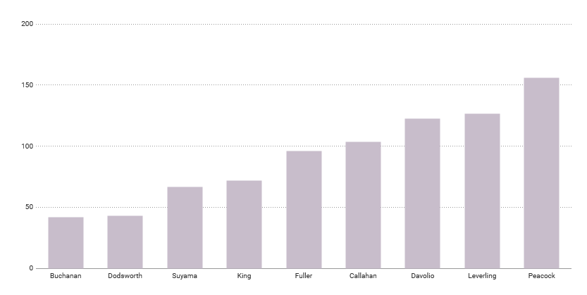
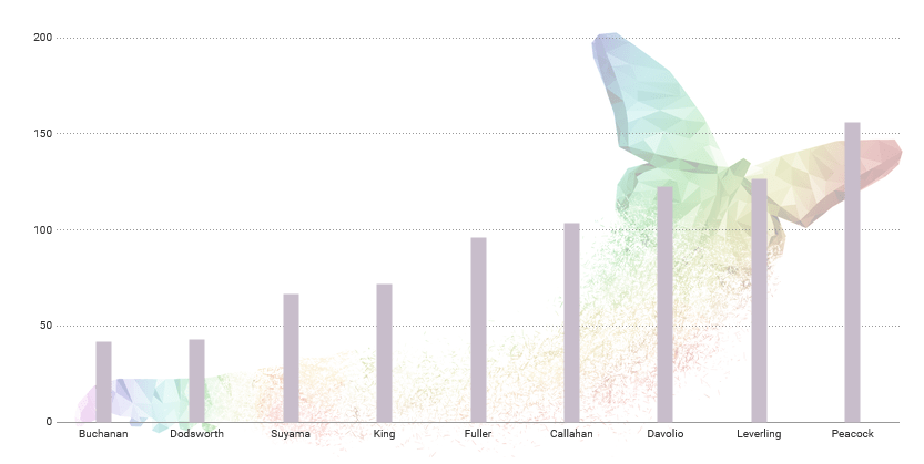
| Advanced Feature Name | Value |
|---|---|
| bgImage | A URL in the same domain as Exago that points to the background image e.g. http://192.168.168.129/butterfly.jpg |
| bgImageAlpha | 40 |
| imageHAlign | middle |
| bgImageDisplayMode | stretch |
| maxColWidth | 14 |
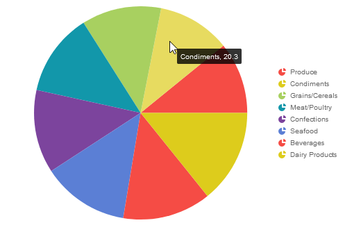
Pie Charts
Show Values in Tooltips
By default, the tooltip on a pie chart shows the percentage of the series. With the showPercentInToolTip advanced feature, the underlying value can be displayed instead.

| Advanced Feature Name | Value |
|---|---|
| showPercentInToolTip | 0 |
Radar Charts v2021.1+
Outline Instead of Filled Data Plot
To show an outline instead of a filled in area representing the data, use a combination of four advanced features.
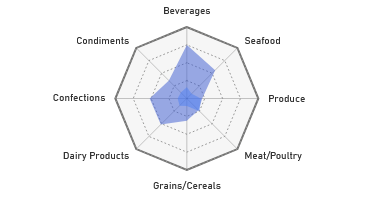
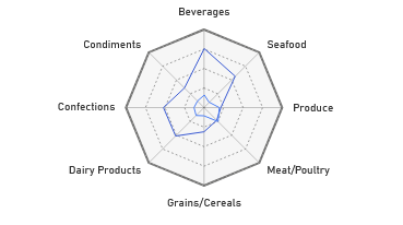
Note
The Theme setting in the Chart Wizard will not apply when utilizing these features.
paletteColorscan be used to change the colors of the series instead.
| Advanced Feature Name | Value |
|---|---|
| plotFillAlpha | 0 |
| plotBorderAlpha | 100 |
| showPlotBorder | 1 |
| palletteColors | #3B5BD2,#4E80F4 optional — a comma separated list of hexadecimal HTML color codes |
Spark Line Charts
Remove Anchors and Values
A background color is also applied to this spark chart through its Other Features.

| Advanced Feature Name | Value |
|---|---|
| shopOpenAnchor | 0 |
| showCloseAnchor | 0 |
| showHighAnchor | 0 |
| showLowAnchor | 0 |
| showOpenValue | 0 |
| showCloseValue | 0 |
| showHighLowValue | 0 |
| lineThickness | 3 |
0 out of 5 stars
| 5 Stars | 0% | |
| 4 Stars | 0% | |
| 3 Stars | 0% | |
| 2 Stars | 0% | |
| 1 Stars | 0% |