Building Your First Report
In versions v2021.1+:
There are two report types well suited for building your first report: ExpressView and Advanced Reports.
ExpressView is a tool to quickly get insight into vertically expanding data records and groups. An ExpressView can optionally include a visualization.
Advanced Reports are the flagship report type of the application. Advanced Reports are made using an spreadsheet-like cell-grid interface. The most powerful reporting tools are available with Advanced Reports, including geographic maps; CrossTabs; repeating groups; complex join, filter, and sort logic; drilldowns to linked child reports, and more.
Review Report Types to learn more.
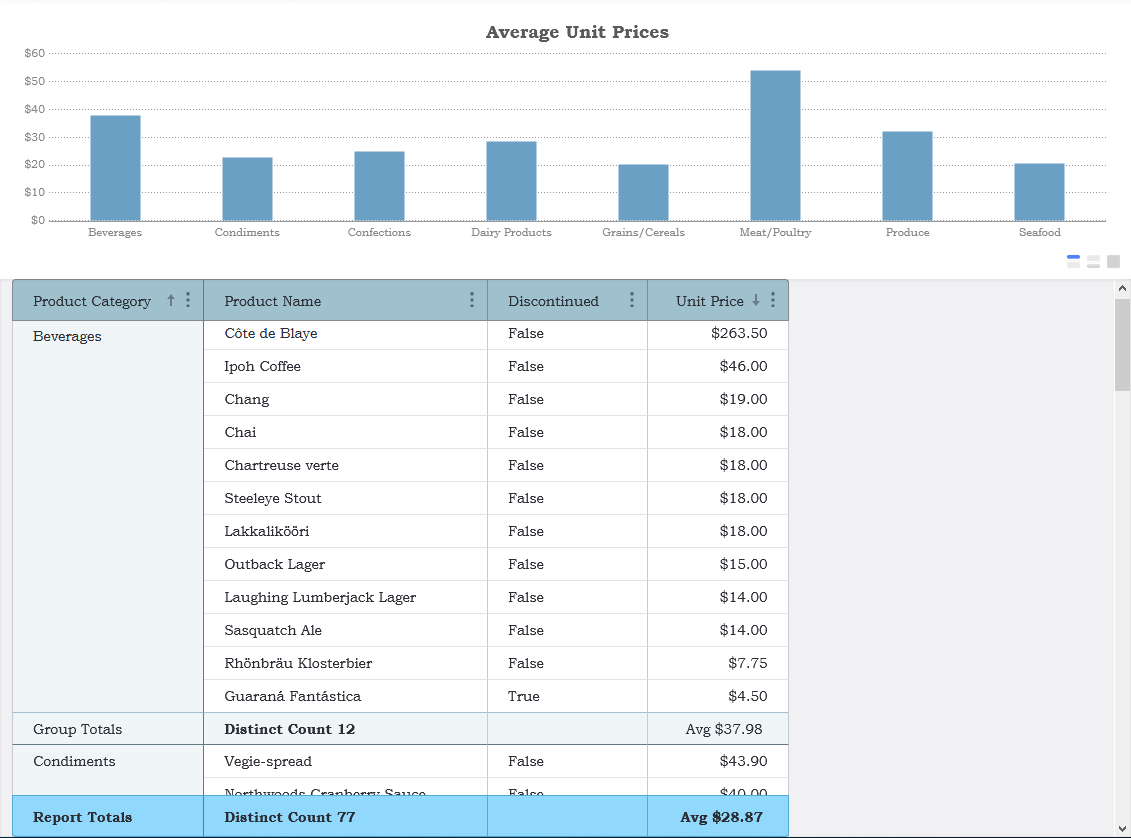
The examples below utilize the Northwind sample data set.
Creating an ExpressView
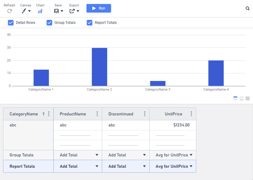
This section will walk-through creating an ExpressView report listing the unit prices of products organized into categories. A column chart comparing the average price on a per-category basis is also included. The report looks like this:
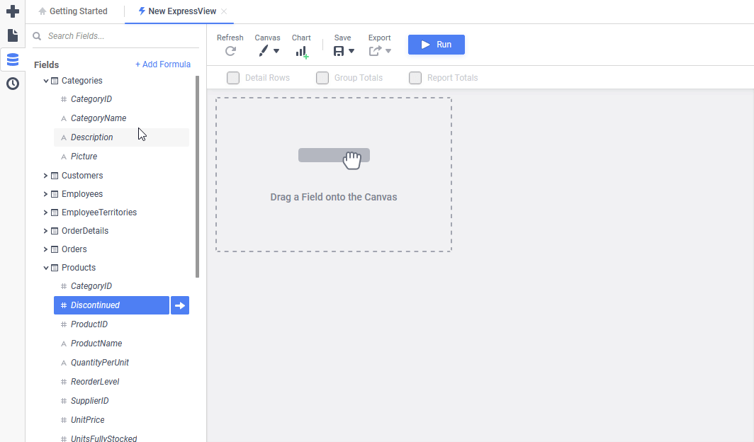
- On the main menu in the top-left corner, click the Create New Report
 icon.
icon. - Click ExpressView to start the ExpressView Designer.
- Add the necessary data fields to the canvas, by dragging them from the Data Fields Pane on the left side of the screen and dropping them into desired position on the canvas:
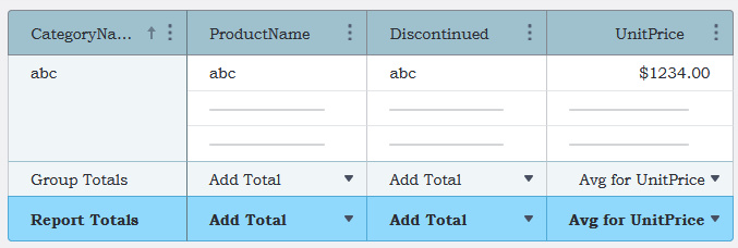
Categories.CategoryNameProducts.ProductNameProducts.DiscontinuedProducts.UnitPrice
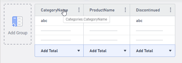
- To organize the report by the product category, set
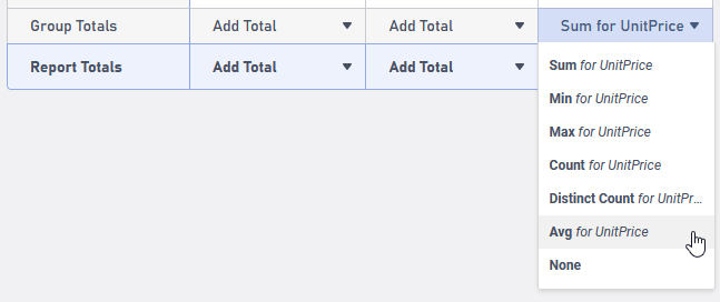
Categories.CategoryNameas a Group. Click-and-drag on theCategoryNameheader and drop it to the Add Group drop zone. - To calculate the average unit price for each category, on the Group Totals line, click on the Sum for UnitPrice dropdown and change to Avg for UnitPrice.
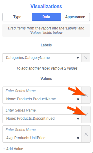
- Add a chart to the report, by clicking the Chart icon on the toolbar. Then, in the Properties Pane on the right, choose the Visualizations tab, and then Data.
- Since columns that are not totaled don’t appear in charts, remove the Values for
Products.ProductNameandProducts.Discontinuedby clicking the X icon in each element. The chart will appear. - Switch to the Type tab, then click the Column icon to change the chart to a column chart.
 icon.
icon. to start the ExpressView Designer.
 Data Fields Pane on the left side of the screen and dropping them into desired position on the canvas:
 icon on the toolbar. Then, in the Properties Pane on the right, choose the Visualizations tab, and then Data.
 icon to change the chart to a column chart.
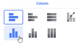
At this point, the ExpressView very closely matches the same report at the beginning of this article. It should look something like the figure below.
Continue on to apply formatting such as color schemes, fonts and column names:
- To style the groups and detail fields, click the Canvas icon in the toolbar.
- Choose a color Theme from the dropdown. The Office Park theme is used in the example report. The color theme will immediately change on the canvas.
- Choose a Font from the dropdown. Bookman Old Style is used in the example report.
- Click the Canvas icon again to close the menu.
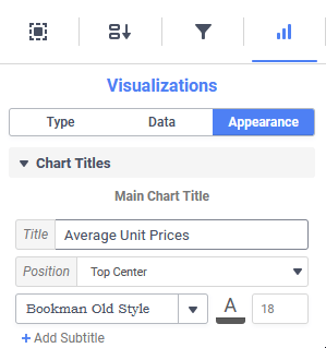
- In the Properties Pane on the right, choose the Visualizations tab, then Appearance, then Chart Titles.
- Enter a Main Chart Title, and choose a font.
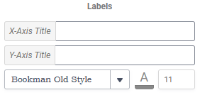
- In the Labels section, choose a font to match the others. Optionally, add an X-Axis Title and Y-Axis Title.
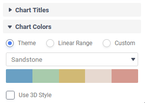
- Change to the Chart Colors section, then choose a color theme from the dropdown. The example report uses the Sandstone theme.
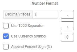
- Change to the Chart Data section, scroll down to Number Format. This section formats how the values in the chart axes appear. Since they are average dollar values, set these controls as follows:
- Enter 2 for Decimal Places
- Check the Use Currency Symbol checkbox
- Each column can be given a custom name, font style and alignment. Click on a column header (e.g.
CategoryName) and then in the Selected Section tab of the Properties Pane, enter a Display Name, Horizontal Align choice, Font Style and Underline as desired. Repeat for the ProductName,DiscontinuedandUnitPricecolumns.
Note
The Horizontal Align property will apply to the column header and the data in the column. The Display Name, Font Style and Underline only apply to the column header.
- The data in the columns, and the totals can also be styled. Click on the white area of the Unit Price column between the header and the total. In the Selection Section tab of the Properties Pane, choose a Data Format (Number should already be selected). Repeat this step for the Group Totals, which will also apply the settings to the Report Totals line.
- Save the report by clicking the Save icon in the toolbar. Enter a Name, an optional Description and select a folder to save it to. The My Reports folder is a good choice for a first report.
- Click on the toolbar to switch to Live Data mode and see the new ExpressView in all its glory. Congratulations!

 icon in the toolbar.
 Selected Section tab of the Properties Pane, enter a Display Name, Horizontal Align choice, Font Style and Underline as desired. Repeat for the
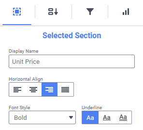

 on the toolbar to switch to Live Data mode and see the new ExpressView in all its glory. Congratulations!
Additional Resources
Creating an Advanced Report
Tip
A quick way of getting an Advanced Report up and running is to start with an ExpressView, then export that ExpressView as an Advanced Report. Editing can then resume in the Advanced Report Designer.
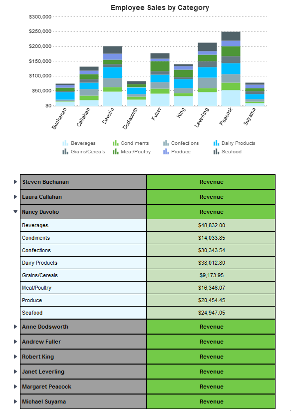
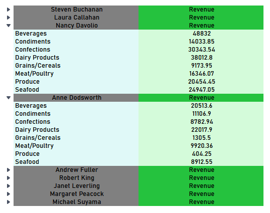
This section will walk-through creating an Advanced Report from scratch with the Advanced Report Designer. The sample report lists the amount of revenue generated by each salesperson in a company, including the amount of revenue of each product category in a collapsible section. A multi-series column chart appears at the beginning of the report. The sample report looks like this:
To jump through the steps of this tutorial, click one of the following links or start from step 1 below.
- Setup the Report’s Layout (steps 1–8)
- Add Data and Content to the Report (steps 9–12)
- Apply Formatting to the Cells and Data (steps 13–16)
- Add the Chart (steps 17–20)
- On the main menu in the top-left corner, click the Create New Report icon.
- Click Advanced Report to start the Advanced Report Designer.
- The Add Data Objects dialog appears. These data objects are needed for this report:
CategoriesProductsEmployeesOrdersOrderDetails
Not all of these data objects appear on the report, but they provide a join path between the objects that do.
Click Okay. - The report will group and aggregate (summarize) data by the employee name, and by the product category name. Sorts are required to create groups. To create sorts:
- Click the Sorts icon on the toolbar to open the Report Sorts dialog.
- From the dropdown on the left, choose
Employees, then double click theLastNamefield. This will addEmployees.LastNameas a sort. - Repeat step 2 to add
Categories.CategoryNameas a second sort. - Click Okay to close the Report Sorts dialog.
- Click the Sorts
- This report will show two columns: one with the employee’s name and category names, the other withe actual revenue values. The other columns can be removed from the grid
- Hold the Ctrl key on the keyboard and click the column headers for columns E, D and C.
- Click the Column Menu icon to open the Column Menu.
- Click Delete 3 Columns.
- The Page Header section is also not needed for this example report. Click the Section Menu icon on the Page Header, then click Delete Section. The design grid should now look like this:
- The chart will reside in the Report Header section. To add it:
- Click the Add Section button
- Click Report Header.
- Click the
- Add the Group Header sections for the Employee Name and Category Name:
- Click the Add Section button
- Click Group Header.
- In the Group Header dialog, select
Employees.LastNamefrom the dropdown list. - Click Okay to close the Group Header dialog.
- Repeat steps 1–3 for
Categories.CategoryName.
The design grid should now look like this:
- Click the
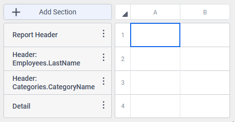
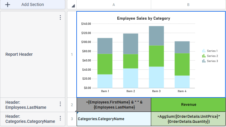
- Add the data to the cells on the design grid:
- Add
Categories.CategoryNamedirectly from the Data Objects Pane by dragging it to cell A3 on the grid. - Type the word Revenue into cell B2.
- Add
- Since the employee’s first and last names are contained in two different fields, a formula can be used to concatenate or join the fields together. Here is how:
- Select cell A2 by clicking it.
- Place the cursor into the Formula Bar just below the toolbar.
- Type an equals sign =.
- Begin typing
Employees. A tooltip will appear with all of the fields that contain the wordEmployeesas guidance. Use the mouse or arrow keys to highlightEmployees.FirstNamethen press Enter. The entire data field name will be added to the formula bar. Notice it is enclosed in{curly braces}. Data fields must always be enclosed in curly braces in formulas. - Type &. This is called the concatenation character and tells the system to join two things together.
- Type ” “. This will add a space between the first and last names.
- Type another &.
- Type
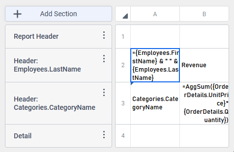
Employeesagain, this time highlightingEmployees.LastName, then press Enter. The complete formula should look like this:={Employees.FirstName} & " " & {Employees.LastName}
- Use another formula to calculate the revenue for each category:
- Select cell B3 by clicking it.
- Place the cursor into the Formula Bar just below the toolbar.
- Enter the formula exactly as it appears below:
=AggSum({OrderDetails.UnitPrice}*{OrderDetails.Quantity})This formula uses an aggregate function to calculate sum of the revenues of all sales, by multiplying the quantity of each product sold by its unit price, then adding them all together. The breaking down of revenues into product categories, and for each employee happens automatically since the aggregate function is contained in the group sections created earlier.The design grid should now look something like this:
- Now is a good time to save the report. Click the Save icon on the toolbar. Enter a Name, an optional Description and select a folder to save it to. The My Reports folder is a good choice for a first report.
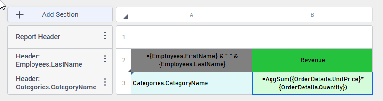
- Apply the color formatting to the cells to match the example report.
- Select cell A2, then click the Background Color icon on the toolbar. Select a medium gray color. Click the Bold icon to increase the font’s weight.
- Repeat step 1 for cell B2, choosing a medium green color. Click the Horizontal Alignment icon, then choose Center .
- Select cell A3, apply a light blue background color. Select cell B3 and apply a light green background color. Set cell B3 for a center alignment as well.
- Select both columns A and B, then place the cursor between the columns and drag to resize both of them.
- To make the categories list collapsible, click the header for row number 2 to open the Row Menu. Click Collapse Rows.
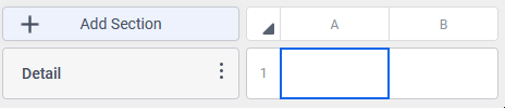
- Delete the Detail section from the report, it won’t be needed.
- Select cell A2, then click the Background Color
- The design grid should now look like this:
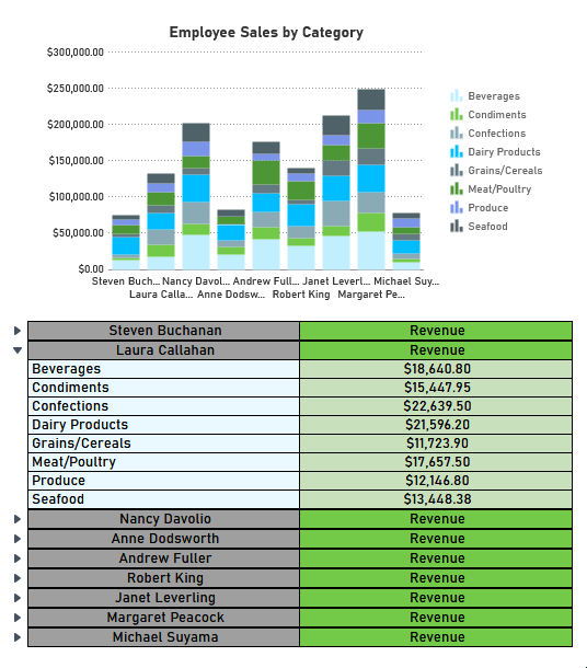
Click on the toolbar to execute the report to see the progress so far. In the Report Viewer, the report should look like this:
Click on the Open Rows icons to open or close the collapsed rows to see the revenue figures. - Close the Report Viewer tab and return to the Report Designer.
- Apply borders and advanced numeric formatting to the data. These changes don’t appear on the Design Grid, but they affect how the data is presented in the Report Viewer and when exported to output files such as PDF or Excel.
- Select cell A2, then click the Format Cells icon. When the Format Cells dialog opens, switch to the Border tab.
- Check the Make Borders Uniform checkbox. Click the Color Chooser icon, then choose black.
- Click Okay to close the dialog.
- Select cell B2, then click the Format Cells icon. Apply a top, right and bottom border with color black by setting the individual border settings.
- Repeat step 4 for:
- cell A3 — apply a left, bottom and right border
- cell B3 — apply a bottom and right border
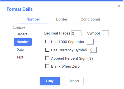
- With cell B3 still selected, and the Format Cells dialog still open, switch to the Number tab to apply advanced numeric formatting to the revenue values contained within it:
- Under Category, select Number.
- Ensure Decimal Places is set to 2.
- Check the Use 1000 Separator and Use Currency Symbol.
- Click Okay to close the dialog.
- Select cell A2, then click the Format Cells
- Run the report again to observe the changes that the formatting options have made to the report output. When satisfied, close the Viewer tab and return to the Designer.
- Hold the Ctrl key on the keyboard and click cells A1 and B1 to select both cells. Click the Merge Cells icon on the toolbar to combine the cells together.
- Place the cursor between the headers for rows 1 and 2, then drag the mouse down to increase row 1’s height.
- Select the new single cell on row 1, then add the chart:
- Click the Insert icon on the toolbar, then select Chart to start the Chart Wizard.
- On the Type tab, select the Stack Column chart type. Then, click Next to advance to the Data tab.
- Click the Data Layout… button. Since all of the revenues that appear on the chart are in a single column but different rows, click Row Based Chart then click Okay to return to the Chart Wizard.
- Under Data for Chart, make the following choices, then click Next to advance to the Appearance tab.
- Data Values — choose the formula
=AggSum({OrderDetails.UnitPrice}*{OrderDetails.Quantity}). This setting determines the size of the colored segments in each column. - Data Labels — choose the formula
={Employees.FirstName} - Series Labels — choose the cell value
Categories.CategoryName. This setting determines the labeling of each of the Data Values.
- Data Values — choose the formula
- Under Colors, choose Blue Grey as the Theme.
- Under Labels, enter Employee Sales by Category for the Chart Title.
- Click Finish to close the Chart Wizard.
- Click the Insert
- Save the report with the chart.
- The report design should now look like this:
Run the report to see the completed report design in the Report Viewer. Congratulations!
 to start the Advanced Report Designer.
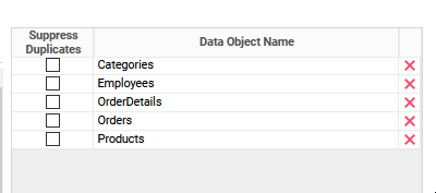
 icon on the toolbar to open the Report Sorts dialog.
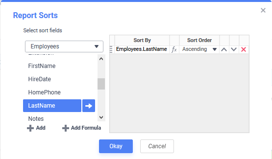
 icon to open the Column Menu.
 Delete 3 Columns.
 Report Header.
 Group Header.
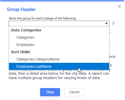
 Formula Bar just below the toolbar.
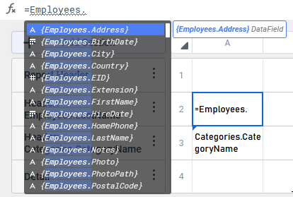
 icon on the toolbar. Select a medium gray color. Click the Bold
  icon to increase the font’s weight.
 .
.
 icons to open or close the collapsed rows to see the revenue figures.
 icon. When the Format Cells dialog opens, switch to the Border tab.
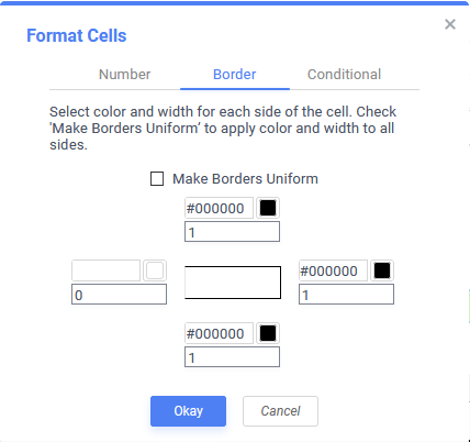
 icon on the toolbar to combine the cells together.
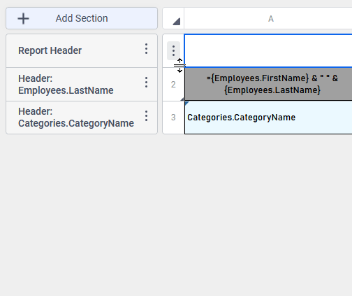

 Chart to start the Chart Wizard.
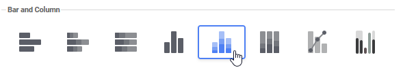
 Data Layout… button. Since all of the revenues that appear on the chart are in a single column but different rows, click Row Based Chart then click Okay to return to the Chart Wizard.
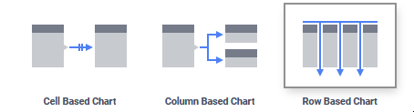
Additional Resources
In versions pre-v2021.1:
This section will walk users through the New Report Wizard and demonstrate how to create a new report from start to finish.
- In the main menu, click the Create New Report icon.
- There are several types of reports, the most common being an Advanced Report.
Note
This article will focus on building an Advanced Report. For information on the other types of reports, see the article on Report Types.
The Report Wizard will open. The Report Wizard has five tabs: Name, Categories, Sorts, Filters and Layout. The Name and Categories tabs must be completed while the other tabs are optional.
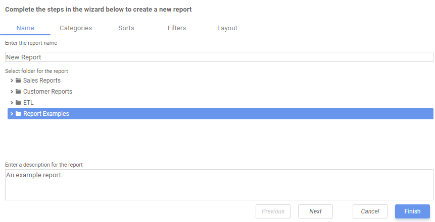
Name Tab
In the Name tab, enter a report name and click on the folder where the report will be saved.
The report name can be up to 255 characters long. The following special characters may not be used: ? : / * “ < >
The report’s description appears at the bottom of the Main Menu when it is selected. The description text may also be used to search for a report.
Note
You cannot create a report inside a folder that is read-only (
 ).
).
Categories Tab
In the Categories Tab, select the Data Categories that you would like to have access to on the report. It is important to understand two terms: Data Category and Data Field.
Data Category – A Data Category is a data object that has several attributes. For example, Students is a category; each student has an ID, a major, an advisor, etc.
Data Field – A Data Field is a single attribute within a category. For example, Students.ID is the numeric value that identifies a specific student.
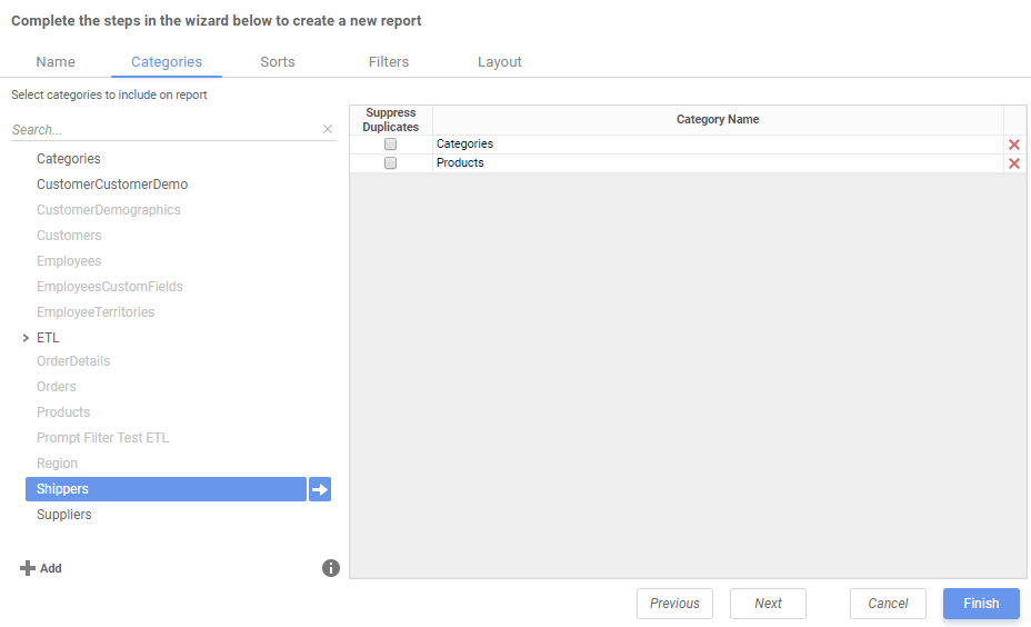
- To add a Data Category, either drag and drop it to the Category Name column, use the Add button, or double-click the category.
 Add button, or double-click the category.
Note
When one Data Category is added, other Data Categories that are not joined to it become unavailable by default.
- To search for a specific Data Category or folder, type its name into the Search box.
- To see what Data Fields are in a Data Category, click on a Data Category and then click the information button.
- Check the Suppress Duplicates box to suppress any repeated records from that category.
- To remove a Data Category, click the delete button.
 button.
 button.
For this report, we’ve selected Categories and Products.
Note
For each category selected, a user can Suppress Duplicates within the data by ticking the check box that appears next to the category name. This will suppress repeated items in the given category for the final report.
Sorts Tab
In the Sorts tab, specify which Data Fields will be used to determine the order of data on the report.
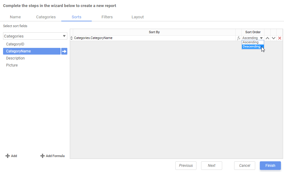
- To sort by a Data Field either drag and drop it to the Sort By Column, use the Add button, or double-click the field.
- You can sort each Data Field in Ascending (A-Z, 0-9) or Descending (Z-A, 9-0) order.
- Use the Move Item Up and Move Item Down icons to indicate the sort priority.
- To remove a sort, click the Delete icon.
 and Move Item Down
  icons to indicate the sort priority.
For this report we have sorted on Categories.CategoryName in descending order.
Note
Sorts are not mandatory in order to create a report. Sorts allow for more complex organization of a report but do not bar the report wizard from continuing if left blank.
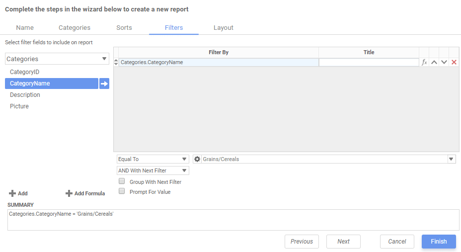
Filters Tab
In the Filters tab, create statements that will be used to filter the data when you run a report.
There is no limit to the number of filters that can be defined. Filters can be numeric (up to eight decimal places) or alphanumeric.
- To filter a Data Field, either drag and drop it to the ‘Filter By’ column, use the button or double-click it.
- Use the Move Item Up and Move Item Down icons to indicate the filter priority.
- To remove a filter, click the Delete icon.
- Set the operator (equal to, less than, one of, etc…) by selecting it from the Operator dropdown.
- Set the filter value by either entering it manually or selecting a value from the dropdown. If the Data Field is a date, the calendar and function buttons can be used to select a value.
- Choose AND With Next Filter to require that the selected filter and the one below it both evaluate to true. Choose OR With Next Filter to require that either or both be true.
- Check Group With Next Filter to group the filters. Filters can be nested indefinitely by using the following keyboard shortcuts while a filter is selected:
- Ctrl + [ adds an open-parenthesis before the selected filter.
- Ctrl + ] adds a close-parenthesis after the selected filter.
- Ctrl + Shift + [ removes an open-parenthesis from before the selected filter.
- Ctrl + Shift + ] removes a close-parenthesis from after the selected filter.
- Check Prompt for Value to prompt the user for a new filter value at the time the report is executed.
For this report, an Equal To filter on Category Name has been created in order to limit the data on the final report.
Note
Like Sorts, Filters add complexity to a report but, but their completion is not mandatory.
Important
If a filter is chosen, the above fields must be completed or the report will not execute.
Layout Tab
In the Layout tab, select the Data Fields that will appear on the report. For each Data Field chosen, the report will automatically create a column header and place the Data Field in the detail section. Additionally, subtotals, grand totals, and a page header/footer can be created.
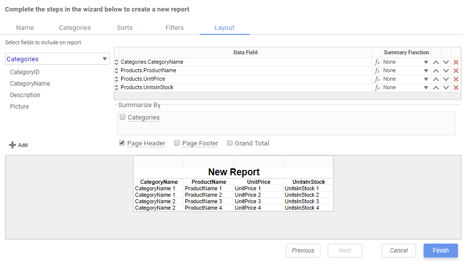
Display Data
- To place a Data Field on the report, either drag and drop it to the Data Field column, use the Add button, or double-click the field.
- Use the Move Item Up and Move Item Down arrows to indicate the order the Data Fields should appear on the report. The Data Field at the top will appear on the report as the left-most column.
- The Summary Function column is used to make subtotals and grand totals.
- To remove a Data Field, click the Delete icon.
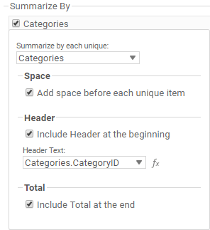
Using the Summarize By box, you can display subtotals, grand totals, or headers for the values of a Data Field.
Subtotals and Grand Totals
- To display subtotals, check the box of the category you want subtotals for in the Summarize By box. Then, for each Data Field you want totaled, select a Summary Function (see below).
- To display grand totals, check the Grand Total box. Then for each Data Field you want totaled, select a Summary Function (see below).
Summary Functions
- Sum: Totals the all of the data in the Data Field.
- Count: Returns the number of rows in the Data Field.
- Average: Takes the mean of the data in the Data Field.
- Minimum: Displays the lowest value in the Data Field.
- Maximum: Displays the highest value in the Data Field.
Data Headers
A checkbox will appear in the Summarize By box for each Data Category in the Sorts tab. To display a header for each value of a Data Field, click on the associated Data Category in the Summarize By box. Click the Data Category name next to the checkbox, and the will appear.
- To include a Header, check the Include Header at the beginning checkbox. In order to select the text that will appear as the header value, use the Header dropdown to select a Data Field or use the Formula Editor icon to create a formula.
- Use the Summarize by each unique dropdown to specify if the header should repeat based on a specific field or fields within a Category.
- Check the Include Total at the end checkbox to have a subtotal created for this Category.
 icon to create a formula.
For this report, the Data Fields Products.ProductName, Products.ProductID, Products.UnitPrice, and Products.QuantityPerUnit have been selected.
- To see the report in the Report Designer, click Finish.
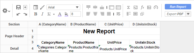
The Report Designer will display the report like this.
Note
For information on the Toolbar and all its features, see the Using the Toolbar article
To add the next layer of intricacy to your articles you’ll want to create grouping within the present data. To read more, continue to Grouping Basics.