Advanced Reports: Design Grid (v2021.1+)
The Design Grid is main interaction point of the Advanced Report Designer. Use the Design Grid to:
- Define the layout of the report by adding, altering and deleting rows, columns, and sections to it.
- Define the content of the report by entering data fields, text, labels, formulas, images, charts, CrossTabs and maps to it.
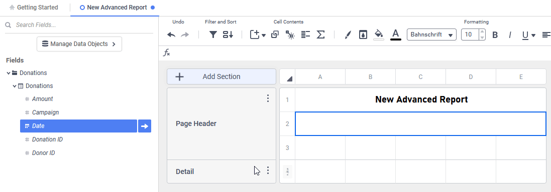
Anatomy of the Design Grid
The Design Grid has six principal components:
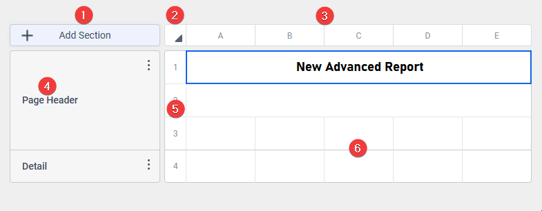
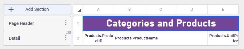
The anatomy of the Advanced Report Designer Design Grid
 Add Section button — click this button to add a new section to the grid
- Select All Cells button — click this button to select all of the cells in the grid
- Column Headers — labelled alphabetically beginning with A from left to right. Click the header to open a menu for working with columns. These headers are referenced only in the Designer, and do not appear on the report output.
- Section Header — displays the name and type of the section. Click the header to open a menu for working with sections. These headers are referenced only in the Designer, and do not appear on the report output.
- Row Header — labelled numerically beginning with 1 from top to bottom. Click the header to open a menu for working with rows. These headers are referenced only in the Designer, and do not appear on the report output.
- Cells — contain the report’s contents
 Add Section button — click this button to add a new
  Select All Cells button — click this button to select all of the
 Sections
The sections of an Advanced Report define its appearance and pattern. Specifically, sections determine how frequently cell contents are repeated. For example, a report may have a Page Header, a Report Footer and Detail section to display data.
To resize the Section Headers, hover the mouse on the right edge of the Section Header. The cursor will change to the resizing cursor. Click and drag the mouse in the desired direction, to either expand or shrink the header.
Learn more about working with sections in the Advanced Reports: Sections article.
Columns
Columns expand horizontally across the report. Typically, each parcel of information to be included in the report is included in its own column. Columns may also be used for padding cells or creating hierarchical indentations in the report’s layout. There is no practical limit to the number of columns a single report may have.
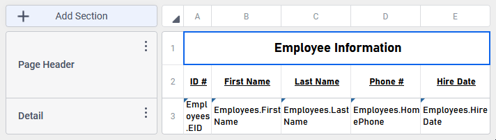
A very simple report design with five columns, labeled A–E, one for each identifiable employee property to include in the report.
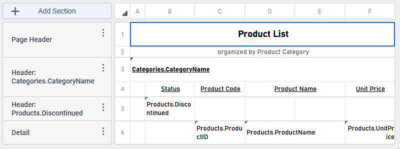
Slightly more complex report design, note columns A and B don’t contain content in the Detail section, instead they create padding for the Detail information and establish a hierarchy of the group headers over the Detail
Working with Columns
- Selecting Columns
- To select a continuous group of columns, hold the Shift key and then click the starting and ending columns.
- To select non-continuous groups of columns, hold the Ctrl key (Command key on Mac) then click the desired columns.
- Resizing Columns
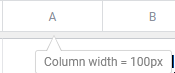
- A column can be resized by dragging its right edge horizontally, just as Section Headers can be.
- Use the Column Width… or Set Widths Identical options on the Column Menu described below
- Hover the mouse over the column header to see it’s current size
Once one or more columns are selected, hover the mouse over a column header, then click the Column Menu  icon, or right-click on a column header to open the Column Menu.
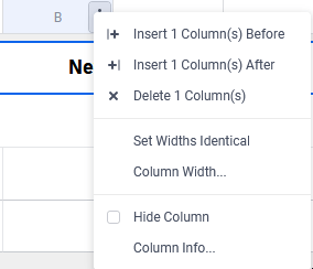
The Design Grid Column Menu
- Insert x Column(s) Before — insert the selected number of columns before (to the left of) this column (e.g. if three columns are selected, this menu item is Insert 3 Column(s) Before)
- Insert x Column(s) After — insert the selected number of columns after (to the right of) this column (e.g. if three columns are selected, this menu item is Insert 3 Column(s) After)
- Delete x Column(s) — delete the selected columns
- Set Widths Identical — set the widths of the selected columns to the width of the column that was selected last
- Column Width… — open the Column Width dialog, where an absolute value, in pixels may be set for the column’s width
- Hide Column — when checked, the selected columns (and their contents) will be hidden from the report output. Hidden columns can be unhidden in the Report Viewer.
- Column Sort — if the Interactive Column Sorts feature has been enabled on this column, hover over this item to select the default sorting direction. This menu item only appears if the Interactive Column Sorts feature is on, and only has an effect in the Report Viewer.
- None — this column will not be sorted when the report is first executed
- Ascending — this column will be sorted in Ascending (smallest/earliest to largest/latest) order
- Descending — this column will be sorted in Descending (largest/latest to smallest/earliest) order
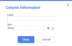
- Column Info… — open the Column Information dialog, to set properties of the column that are used for the Report Viewer’s interactive functions. Review Advanced Reports Report Viewer for more information.
- Label — provide a label or title for the column that will be used in the Report Viewer
- Sort — enable the Interactive Column Sorts feature, described below.
 Insert x Column(s) Before — insert the selected number of columns before (to the left of) this column (e.g. if three columns are selected, this menu item is Insert 3 Column(s) Before)
 Insert x Column(s) After — insert the selected number of columns after (to the right of) this column (e.g. if three columns are selected, this menu item is Insert 3 Column(s) After)
 Delete x Column(s) — delete the selected columns
 Column Sort — if the
 Interactive Column Sorts
While viewing reports in the Report Viewer, a user can click the bar at the top of the report to sort on a column. Only those columns that have an Interactive Column Sort defined can be sorted in the Report Viewer interactively like this.
A report with three columns in the Report Viewer, with a Column Sort activated on the Unit Price column. Both Product Code and Product Name do not have an interactive column sort.
Note
Interactive Column Sorts are applied after the sorts defined in the Report Designer’s Sorts dialog.
To add an Interactive Column Sort:
- Hover the mouse over a column header, then click the Column Menu icon, or right-click on a column header to open the Column Menu.
- Select Column Info… from the menu.
- Provide a Label for the column as it will appear in the Report Viewer.
- From the Sort dropdown select the Data Field to be used for sorting, or provide a formula by clicking the Formula Editor icon.
- Click Okay.
- Hover the mouse over a column header, then click the Column Menu icon, or right-click on a column header to open the Column Menu again.
- Hover over Column Sort and choose a default sorting direction.
 icon.
icon.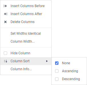
Rows
Rows expand vertically through the report. Rows may also be used for padding cells or creating spacing in the report’s layout. There is no practical limit to the number of rows a single report may have.
When the report is executed, it will automatically add rows to include all of the data necessary. For example, to display a report with many products, it is not necessary to have a row for each product configured in the Report Designer. A single row in a Detail section will automatically expand to include all of the products at run time.
A basic report design that includes only a single row in the Detail section that will expand to include all of the Products when executed
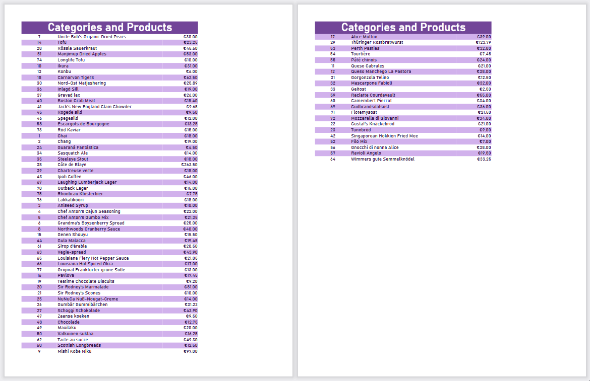
When the report is run, all of the products appear as the Detail section automatically adds the rows it needs to include them
Working with Rows
- Selecting Rows
- To select a continuous group of rows, hold the Shift key and then click the starting and ending rows.
- To select non-continuous groups of rows, hold the Ctrl key (Command key on Mac) then click the desired rows.
- Resizing Rows
- A row can be resized by dragging its bottom edge vertically.
- Use the Set Auto Height or Row Height… options on the Row Menu described below
- Hover the mouse over the row header
Once one or more rows are selected, hover the mouse over a row header, then click the Row Menu icon, or right-click on a row header to open the Row Menu.
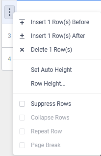
- Insert x Row(s) Before — insert the selected number of rows before (above) this row (e.g. if three rows are selected, this menu item is Insert 3 Row(s) Before)
- Insert x Row(s) After — insert the selected number of after after (below) this row (e.g. if three rows are selected, this menu item is Insert 3 Row(s) After)
- Delete x Row(s) — delete the selected rows
- Set Auto Height — when row height is set automatically, each row will change its height based on the content contained within it. Click this item to quickly set the row height to automatic mode.
- Row Height… — open the Row Height dialog, where an absolute value, in pixels may be set for the row’s height or check the Auto Height checkbox to enable automatic row height
- Suppress Rows — when checked, the selected rows (and their contents) will be hidden from the report output. Suppressed Rows have a faint dot pattern to indicate it won’t be included in report output.
The slight dotted pattern on Row 4 indicates that it is suppressed from report output
- Collapse Rows — only available for rows in Group Header sections. When checked, the groups will hide their content by default in the Report Viewer. A small Open Rows icon will appear next to the Group Header, indicating the group can be expanded to show more information. To learn more, see Collapsed Rows below.
- Repeat Row — only available for rows in Group Header sections. When checked, this row will repeat at the top of each page, if the Detail section in the group continues from one page to another. See Reprinting Group Headers in the Advanced Reports: Sections article for more information.
- Page Break — when checked, a new page will be created before this row.
 Insert x Row(s) Before — insert the selected number of rows before (above) this row (e.g. if three rows are selected, this menu item is Insert 3 Row(s) Before)
 Insert x Row(s) After — insert the selected number of after after (below) this row (e.g. if three rows are selected, this menu item is Insert 3 Row(s) After)
Auto Row Height
By default, all rows will have their height set automatically. This means that the rows height will conform to the data that is contained in the row.
Each row is a different height, adapted to the length of the Description field on that row
The same report, with a fixed row height of 50 pixels. Notice the first row has extra space and the other rows have truncated the category description
Collapsed Rows
A Group Section can be set to display as collapsed by default in the Report Viewer. This causes the contents of the section to be hidden and individually expandable for each break in the group section. When the report is exported to PDF, Excel, CSV or RTF all of the groups will be expanded so all report content is visible. Only one row in the Group Header section can be set to collapse, but multiple groups may be set to collapse.
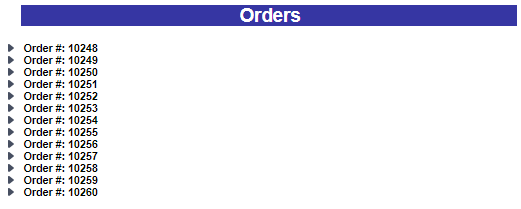
A report with Collapse Rows enabled in the Report Viewer, with all of the groups collapsed
In the Report Viewer, left-click on the Open Rows  icon to expand (open) or collapse (close) the group.
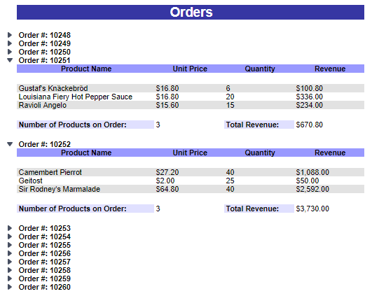
The groups for Order #10251 and Order #10252 are expanded whilst the others remain collapsed in the Report Viewer
Alternatively, right-click on the Open Rows icon to open a menu with display options:
- Expand — open the selected top-level group. This is the same behavior as left-clicking the Open Rows icon on a collapsed/closed group
- Collapse — close the selected top-level group. This is the same behavior as left-clicking the Open Rows icon on a expanded/open group. The state of the sub-groups is preserved.
- Expand Group — open the selected top-level group and all sub-groups within that group.
- Collapse Group — close the selected top-level group and all sub-groups within that group.
- Expand All — open every group and sub-group on the page.
- Collapse All — close every group and sub-group on the page.
Properties of a Collapsed Row
- Collapsed Rows always start as collapsed in the Report Viewer.
Note
Collapsed/expanded states of rows won’t be saved to User Reports.
- Page Breaks below a collapsed row are ignored. Expanding a collapsed group does not alter the report’s pagination.
- The contents of a collapsed group are searchable, but will not be visible until the containing group is expanded.
See Interacting with the Report Viewer for more information on the Report Viewer.
Row Header Indicators
When rows are collapsed, repeated or a page break is added, small indicators will appear with the row header.
| Feature | Description of Indicator | Example |
|---|---|---|
| Collapsed Row | Small black arrow pointing down right |  |
| Repeat Row | Two blue lines on the left |  |
| Page Break | Dashed lines on the top of the row header |  |
The indicators may appear together if more than one feature is set on that row.
A collapsed, repeating row that causes a new page each time it appears in the report
Cells
Cells are the containers for all the information in a report. Cells may contain data fields, formulas, text, images, charts, maps, links to other reports and/or links to special code snippets called Action Events.
The cells (and their contents) are the only elements on the Design Grid that actually appear in the final report output.
- To select cells, either click or use the keyboard arrow keys.
- To select a continuous group of cells, hold the Shift key and then click the starting and ending cells or click and drag the center of one cell to another.
Note
Holding Shift while using the keyboard arrow keys will move the selected cell in the opposite direction, not select multiple cells. Use the mouse to select multiple cells.
- To select non-continuous groups of cells, hold the Ctrl key (Command key on Mac) then click the desired cells.
- To select a continuous group of cells, hold the Shift key and then click the starting and ending cells or click and drag the center of one cell to another.
- To enter text into a cell either:
Tip
When entering a formula, start with an equals sign. For example:
=aggsum({OrderDetails.Quantity})- click the cell and begin typing, the cell contents appears in the formula bar just below the toolbar
- double-click the cell, and a text field will appear on the cell
- To add data fields from Data Objects to a cell, either
- Drag the field from the Data Objects Pane and drop it on the cell
- Select a cell and begin entering a formula with the data field’s name in curly braces. For example,
={Categories.CategoryName}
- Drag the field from the Data Objects Pane and drop it on the cell
- To insert charts, gauges, maps, images or CrossTabs into a cell, select it then either:
- click the Insert icon in the toolbar to select the item to add
- right-click on the cell to open the cell context menu, described below
- click the Insert
- Move contents from the selected cell to another by placing the mouse on the cell border. The cursor will change to a hand icon. Then drag to the destination cell. Or, use the Cut and Paste keyboard shortcuts or the Cell Context Menu.
- Copy contents from the selected cell to another by placing the mouse on the cell border. The cursor will change to a hand icon. Hold down the Ctrl key then drag to the destination cell. Or, use the Copy and Paste keyboard shortcuts or the Cell Context Menu.
- Adjacent cells can be merged and split using the Split/Merge Cells icon on the toolbar or the Merge Cells cell context menu item. Cells in different rows may also be merged together. Only those cells that have been merged can be split.
 icon in the toolbar to select the item to add
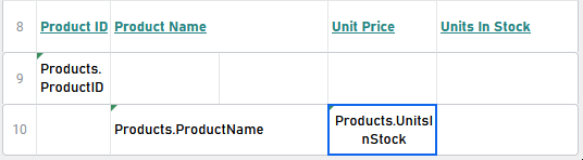
 icon on the toolbar or the
  Merge Cells
 Cell Context Menu
Right-clicking on a selected cell will open a Cell Context Menu with several cell options. Some of the options will only be available in certain situations.
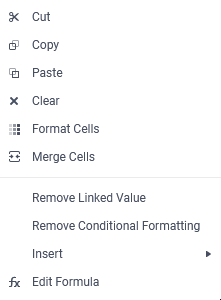
Cell Context menu
- Cut — copy the contents of this cell so that it may be pasted into another one, and clear the cell’s contents
- Copy — copy the contents of this cell so that it may be pasted into another one, without clearing the cell’s contents
- Paste — place the contents of a previously cut or copied cell into this one
- Clear — delete all of the cell’s contents
- Format Cells — open the Cell Format dialog to customize how data values will display, add custom borders, and apply conditional formatting
- Merge Cells or Split Cells — merge a group of selected cells together, or split a group of already merged cells up
- Remove Linked Value — available only if this cell is linked to another report. Click this option to remove the linked report from this cell. See Advanced Reports: Linked Reports (Drilldowns).
- Remove Conditional Formatting — available only if conditional formatting has been applied to this cell. Click this option remove the conditional formatting properties that have been applied to it.
- Insert — like the Insert icon on the toolbar, insert a new item such as a chart, gauge, map, image, CrossTab or formula. Only those items that may be added into this cell based on its section are available.
- Edit Formula — available only if there is a formula in this cell. Click this option to open the Formula Editor dialog.
- Edit — available only if there is a chart in this cell. Hover over this item, then select from one of the following options:
- Type — change the chart from one type to another as in the Type tab of the chart wizard. Only charts of the same series type may be selected. That is, if the chart is a multi-series type of chart only other mutli-series charts may be selected.
- Theme — change the color palette of the chart as in the Appearance tab of the chart wizard
- Legend Location — change the location of the legend
- Wizard… — open the Chart Wizard dialog
- Edit Gauge — available only if there is a gauge in this cell. Click this option to open the Gauge Wizard.
- Edit CrossTab — available only if there is a CrossTab in this cell. Click this option to open the CrossTab Data Designer dialog.
- Edit Google Map — available only if there is a Google Map in this cell. Click this option to open the Google Map Wizard.
- Edit Map — available only if there is a GeoChart in this cell. Click this option to open the GeoChart Map Wizard.
 Cut — copy the contents of this cell so that it may be pasted into another one, and clear the cell’s contents
 Copy — copy the contents of this cell so that it may be pasted into another one, without clearing the cell’s contents
 Paste — place the contents of a previously cut or copied cell into this one
 Format Cells — open the
  Edit Formula — available only if there is a formula in this cell. Click this option to open the Formula Editor dialog.
 Edit — available only if there is a chart in this cell. Hover over this item, then select from one of the following options:
 Edit Gauge — available only if there is a gauge in this cell. Click this option to open the Gauge Wizard.
 Edit CrossTab — available only if there is a CrossTab in this cell. Click this option to open the CrossTab Data Designer dialog.
 Edit Google Map — available only if there is a Google Map in this cell. Click this option to open the Google Map Wizard.
 Edit Map — available only if there is a GeoChart in this cell. Click this option to open the GeoChart Map Wizard.
Cells containing fields from Data Objects will have a small color-coded triangle appear in the top-left corner. Cells containing data fields from the same data object will have the same color.
Each cell with a field from a different Data Object has a different indicator color. Note that two cells on Row 6 with fields from the Product Data Object have the same color.
Indicators
Certain indicators will appear in the cell if features have been enabled on them.
| Feature | Description of Indicator | Example |
|---|---|---|
| Conditional Formatting | Uppercase letter A in top right corner of the cell |  |
| Linked Report | Chain links in the top right corner of the cell |  |
| Data Field in a Cell | Small colored triangle in top left corner of the cell |  |