Charts and the Chart Wizard
Charts are a way of illustrating data in order to make it easy to spot trends and patterns. Most types of charts are simply a collection of points on a grid, with interstitial designs and labels that make them easier to read.
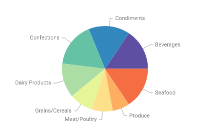
Pie chart
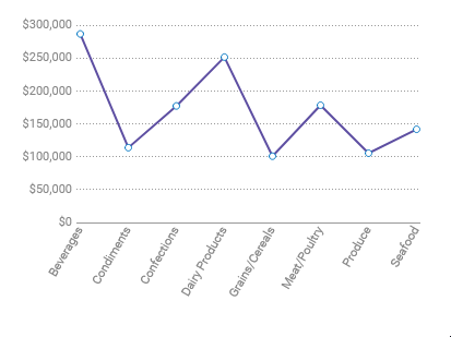
Spline chart
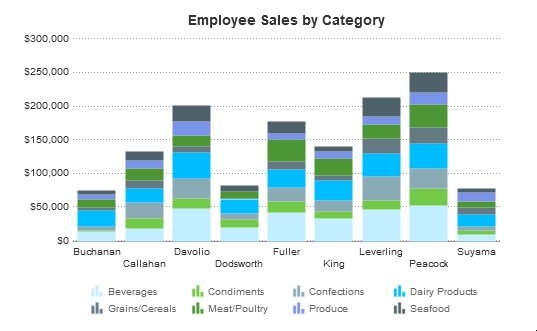
Bar chart
By default, charts are generated dynamically, based on data points that come from Data Objects. Each data field can be thought of as a “series” of data, which have a common association and are connected in some way. When we put one data field on a chart, we have a single-series chart, which is useful for comparing values to each other. When we put multiple data fields on a chart, we have a multi-series chart, which is useful for comparing trends.
Before creating a chart, make sure that your data exists in cells on the report. These cells don’t have to be visible, so you can suppress them if desired. Charts are interactive in the Report Viewer, but will appear as static images in PDF, RTF, and Excel formats (CSV is incompatible with charts).
To insert a chart into an Advanced Report:
- Select a Group Footer or Report Footer cell
- Open the Chart Wizard:
- (pre-v2021.1) Click the Chart Wizard
 icon in the toolbar.
 - (v2021.1+) Click the Insert icon on the toolbar, then click Chart
- (pre-v2021.1) Click the Chart Wizard
 icon in the toolbar.
 icon on the toolbar, then click
  Chart
ChartThe Chart Wizard has four tabs: Type, Data, Appearance, and Size and Preview. You can navigate between the tabs by clicking on the tab name or using the Previous and Next buttons.
Although the information in the Chart Types section below applies to all reports, the Chart Wizard is only available in the Advanced Report Designer. The ExpressView Designer and Dashboard Designer have their own chart building wizards. Review the ExpressView: Visualizations and Dashboard: Visualizations articles for more information.
Chart Types
The Type Tab lays out all the available types of charts you can create. There are 24 types, sorted into five general categories.
- Line
- Line
- Spline
- Area
- Spline Area
- Stacked Area (v2021.1+)
- Spark Line
- Zoom Line
- Statistical Process Control
- Radar (v2021.1+)
- Bar and Column
- Bar
- Stack Bar
- Stack Bar 100
- Column
- Stack Column
- Stack Column 100
- Pareto
- Spark Column
- Pie and Other Single-Series
- Pie
- Doughnut
- Pyramid
- Funnel
- Scatter and Bubble
- Scatter
- Bubble
- Zoom Scatter
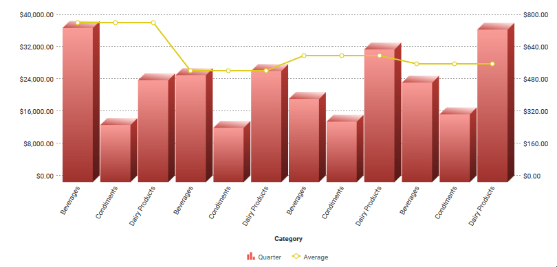
- Combination
- Heatmap (v2020.1.3+)
- Tabular (available to Dashboards only)
 Line
Line Spline
 Area
Area Spline Area
 Stacked Area (v2021.1+)
 Spark Line
 Statistical Process Control
 Radar (v2021.1+)
 Bar
Bar Stack Bar
 Stack Bar 100
 Column
 Stack Column
 Stack Column 100
 Pareto
 Spark Column
 Pie
Pie Doughnut
 Pyramid
 Funnel
 Scatter
 Bubble
 Combination

Line
Line charts display series of data points on a grid, connected by straight lines. They are often used to display a trend over time.
Each series on a line chart is represented as a colored line. Line charts can have up to three Y-axes.
Variations:
- Spline chart — data points are connected by interpolated curves instead of straight lines.
- Area chart — area under each line is filled in by a color. Overlapping areas have mixed colors.
- Spline-Area chart — combination of a spline chart and an area chart.
- Stacked Area chart — similar to an area chart, but may display multiple series additively.
- Spark Line chart — has no grid or axes. Use point labels and benchmark lines for reference.
- Statistical Process Control chart — always have a central line for the average, an upper line for the upper control limit and a lower line for the lower control limit. Data points outside of the limits are indicative of an out-of-control process.
- Radar chart — also known as a spider chart, multiple series (typically three or more) may be compared along the same radial grid/axes
Learn more and see some examples in the Line Charts and Spark Charts articles.
Statistical Process Control
A Statistical Process Control (SPC) Chart is a graph used to study how a process changes (usually over time). Data is plotted in time order. SPC charts always have a central line for the average, an upper line for the upper control limit and a lower line for the lower control limit. Control limits are located 3 standard deviations above and below the centerline (mean). Data points outside of the limits are indicative of an out-of-control process.
SPC is a single series Line chart with the following attributes:
- Data Label — as with any other single series line chart, users must specify the column/formula to be used as the Data Label source for the chart. This value will display along the x-axis.
- Data Value — as with any other single series line chart, users must specify the column/formula to be used as the Data Value source for the chart. This value will display along the y-axis, and will be used to calculate the Control, Upper Control Limit, and Lower Control Limit.
Default Benchmarks
When SPC is the selected chart type, the following benchmarks will be added by default:
- Mean — a benchmark with the value “Mean” will be added to represent the Control. By default, this benchmark will have the label “Mean”, will be colored Green, and will have a Solid line style.
- UCL — a benchmark with the value “Standard Deviation +3” will be added to represent the Upper Control Limit. By default, this benchmark will have the label “UCL”, will be colored Red, and will have a Dashed line style.
- LCL — a benchmark with the value “Standard Deviation -3” will be added to represent the Lower Control Limit. By default, this benchmark will have the label “LCL”, will be colored Red, and will have a Dashed line style.
Benchmark definitions can be altered as desired.
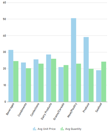
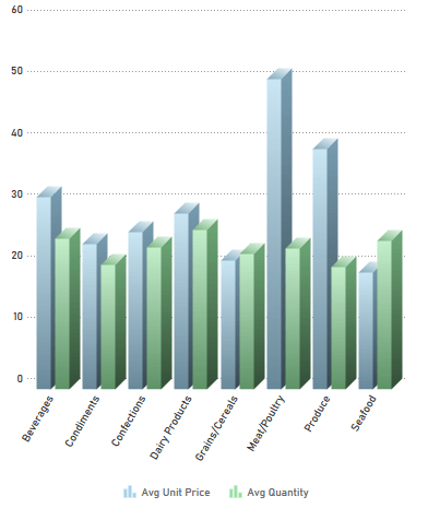
Bar and Column
Bar charts use rectangular bars which extend horizontally left to right to show comparisons between categories. Column charts use vertical bars which extend upward. The length of a bar represents the quantity of the data value.
Each series on a bar or column chart is represented by a colored set of bars.
Variations:
- Stacked bar/column chart – Series are stacked on top of each other, additively.
- 100% Stacked bar/column chart – Series are converted to a % of the max, then stacked on top of each other, additively to 100%.
- Spark column chart – Has no grid or axes. Use point labels and benchmark lines for reference.
- Pareto chart – Combines a descending column chart, where each column is the next highest data value, and an overlapping line chart, where each point is the cumulative sum to that point. Often used to highlight the most important field in a series. Single-series only.
Learn more and see some examples in the Bar Charts and Spark Charts articles.
Pie and Other Single-Series
Pie charts are used to show the relationship of data values in a series as portions of the total. The area of each slice is proportional to the quantity.
Each data value on a pie chart is represented by a colored “slice”. Pie charts are single-series only.
Variations:
- Doughnut chart – Pie charts with a hole in the center.
- Pyramid chart – Used to show data hierarchy in addition to value. Data values are represented by vertically stacked slices, the height (not width) proportional to the quantity. The vertical order of the slices is determined by the sort order.
- Funnel chart – Inverted pyramid chart. Often used to show retention amount, or stages in a process. Shape is inverted, not data order. To change the order, swap the sort direction.
Learn more and see some examples in the Pie, Doughnut, Pyramid, and Funnel Charts article.
Scatter and Bubble
Scatter charts use pairs of data fields with a common relation to generate coordinates as points on a grid. They are often used to find relationships between two variables in a set of data. Unlike most other report types, scatter charts often map data from detail rows, instead of group rows.
Each series on a scatter chart is represented by a different shape and color combination.
Variations:
- Bubble chart – The points become circular “bubbles”, with a third coordinate field as the radius of the bubble.
Learn more and see some examples in the Scatter and Bubble Charts article.
Zoom Charts
Zoom charts provide the ability to view data at various levels of granularity, especially when the data set under observation is large and can be organized into layers for easier interpretation. The ability to zoom-in and zoom-out makes it easy to view data at various macroscopic and microscopic levels.
Variations:
- Zoom Line chart – A variation of a standard Line chart with zooming as an added capability.
- Zoom Scatter chart – A variation of a standard Scatter chart with zooming as an added capability.
Learn more and see some examples in the Line Chart and Scatter and Bubble Chart articles.
Combination Charts v2016.3+
Combination charts are several different charts layered on top of one another. They comprise of a combination of Column, Line, Area, and/or Stacked Column charts. (Stacked Column charts are not compatible with other chart types). Combination charts can have up to two Y-axes.
Heatmaps v2020.1.3+
A heatmap is a chart with a minimum of two related axes and as few as one or as many as six data series arranged on a grid. The defining characteristic of a heatmap is its use of color to indicate value in the cells. In addition to color, each cell may display up to five additional values (one in each corner of the cell and a fifth in the center). When hovering the mouse over a cell, a tooltip may optionally display information about the series.
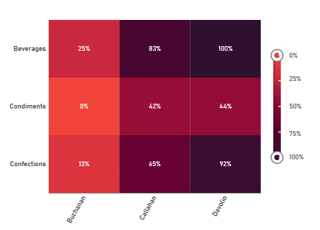
Heatmaps have a unique Chart Wizard experience, visit the Heatmap Charts article for details.
The following sections pertain to building Line, Bar, Column, Pie, Pareto, Spark, Scatter and Bubble charts. For information on how to build Gauges, GeoCharts and Google Maps and Heatmaps, visit their respective articles.
Data
The Data Tab is used to specify which cells to use as chart data. You can change how data is translated into points by changing the data layout. You can also choose a sort order, as well as upper and lower boundaries for the data and axes.
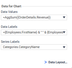
Data for Chart
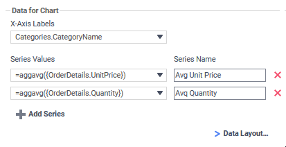
Add series to the chart by selecting a Data Field containing numeric values from the Series Values dropdown menu. Some charts may require you to select a data field to label the X-Axis. Some charts may ask for two or three data fields per series. The data axis is drawn automatically.
Note
Data is on the Y-Axis; this may not always be the vertical axis. Labels are on the X-Axis; this may not always be the horizontal axis. Scatter charts have no labels axis, but have X- and Y- data axes.
Add additional series by clicking  Add Series (disabled for single-series charts). Give a Name to each series. Click the Delete
  icon to remove a series.
Change the data layout by click  Data Layout…. This will open the Data Layout dialog. If you change the data layout, this section will change for you to add either individual points, or groups of series, instead of adding individual series. See Data Layout below for details.
Other Options
The Other Options setup how data is sorted and what data points are excluded (if any) and sets boundaries for the axes (if applicable).
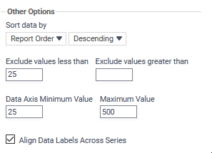
Use the Sort data by dropdown to determine how series data should be ordered:
- Report Order — Use the sort order specified by the report.
- Data Labels — Sort by the label axis value, alphabetically or numerically.
- Data Values — Sort by the value of the data.
You can sort data in Ascending (A- Z, 0-9) or Descending (Z-A, 9-0) order.
Use the Exclude values fields to ignore values that are too large and/or too small.
(Grid charts) Use the Data Axis Minimum Value and Maximum Value fields to set upper and/or lower bounds for the data axis.
(Grid charts) Align Data Labels Across Series: Re-sorts the data in each series by the data labels. Enable this option if you have a chart where each series has the same data labels and the intent is to compare values per series and label. If you have series that don’t necessarily have the same labels, you can disable this option.
(Pie charts) Use the Other Category Percent field to group data fields with small quantities into an “Other” category.
Data Layout
Your data may not fit neatly into series. This dialog accommodates different data layouts by allowing you to select from a couple of different ways to build a chart.
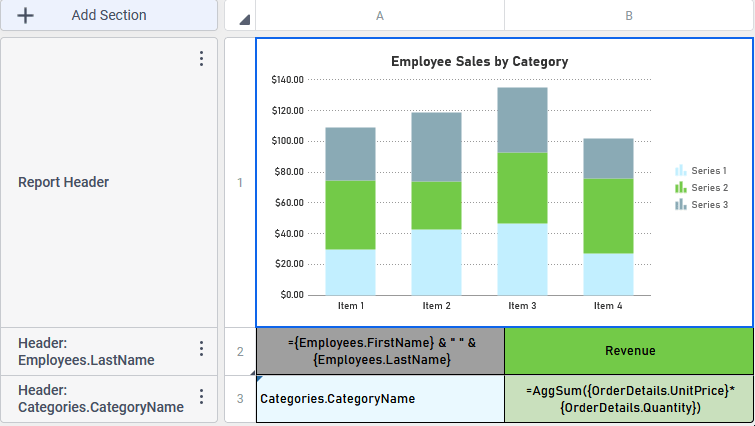
Column Based Chart is the default. This layout builds charts by taking data fields, and mapping selected values as Y-coordinates on the data axis. Determine which values are selected by specifying a data field with a common relation as the X-axis. This layout is useful if you want to plot one or more unrelated series in a group (e.g. Budget and Sales and Expenditures per Store).
Use Column Based Chart if… Your report contains a group with one or more elements. For example:
Row Based Chart is a little more complex. This layout still uses fields as series, but all your series are a group, nested within another group which determines the X-axis values. Data values are mapped per series per group. This layout is useful if you want to plot two or more related series in a group (e.g. Sales per Employee per Store).
Use Row Based Chart if… Your report contains a group within a group. For example:
If you select this layout, the data selector will change to allow you to add all your series as a group, nested within an outer group for the data labels:
Cell Based Chart is the simplest option. This layout builds charts by taking pairs of static report values, and using them as (X,Y) or (label, value) coordinate pairs.
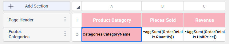
In order for the chart wizard to recognize report cells, they must be in Formula form, with a preceding = sign, text surrounded by quotes, and data fields surrounded by braces { }. Examples:
- Number: =42
- Text: =”February 24th”
- Data field: ={Employees.EmployeeName}
- Formula: =Month{Orders.OrderDate}
- Math: ={Orders.UnitPrice} * 2.43
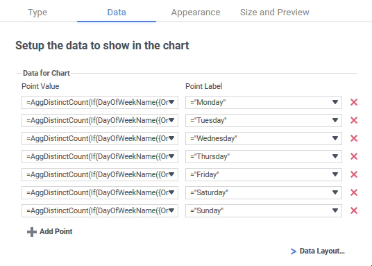
Use Cell Based Chart if… You want to build a chart point by point, and only have one data series. For example:
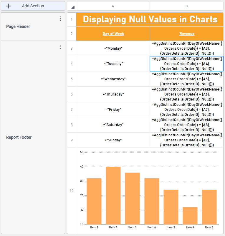
If you select this layout, the data selector will change to allow you to add points. This layout only supports one series of data (duplicating data labels will create duplicate axis labels):
Appearance
The Appearance Tab contains options for customizing how the chart will look.
Colors
Use the Colors dropdown to select either:
- a named color theme to apply to the chart
- a custom gradient range of colors by selecting the Linear Range option.
- a specific range of colors by selecting the Custom option.
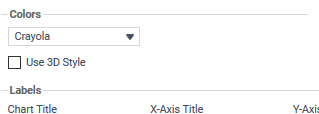
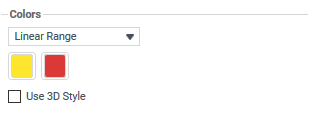
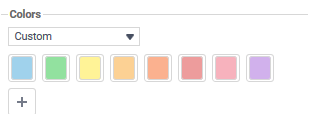
Check Use 3D Style to give your chart a three-dimensional look.
Labels
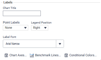
Chart Title – Enter the text you want to appear in at the top of the chart.
(Grid charts) X-Axis Title – Enter the text you want to appear on the X-Axis (horizontal axis).
(Grid charts) Y-Axis Title – Enter the text you want to appear on the Y-Axis (vertical axis).
Use the Point Labels dropdown to label the points on the chart:
- Series Values
- Percent of Series Values
- Data Labels
- Data Labels with Data Values
Use the Legend Position dropdown to choose where to display the legend relative to the chart, either:
- None — do not show a legend
- Bottom — show the legend along the bottom of the chart
- Right — show the legend along the left of the chart
Use the Label Font dropdown to specify the font for the labels.
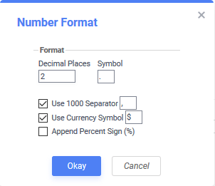
Use the  Number Format… dialog to specify how data and axis labels should be formatted:
Use the Conditional Colors… dialog to conditionally change chart element colors. Bars, columns, segments of pie charts, points in line and scatter charts, and bubbles in bubble charts can change color conditionally, depending on a formula. To add a conditional formula, click Add. Choose a color by using the color picker, or enter a color value. Then click the Formula  icon to open the Formula Editor and set the condition.
There are additional parameters available when making chart conditional formulas that allow you to set the condition for coloring points based on the point data. The following parameters are available depending on the type of chart and data layout:
@data_label@– the value of the point’s Data Label field, or Y Value field for scatter and bubble charts@data_value@– the value of the point’s Data Value field, or X Value field for scatter and bubble charts@series_label@– the value of the point’s Series Label field for charts using the Row Based layout@bubble_size@– the value of the point’s Bubble Size field for bubble charts@bubble_label@– the value of the point’s Bubble Label field for bubble charts
(Line & combo charts) Use the Chart Axes dialog to add and format axes:
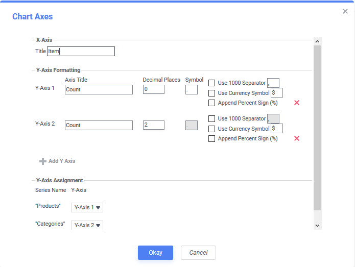
- Click Add Y Axis to add an additional axis. Give it a title, and use the formatting options to format the axis labels and data labels for associated series. Click the Delete icon to remove an axis.
- Y-Axis Assignment – Use the dropdown menu for each series to associate the series with an axis. Each series will have the same format as the axis, and hiding an axis will hide associated series.
- Click Okay when done.
Use the  Benchmark Lines… dialog to add horizontal lines at specific sections of the chart:
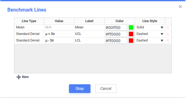
Benchmark lines dialog for a Statistical Process Control (SPC) chart
- Click New to add a benchmark line:
- Line Type — select one of the available pre-defined lines
- Static — a line that is set a fixed value
- Minimum — a line at the data’s minimum point
- Maximum — a line at the data’s maximum point
- Mean — a line at the data’s mean
- Median — a line at the data’s median
- Standard Deviation (Population) — a line at the data’s population standard deviation
- Standard Deviation (Sample) — a line at the data’s sample standard deviation
- Label – Enter the text you want to label the line.
- Value – Set the value for where the line will display.
- Color –Specify the color of the line.
- Line Style – Solid or Dashed.
- Line Type — select one of the available pre-defined lines
- Click the Delete icon to remove a benchmark line.
- Click Okay when done.
Other Features
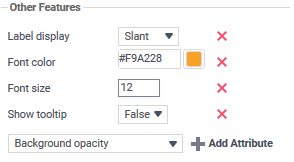
This section allows you to customize a variety of attributes. The following attributes are supported:
- Font color
- Font size
- Background opacity
- Background color
- Title alignment
- Title font size
- Title on top
- Legend title
- Title font size
- Show border
- Show tooltip
- Subtitle
- Subtitle font size
To add a feature, select an attribute from the dropdown menu and click Add Attribute. Then enter a custom property into the attribute field or select from the attribute dropdown menu.
Click the Delete icon to remove a feature.
Advanced Features
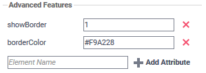
In addition to the Other Features, there are a number of Advanced Features that may be added to a chart. Contact your system administrator for assistance with this feature.
Size and Preview
The Size and Preview Tab allows you to change the size of the chart and preview any customizations.
Note
Chart previews in the Wizard and on the Design Grid use placeholder data.
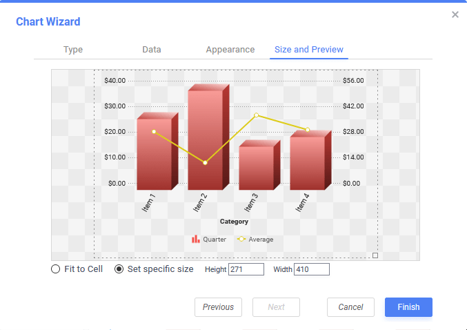
Change the size of the chart in one of three ways:
- Drag-and-drop the resizing handle in the bottom-right corner.
- Check Fit to Cell and resize the chart cell on the Design Grid.
- Check Set specific size and enter a custom Height and Width in pixels