Heatmaps are available in Advanced Reports starting with v2020.1.3+.
Heatmaps
A heatmap, sometimes referred to as a mosaic plot or density function visualization, is a chart with two related axes and 1–6 data series arranged on an X-Y grid. The defining characteristic of a heatmap is its use of color or shading to indicate data magnitude. In addition to color/shade, each cell may display up to five additional values (one in each corner and a fifth in the center). When hovering the mouse over a cell, a tooltip may optionally display information about the series. Like other charts, heatmap cells may be linked to other reports to drilldown into further detail.
Data Layout
Heatmaps only support Column Based Chart Data Layout (Layout 2). Additional information about data layouts can be found in the Chart Data Layout Types article.
Examples
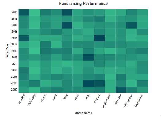
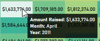
A heatmap in gradient coloring mode displaying fundraising activity by month over the last 12 years
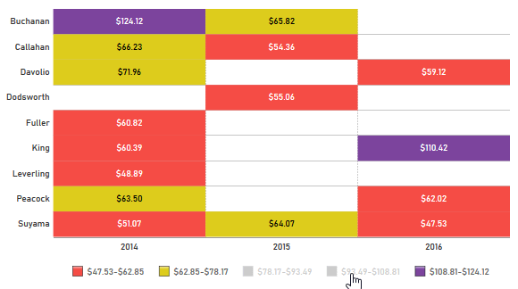
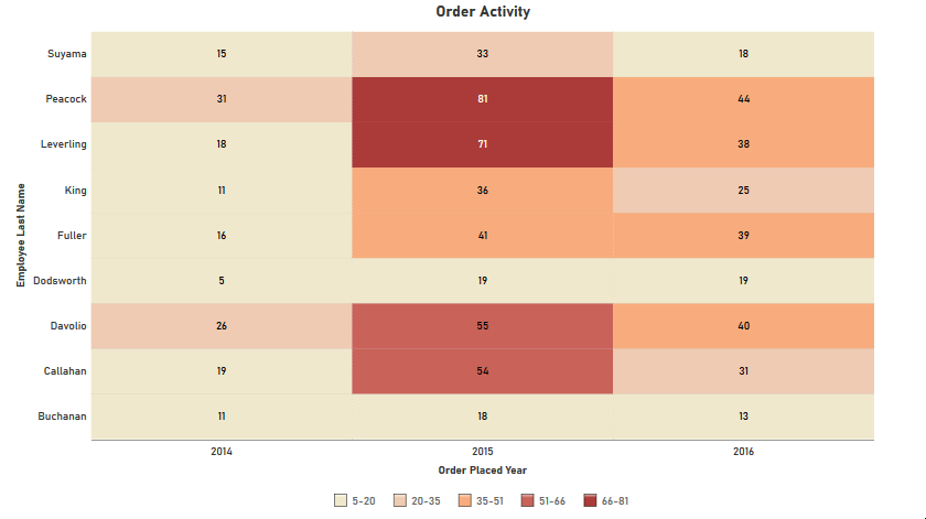
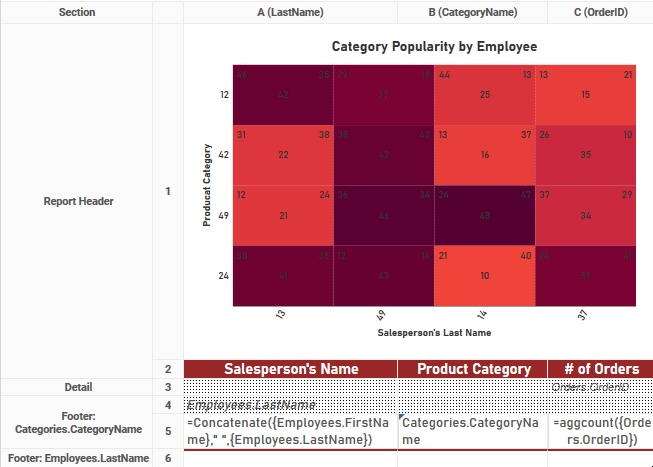
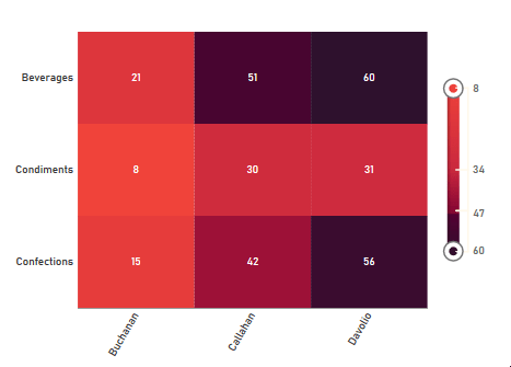
A heatmap in interval coloring mode displaying the quantity of orders placed by each salesperson for several years, including a data series displayed in the center of each cell
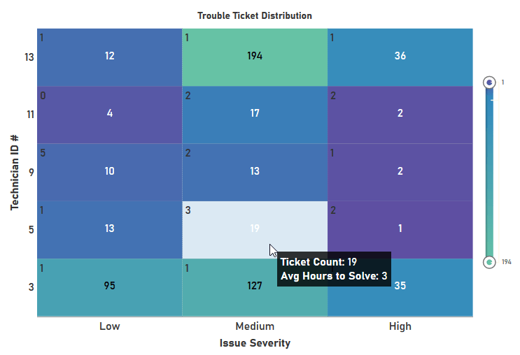
A heatmap in gradient color mode displaying the performance of five service technicians on work tickets, including two displayed data series and a legend on the right side. A tooltip explains the meaning of the displayed data series.
Advanced Reports
Arranging Data for a Heatmap
Data to be displayed on a heatmap must be grouped into two sections.
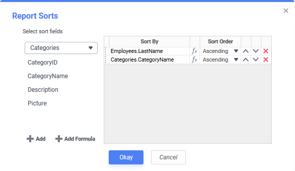
For example, to show the number of products from each category ordered by each employee, the report should have a sort first on the Employee and then on the Category.
Data on the report should then be placed in a group header or group footer section that changes on the second (inside) sort object. In this example, the second (inside) sort is Categories.CategoryName. For more information about sorting and grouping on Advanced Reports, review the Advanced Reports: Sorts article.
Tip
To prevent the first sort object from repeating and to maintain a sense of hierarchical grouping, enable Duplicate Suppression on that column in the report. Select the cell and click the Suppress Duplicates (pre-v2020.1.1) Hide Repeated Values (v2021.1.1+) icon on the toolbar.
Suppress Duplicates/Hide Repeated Values disabled for Salesperson’s Name Suppress Duplicates/Hide Repeated Values enabled for Salesperson’s Name
Set the axis labels, data series and data formatting options on the Data tab.
Select the X (horizontal) axis values and Y (vertical) axis values from the X Values and Y Values dropdowns respectively.
Optionally, select sorting of the X Values and Y Values from the Sort X-Axis By and Sort Y-Axis By dropdowns. Choose from:
Report Order — axis values will be displayed in the order they are returned from the data source. This is the default sorting method.
Data Labels — axis values will be sorted by the label that appears on the chart. For example, a list of seasons would be ordered Fall, Spring, Summer,Winter in alphabetical order. Choose a sorting direction from the Direction dropdown that appears, either Ascending or Descending.
Data Values — axis values will be sorted by the value associated with the label. For example in the Northern Hemisphere, Winter, Fall, Spring, Summer since winter has the coolest temperatures and Summer has the warmest. Choose a sorting direction from the Direction dropdown that appears, either Ascending or Descending.
Note
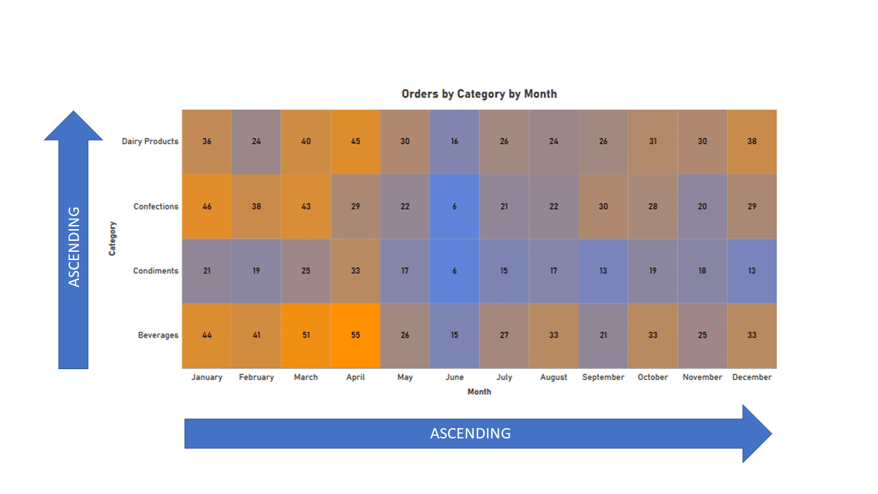
Like Scatter and Bubble Charts, Heatmaps consider the lower-left corner as the origin for axis labels. This means when sorting axes in Ascending order, the smallest or earliest value will appear in the bottom or the left corner. The largest or latest value will appear on the top or the right corner. See the figure below for a graphical explanation.
Ascending sort order for axes in heatmaps
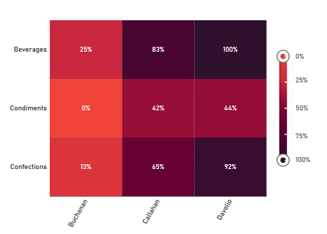
Check the Percentage Mode checkbox to transform the Assign Color By series (assigned in the Appearance tab) to relative percentages 0–100%. When percentage mode is enabled, the applicable series will show a % sign and only Percentage of DataColor Distribution mode will be available in the Appearance Tab.
A heatmap with Percentage Mode disabled (top) and the same heatmap with Percentage Mode enabled (bottom)
Data Layout… is disabled for heatmaps, as only column based chart layout (layout 2) is supported.
Add a minimum of one, and a maximum of six data series:
Important
At least one of the series must be numeric.
Click the Add Heatmap Series button. The first series will appear in the Center display area position. Series may also be displayed in the Top Left, Top Right, Bottom Left, and Bottom Right of a cell, or not at all if in the Color Only display area position. To move the series to a different location, either:
click and drag the Move Grid Row icon to move the series to the desired position.
use the Move Item Up and Move Item Down icons to move the row up or down by one position at a time
Priority will be given to display the Center series in the cell if present. If the cells are not large enough to display the other series without them colliding vertically, then they will be hidden and only be visible in the tooltip if their Show in Tooltip checkbox is checked.
Choose the Data Field to include in the series from the dropdown. The data field must be in the same report section as the X Values and Y Values.
Uncheck the Show in Tooltip checkbox to prevent the series from appearing in a tooltip when the cell is hovered over with the mouse. The default is for all series to appear in the tooltip (checked).
If Show in Tooltip is checked, it is recommended to provide a friendly Display Name for the series. If no Display Name is provided, the name of the series as it appears in the Data Field dropdown will display instead. A colon will be automatically appended at the end of the Display Name. Three data series with no Display Name specified (top) and with a Display Name specified (bottom)
Click the Number Format icon to change how the value is displayed in the cell and in the tooltip. This will open the Number Format dialog which works very similar to the Cell Format dialog in the Advanced Report Designer. The number formatting changes will only apply if the data field is numeric.
Remove a series by clicking the Delete icon at the end of the row.
Set the heatmap coloring scheme, labels, legend and other features on the Appearance tab.
Colors
Color section of the Appearance tab
The data values that color the cells are set in the Assign Color By dropdown. Choose one of the numeric data series defined in the Data Tab from the dropdown. The magnitude of the chosen series will be used to color/shade the cells.
There are four ways to style the coloring of the heatmap cells, by setting different combinations of the Style and Color Distribution options.
Choose the method of color transitioning by selecting one of the Style options, either:
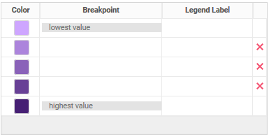
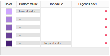
Gradient — colors will change smoothly, automatically and evenly between the color breakpoints. A minimum of 2 colors must be provided in gradient mode, with 3 being the default number provided for new heatmaps.
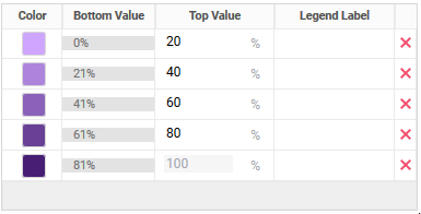
Interval — colors will change in explicitly defined steps when the magnitude of the Assign Color By field falls within specified Bottom Value and Top Value settings. A minimum of 1 color must be provided in interval mode, with 5 being the default number provided for new heatmaps.
Choose the method of entering breakpoints into the color grid by selecting one of the Color Distribution options. Breakpoints are locations in the data where the color will have a defined change. Either:
Percentage of Data — breakpoints are calculated as a percentage of the data values with the smallest value at 0% and the largest value at 100%. This is the default mode, and the only mode available when Percentage Mode on the Data tab is checked.
Data Values — breakpoints in color happen at explicitly defined values of the data. This is useful when the desired data point changes are well known.
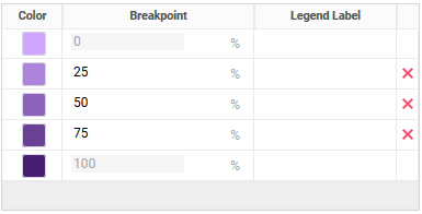
The Color Grid is where the colors, breakpoints and legend labels are set. Depending on the Style and Color Distribution options, the color grid will appear slightly differently for each expected input.
Table A — Color Grid Control Layouts
Gradient, Percentage of Data
Interval, Percentage of Data
Gradient, Data Values
Interval, Data Values
Additional color breakpoints may be added by clicking the Add button on top of the grid, and removed by clicking the Delete icon at the end of the corresponding row.
For each breakpoint:
set the location where the color break will happen. Breakpoint values must all be numeric and must be entered in ascending order. If Assign Color By is a plain data field (i.e. not a formula) and Color Distribution is set to Data Values a filter dropdown will appear for each breakpoint value required, to aide in selecting values. Otherwise, values must be entered manually.
For Gradient — specify the value where the background color of the cell will match the Color column. Colors will automatically shift towards and away from the Color as values approach and diverge from this point
For Interval — specify the Top Value of each interval where the background color of the cell will match the Color column. The Bottom Value for the next breakpoints will be calculated automatically.
a Legend Label can be specified to appear in the optional chart legend. More detail about the legend is detailed in the Labels section below.
remove it by clicking the Delete icon at the end of the row
The background colors of the cells are controlled with the following settings:
select a predefined color palette from the Theme dropdown. Available choices are:
Default — a color theme defined by the system administrator
Named Themes — a variety of named color themes are available (e.g. Blue Gray, Emerald Forest, Prismatic Wave, etc…)
Custom — the color palette may be manually specified as detailed below
manually change the colors by choosing Custom from the Theme dropdown and then clicking on the squares in the Color column and choosing a new color
Note
The font color of the Center series will automatically change between black or white to contrast with the cell background color. The other series will always appear with black text.
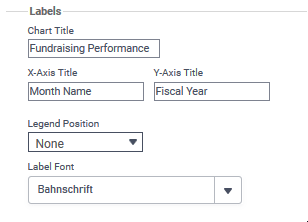
Labels
Enter a Chart Title, X-Axis Title and Y-Axis Title into their respective fields. The X-Axis Title and Y-Axis Title will always appear along their corresponding axis, but the Chart Title may appear on either the top or bottom of the chart, determined by the Title on top setting in Other Features.
An optional legend can display on the heatmap. Choose a Legend Position from the dropdown:
None — no legend will be displayed
Right — (default) a legend will be displayed along the right side of the heatmap
Bottom — a legend will be displayed along the bottom of the heatmap
The legend displays the range of available colors and their value/percentage assignments. As it does for other charts, the legend also provides a simple filtering capability by hiding certain ranges when clicked.
Using the filtering function of the legend on a heatmap with Interval color styling mode
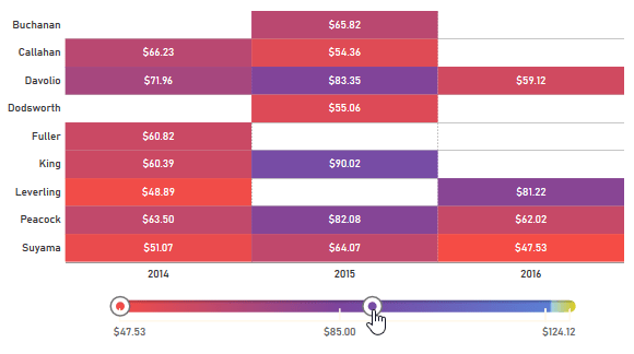
When Style is set to Gradient on the Appearance tab, the legend appears as a double-ended range slider. The knobs on the legend can be dragged to change the filtered range of values.
Using the filtering function of the legend on the same heatmap with Gradient color styling mode
A font may be selected from the Label Font dropdown. This font will be applied to all content displayed on the chart including the data series, labels, legend and tooltips.
Other Features
The Other Features for heatmaps work the same as they do for other chart types. For more information about these features, review the Other Features section of the Charts article.
Advanced Features
Advanced Features allow special commands to be passed directly to the heatmap rendering engine.
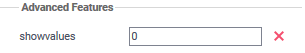
To create a heatmap that displays only color in each cell, but still maintains the ability to show up to 5 data series in the tooltip, add the showvalues feature:
In the Element Name field enter showvalues.
Click the Add Attribute button.
In the field that appears next to the newly added showsvalues feature, enter 0.
This heatmap will show only color when rendered, but hovering the mouse over any cell can display up to 6 data series in the tooltip
To return to normal data display mode, click the Delete icon next to the showvalues item.
Otherwise, the Advanced Features for heatmaps work the same as they do for other chart types. For more information about these features, review the Advanced Features section of the Charts article.
As it does for other chart types, the Size and Preview tab displays a simulation of the configured visualization. The data displayed is sample information only and is not representative of the data that will be included when the report is executed.
There are two great teachers of perseverance in this world: sales and distance running. Kevin LaFrazia does both.
Kevin has finished an incredible 18 5Ks, 14 half marathons, and 3 marathons from Florida to California, including the completion of the Disney Coast to Coast series of races in 2015! 🏃🎽😲🤯
Reaching these milestones has taken a ton of dedication, and the grit has come in handy in Kevin’s sales career. He hadn’t even been sure it was the field for him at first, but his dad had always made the job seem fun, somehow.
“It was because he was being himself,” says Kevin. “He just let himself go through sales conversations as a person. I don’t think anyone could have ever told me anything more valuable.” 😊
Being a person has served Kevin well. It’s how he accesses his sense of humor during grueling races and high-stakes phone calls. Take those moments too seriously, and you end up getting in your own way. Find a way to laugh, and, he says, “you’ll be unstoppable.”
Kevin joined our #humansofexago earlier this summer and already feels comfortable in the application he sells. “Knowing the software makes connecting with leads smoother and more conversational.” He’s also enjoyed collaborating with a growing team of SDRs whose “commitment and confidence is so wonderfully heartening.” 💛
When Kevin isn’t reveling in his number-one non-food indulgence, travel, he’s home with his wife, five cats, and surprisingly prolific, ever-expanding school of fish.
icon on the toolbar.
 icon on the toolbar.
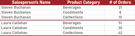
 icon in the toolbar to start the Chart Wizard.
 Heatmap.
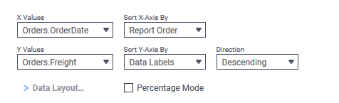
 Data Layout… is disabled for heatmaps, as only column based chart layout (layout 2) is supported.
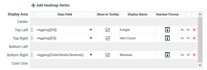
 icon to move the series to the desired position.
 and Move Item Down
  icons to move the row up or down by one position at a time
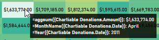
 icon to change how the value is displayed in the cell and in the tooltip. This will open the Number Format dialog which works very similar to the
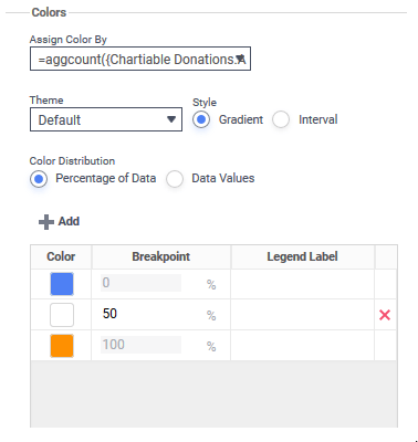
 Add button on top of the grid, and removed by clicking the Delete
  icon at the end of the corresponding row.