ExpressView: Introduction (v2021.1+)
ExpressView is a report building tool that combines grouping, sorting, filtering, and summarizing data with a drag-and-drop interface. A chart can be added with a single click, and the entire report can be exported as PDF, RTF, CSV, or an Excel workbook.
ExpressViews are created in the ExpressView Designer. Depending on system configuration, ExpressView can display data live as they are edited.
Note
This section applies to ExpressView in v2021.1+ of the application. For previous versions, refer to ExpressView (pre-v2021.1)
Layout
ExpressViews are simple reports that contain Detail Fields and Groups. Consider a report that shows products organized into categories. The product name would be a Detail Field and the category would be a Group.
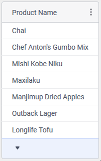
A single detail field on Products.ProductName
Groups, up to 7, nest inside of each other and establish a “for each” hierarchy. Building on the above product example, by adding the product category as a Group the ExpressView now looks like this:
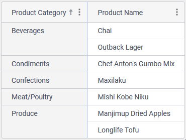
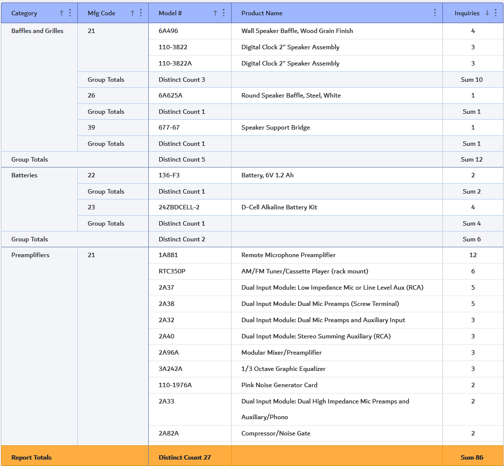
Products organized into their respective Categories by adding a group on Categories.CategoryName
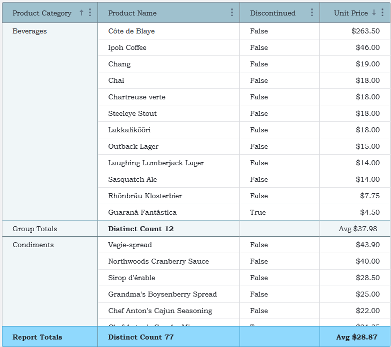
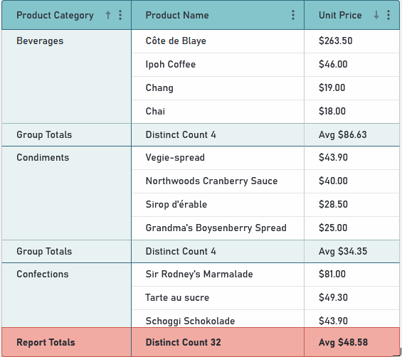
Each Group is capable of displaying a summary for each of its component detail rows, called a Group Total. An overall Report Total is also available. Depending on the type of data in the detail rows, available aggregate functions will change but in general they are: Sum, Min, Max, Count, Distinct Count, Average or None.
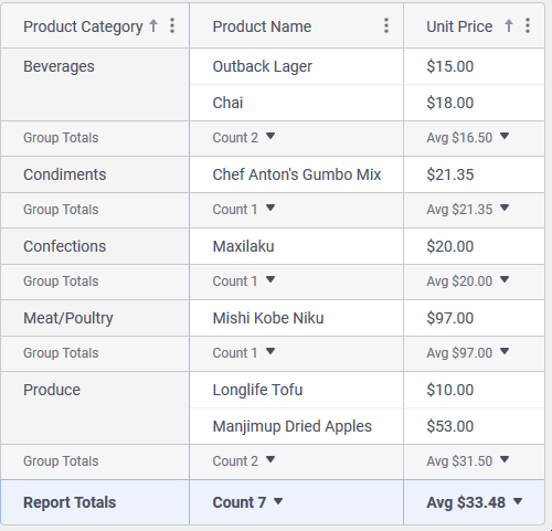
Summarizing Group and Report data by aggregating group and report totals
A visualization can be added to an ExpressView with only a few additional clicks of the mouse.
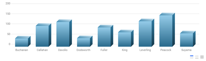
A Column chart showing the number of sales each salesperson made
Anatomy of the ExpressView Designer
The ExpressView Designer consists of four main components: the Canvas, the Toolbar, the Properties Pane and the Data Objects Pane.
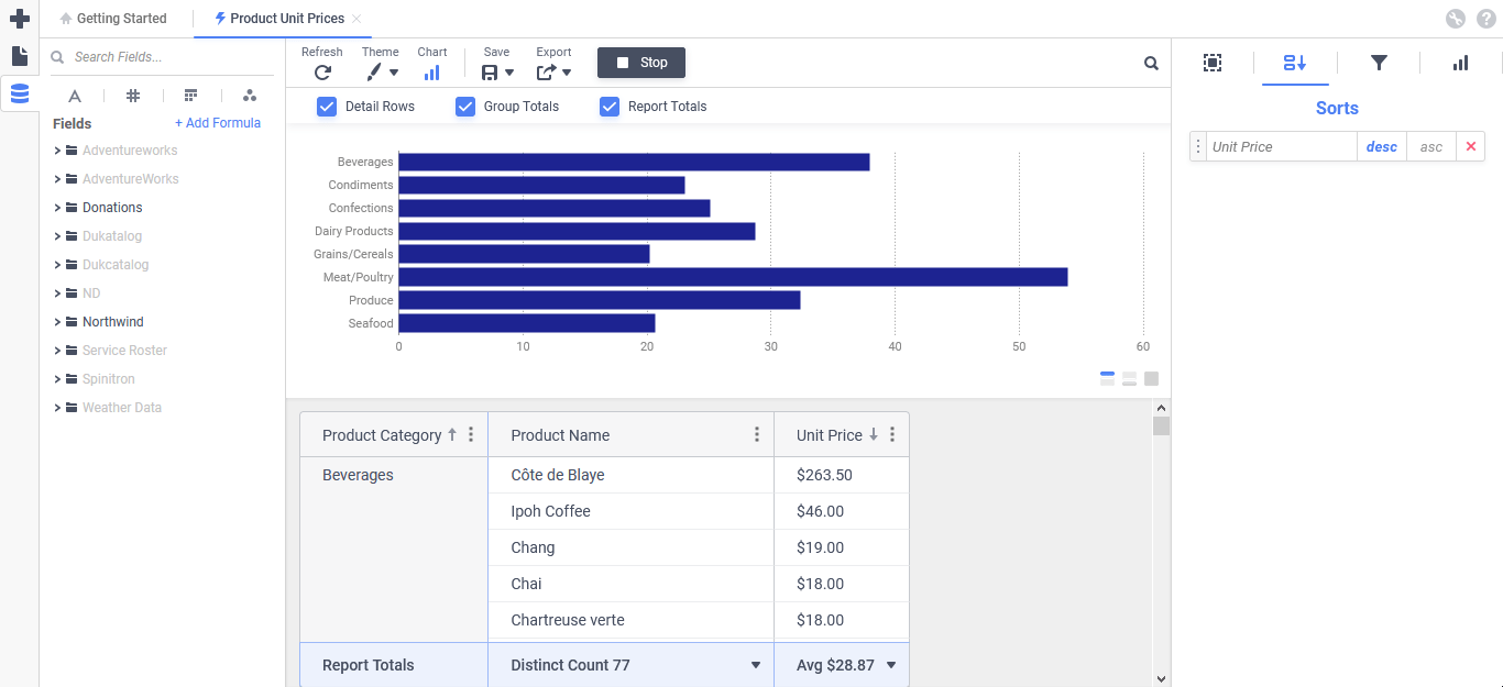
The ExpressView Designer in Live Data (Run) mode, including a Bar chart visualization
Canvas
The Canvas is the central component of the ExpressView Designer. The canvas is interactive, meaning data fields can be drag-and-dropped right onto it from the Data Objects Pane and arranged as desired. Visualizations may be displayed at the top, bottom or fill the canvas.
Depending on system configuration, it may be possible to work with the data in the objects on the report interactively. Click Run on the toolbar to enable Live Data mode. In this mode, as fields are added to the ExpressView canvas, they will display data immediately from the data source. When Live Data mode is enabled, this button becomes Stop. Click Stop to turn off live data mode and work “offline” with placeholder data. For very large and complex ExpressViews, keeping Live Data mode off while editing will be much faster.
Note
When in Live Data mode, data is only refreshed when an action is taken in the ExpressView Designer to do so (i.e. clicking Refresh on the toolbar or making a change to the report design or properties). It is not necessarily a “real-time” automatically updated data display.
Drop zones on the canvas prompt with available actions. For example, when creating a new ExpressView, “Drag a field on the canvas” will appear. Once at least one column is on the canvas, an “Add Group” drop zone will appear.
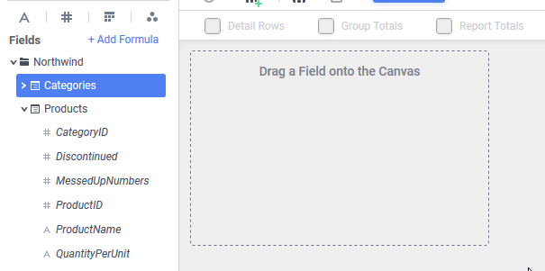
Demonstrating drop zones by dragging ProductName as a Detail Field and CategoryName as a Group from the Data Objects Pane to the Canvas
Once at least one Detail Field and one Group are added to the canvas, the drop zone prompts will disappear but the drop zones remain active.
The columns themselves also have drop zones. Additional detail fields and groups may be added to the canvas by dragging data fields from the Data Objects pane to the desired position. The drop zones on the columns highlight in blue to show where the new column will be added.
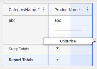
Adding UnitPrice as a detail row by dragging it to the right-hand drop zone on the ProductName detail column
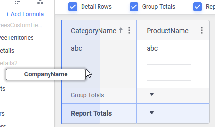
Adding CompanyName as a group by dragging it to the left-hand drop zone on the CategoryName group column
The new column will be of the same type as the column where the data field was dropped. That is, if a new field is dropped on a detail field, a new detail field column will be created. If the new data field is dropped on a group column, the new data field will become a group.
Columns may be re-ordered by dragging them around the canvas and dropping them in the desired destination.
Instead of adding a pre-defined data field, formulas may be added as columns. Click the + Add Formula link at the top of the Data Objects Pane to add a new formula column. More information about formula columns can be found in the ExpressView: Formula Columns article.
Options for grouping, filtering and sorting both detail rows and groups can be found on the Column Menu. This menu is accessed by either right-clicking on the column or by clicking on the Column Menu  icon in the column’s header.
Depending on where the column type (either group or detail field) there will be different options available. In general, they are:
 Move Left/Promote Group — this item will be Move Left for detail fields and Promote Group for groups. Click this option to move this column one position to the left, or promote the group up one level to the left. For more information about grouping, review the ExpressView: Grouping article. This item is disabled if the column is the leftmost column of its type. That is, if this is a detail column and the next column to the left is a group, this item will be unavailable.
- Move Right/Demote Group — this item will be Move Right for detail fields and Demote Group for groups. Click this option to move this column one position to the right, or demote the group down one level to the right. For more information about grouping, review the ExpressView: Grouping article. This item is disabled if the column is the rightmost column of its type.
- Group By This/Ungroup — this item will be Group By This for detail fields and Ungroup for Groups. Click this option to convert a detail field into a Group, or to convert a Group to a detail field. For more information about grouping, review the ExpressView: Grouping article.
- Remove Field — click this option to immediately remove this column.
- Filter By This — click this option to add a new Standard Filter using the field or formula in this column. For more information about filtering, review the ExpressView: Filtering article.
- Sort Ascending — click this option to add a new Ascending Sort using the field or formula in this column, or change the direction of an existing sort to Ascending. Sorts are applied in the order they are added to the report. For more information about sorting, review the ExpressView: Sorting article.
- Sort Descending — click this option to add a new Descending Sort using the field or formula in this column, or change the direction of an existing sort to Descending. Sorts are applied in the order they are added to the report. For more information about filtering, review the ExpressView: Sorting article.
- Change to Primary Sort — click this option to change the sort on this detail field to be the first one. This option is only available if this column is a detail field, there is more than one sort defined, and this column is not already the first sort. For more information about sorting, review the ExpressView: Sorting article.
- Remove Sort — click this option to remove the sort on this detail field. For more information about sorting, review the ExpressView: Sorting article.
- Quick Functions — click this option to add a Quick Function to this column. A Quick Function can quickly manipulate the data in the column. For example, choose Month Name to pick out only the name of the month from a column with a date in it. This option is only available if at least one Quick Function has been configured in the system for the data type in the column (e.g. date, numeric, string). For more information, review the Quick Functions section of the ExpressView: Formula Columns article.
- Convert to Formula/Edit Formula — click this option to either convert from a standard column to a Formula Column, or to edit the formula on an existing formula column. For more information, review the ExpressView: Formula Columns article.
 Move Left/Promote Group — this item will be Move Left for detail fields and Promote Group for groups. Click this option to move this column one position to the left, or promote the group up one level to the left. For more information about grouping, review the
  Move Right/Demote Group — this item will be Move Right for detail fields and Demote Group for groups. Click this option to move this column one position to the right, or demote the group down one level to the right. For more information about grouping, review the
  Group By This/Ungroup — this item will be Group By This for detail fields and Ungroup for Groups. Click this option to convert a detail field into a Group, or to convert a Group to a detail field. For more information about grouping, review the
  Remove Field — click this option to immediately remove this column.
 Filter By This — click this option to add a new Standard Filter using the field or formula in this column. For more information about filtering, review the
  Sort Ascending — click this option to add a new Ascending Sort using the field or formula in this column, or change the direction of an existing sort to Ascending. Sorts are applied in the order they are added to the report. For more information about sorting, review the
  Sort Descending — click this option to add a new Descending Sort using the field or formula in this column, or change the direction of an existing sort to Descending. Sorts are applied in the order they are added to the report. For more information about filtering, review the
  Change to Primary Sort — click this option to change the sort on this detail field to be the first one. This option is only available if this column is a detail field, there is more than one sort defined, and this column is not already the first sort. For more information about sorting, review the
  Quick Functions — click this option to add a Quick Function to this column. A Quick Function can quickly manipulate the data in the column. For example, choose Month Name to pick out only the name of the month from a column with a date in it. This option is only available if at least one Quick Function has been configured in the system for the data type in the column (e.g. date, numeric, string). For more information, review the
 Styling the Canvas
Color Theme
A theme can be applied that will change the colors of the elements on the canvas such as the totals, column headers, data rows, borders and divider lines. Themes will also apply in certain situations when the ExpressView is exported.
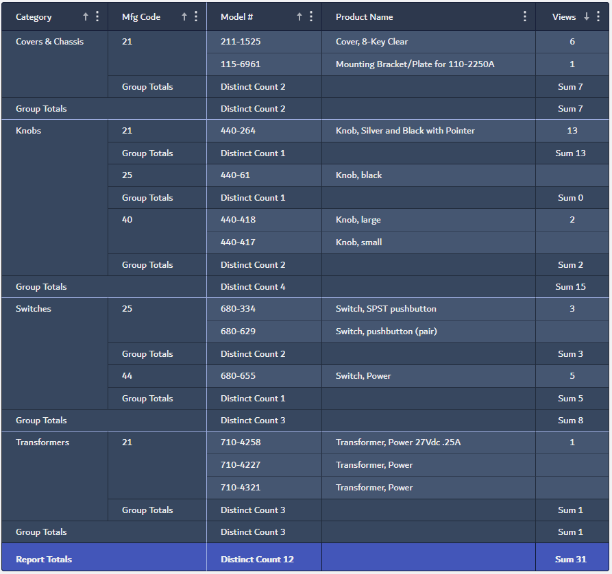
A simple ExpressView with the Lava Splash theme applied
To apply a theme to an ExpressView:
- Click the Canvas icon in the toolbar to open the Report Styling dialog.
- Choose a theme name from the Theme dropdown. A preview of the colors will appear in the Preview and the colors on the canvas will change.
- Close the Report Styling dialog by clicking anywhere on the canvas.
 icon in the toolbar to open the Report Styling dialog.
Font
To change the font of the entire report:
- Click the Canvas icon in the toolbar to open the Report Styling dialog.
- Choose a font from the Font dropdown.
- Close the Report Styling dialog by clicking anywhere on the canvas.
Text Styling
Individual sections of the ExpressView can have styling options (e.g. bold, italic, underline, alignment, data formatting) applied to them. Use the Selected Section tab of the Properties Pane to set those options for each desired element.
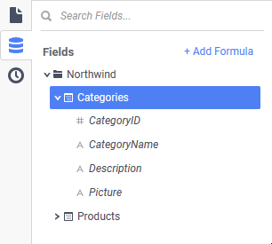
Data Objects Pane
The Data Objects Pane contains the available data objects that may be added to the ExpressView canvas. Data objects are arranged into folders. Those objects are further expanded into fields. A field is a parcel of data from a data object, such as the name of a Product or an Employee ID number.
Use the  Search Fields area to search for fields by name.
Browse through the folders of objects and expand the objects to see the fields available. Some fields may have a description associated with them. Hold the mouse over the field name to see the description.
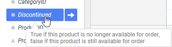
A field with a description that appears as a tooltip
Fields are added to the ExpressView with the methods described in the Canvas section.
Toolbar
The top of the ExpressView Designer contains tools for building and manipulating the report.
The ExpressView Designer toolbar
- Refresh — click to refresh the data displayed when in Live Data mode. Disabled when Live Data is turned off. More information about data modes is above in the Canvas section.
- Canvas — set ExpressView styling options such as a color theme and a font. For more information, review Styling the Canvas above.
- Chart — for more information about charts in ExpressView, review the ExpressView: Visualizations article
- Add Visualization — click to add a visualization to the ExpressView, or show an existing visualization if it is hidden
- Visualization Active — indicates a visualization is part of this ExpressView and is visible
- Hide Visualization — click to hide the visualization. Hiding the visualization does not delete it.
- Save — save the ExpressView. On the first click for new ExpressViews, this will open a dialog to enter a name, description and folder to save to. Subsequent clicks will save changes to the same location. Click the Save Dropdown icon to change the report’s name, description or folder.
- Export — click to export the ExpressView to one of the supported file formats or save it as an Advanced Report. Choose from Excel, PDF, RTF or CSV. Depending on system and report configuration, not all file types may be available.
- Hover over Advanced Report to convert the ExpressView to an Advanced Report. Enter a new name, choose a folder and click the Create Advanced Report button. Review the Exporting to an Advanced Report section of the ExpressView: Exporting article for more information.
- Click Export Options to open the Export Options menu. Review the Export Options section of the ExpressView: Exporting article for an explanation of these settings.
- Run/Stop — click Run to start Live Data mode and view data from the data objects on the report. When Live Data mode is enabled, this button becomes Stop. Click Stop to turn off live data mode and work “offline” with placeholder data. For very large and complex ExpressViews, keeping Live Data mode off while editing will be much faster, as each modification to the report design will not re-query the data source.
- Showing x Results — the report was generated with a partial data set and may contain incorrect calculations and aggregates. Click the link to load more data:
- Load number more Records — get the next number of data rows and add them to the existing report
- Load All Data — get the remainder of the data set
- Report Search icon — click to open a panel to search for content in the report.
Matches for the search query will be highlighted on the report wherever it appears.
- Search report… field — enter the search query into this textbox
- Previous — move to the previous match of the search query
- Next — move to the next match of the search query
- Close — close the search panel and clear highlighting of the matches
- Go to First Page — navigate to the beginning of the report
- Previous Page — go back one page to the previous one
- Next Page — go forward one page to the next one
- Go to Last Page — navigate to the end of the report
- Page Number Entry — navigate to a specific page number
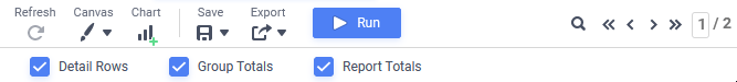
- Detail Rows — check to include all of the component records on the report. Unchecking this option can vastly increase processing speed especially when only interested in group or report-level aggregates. Checked by default.
- Group Totals — check to include aggregate summaries for each group column on the report. Checked by default if at least one group column exists.
- Report Totals — check to include overall aggregate summaries for each column on the report at the end. Checked by default.
 Refresh — click to refresh the data displayed when in Live Data mode. Disabled when Live Data is turned off. More information about data modes is above in the
  Add Visualization — click to add a visualization to the ExpressView, or show an existing visualization if it is hidden
 Visualization Active — indicates a visualization is part of this ExpressView and is visible
 Hide Visualization — click to hide the visualization. Hiding the visualization does not delete it.
 Save — save the ExpressView. On the first click for new ExpressViews, this will open a dialog to enter a name, description and folder to save to. Subsequent clicks will save changes to the same location. Click the Save Dropdown
  icon to change the report’s name, description or folder.
 Export — click to export the ExpressView to one of the supported file formats or save it as an Advanced Report. Choose from Excel, PDF, RTF or CSV. Depending on system and report configuration, not all file types may be available.
 Report Search icon — click to open a panel to search for content in the report.
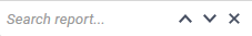
 Previous — move to the previous match of the search query
 Next — move to the next match of the search query
 Go to First Page — navigate to the beginning of the report
 Go to Last Page — navigate to the end of the report
Properties Pane
The Properties Pane on the right side of the Designer is broken down into four tabs:
- — Selected Section
- — Sorts
- — Filters
- — Visualizations
 —
—  —
—  —
—  —
— The active tab is indicated by an underlined and highlighted icon.

The Filters tab is active
To collapse the Properties Pane and expand the canvas, click the active tab icon. Clicking on any icon will re-open the pane.
Selected Section
The Selected Section tab is used to define the characteristics of the column and the formatting of its data.
The Display Name field is used to apply a custom name to the column in lieu of the default field name.
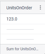
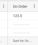
Products.UnitsOnOrder detail column without a Display Name (top) and with “On Order” as a custom Display Name (bottom)Use the Horizontal Align buttons to set the alignment of values as they appear in group columns and detail columns. Choose from Left, Centered, Right or Justified.
Choose a Font Style from the dropdown. Choose from: Normal (no font styling applied), Bold, Italic or Bold Italic. The Font Style applies only to the column header.
Use the Underline buttons to set underlining on the values. Choose from none, single or double underline. The Underline applies only to the column header.
The Data Format section has settings for manipulating the display of data in the column.
Choose a Format Type from the dropdown. Depending on the type selected, additional settings will appear
- General — the application will attempt to format the data based on information in the system configuration for this column.
- Number — explicitly sets the data to be a number with the following settings available:
- Decimal Places — when checked, will force a specified number of decimal places to be displayed. The symbol inserted between the whole and fractional part of the number can also be specified.
- Use 1000 Separator — when checked, will separate thousands places with the specified symbol
- Use Currency Symbol — when checked, will display the specified currency symbol in front of the value (e.g. $3.14)
- Append Percent Sign (%) — when checked, will display a percent sign (%) after the value (e.g. 3.14%)
- Blank When Zero — when checked, if the value is zero, the cell will be blank instead of displaying zeroes
- Show Negative Symbol — when checked, if the value is negative, will display the negative symbol in front of the value (e.g. -25)
- Show Parenthesis — when checked, if the value is negative, will wrap the value in parenthesis (e.g. (25))
- Color — when checked, if the value is negative, will change the value to a specified color. Click the Color Selector icon to choose the color.
- Date — explicitly sets the data to be a date, time or both, with the following settings available:
- Date/Time Format — choose a date format code from the dropdown. The Number Tab section of the Advanced Reports: Cell Formatting article contains a description of each of the codes.
- Text — no additional formatting is applied, it will appear exactly as returned from the data source
 icon to choose the color.
 Sorts
The Sorts tab is used to edit or remove existing sorts for detail rows. For more information, review the ExpressView: Sorting article.
Filters
The Filters tab is used to add, edit or remove filters. For more information, review the ExpressView: Filtering article.
Visualizations
The Visualizations tab is used to configure charts. For more information, review the ExpressView: Visualizations article.
Keyboard Shortcuts
There are several useful keyboard shortcuts available in the ExpressView Designer. They are listed in the Keyboard Shortcuts article.
Further Reading
Continue to the other articles in the ExpressView documentation: