Advanced Reports: Design Grid (pre-2021.1)
- Add and delete rows, columns, and sections to the report.
- Enter data fields, text, and formulas.
- Drag and drop fields into different sections, rows, or columns.
Sections
Sections dictate how the data appears in a report. There are five types of sections: page, report, detail, group, and repeating group.
 Page Header & Page Footer
 Page Header &
  Page Footer
The rows in the Page Header section appear at the top of every page of a report, and the rows in the Page Footer section appears at the bottom of every page of a report. Typically, the Page Header section is used to designate column headers for a report, and the Page Footer section is used to display the page number and/or confidentiality notices for a report.
Page Headers and Page Footers are not intended to perform calculations or display data fields. For this reason, a Page Header populated with a data field will only return the first line of data in that field; a Page Footer will return only the last line of data.
Note
If you are printing a report, remember that Excel outputs do not have pages. Page Headers will appear only once at the beginning of the report. Reports run via the Report Viewer will display Page Headers similarly unless Simulate PDF is checked in the Options menu.
Report Header & Report Footer
 Report Header &
  Report Footer
The rows in the Report Header appear at the beginning of a report. Typically, these rows display the title of a report. The rows in the Report Footer appear at the end of a report. Typically, the Report Footer displays grand totals and summary information.
Detail
 Detail
The Detail section is the main section of most reports. When the report is executed, the Detail Section creates a row for each record in the Data Objects. For example, if the Detail section contains the Data Field Orders.OrderId, the report will display each Order Id on a separate row.
Group Header & Group Footer
 Group Header &
  Group Footer
Group Header/Footer sections require a sort on a Data Field. The rows in a Group Header section will appear above the Detail section for each unique value of the sorted Data Field, or a formula. Typically, Group Header sections are used to display data as labels. For example, a report may contain a Group Header on Orders.OrderDate and display Orders.OrderId in the Detail section. The output would display each date with orders that occurred on that date below them.
The rows in a Group Footer section will appear below the Detail section for each unique value of the sorted Data Field. Typically, Group Footer sections are used to calculate subtotals. For example, a report may contain a Group Footer on Orders.OrderDate which displays the number of orders made on each date.
Repeating Groups
 Repeating Groups
Repeating Groups require a sort on a Data Field. Repeating Groups should only be used when the data has multiple one-to-many relationships and each should be rendered completely before the other. Repeating Groups have their own header, detail, and footer sections.
For example, each Professor can teach multiple classes and advise multiple students. For each professor you want to see all the classes they teach and then all the students they advise.
Using Sections
Sections can be added, deleted, modified, moved, and assigned shading on the Design Grid.
Adding Sections
- Click anywhere in the Section Column.
- Hover your mouse over Add Section, then select the type of section you would like to add.
Deleting Sections
- In the Section Column, click on the section you want to delete.
- Click ‘Delete Section’.
Modify Sections (Group Header/Footers and Repeating Groups only)
- In the Section Column, click on the section you want to modify.
- Click Modify Section. This will bring up a Modify Group Section Menu.
- Select from the dropdown the desired Data Field for the group to use.
- Click OK.
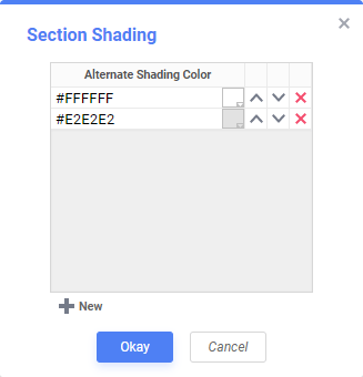
Section Shading
- In the Section Column, click on the section that you want to Shade.
- Click Section Shading. This will bring up a menu.
- Click New to add a color to the shading.
- Click the color box to select a color or enter a hex value.
- Click OK.
Columns and Rows
Columns and rows of cells can be added, modified, or removed as described below.
Columns
- To select a group of columns, hold the SHIFT key and then click the beginning and ending column.
- Non-contiguous columns can be selected by holding the CTRL key and clicking the desired columns.
- A column can be resized by dragging its right edge horizontally.
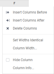
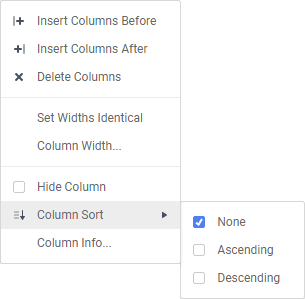
- Clicking on a column (or selected group) will display a menu where you can:
- Insert a new column.
- Delete the selected column.
- Set its width to be identical with the other selected columns.
- Hide the selected column.
- Set Column Info to make the label the column and/or make it sortable within the Report Viewer.
Sorting by Columns within the Report Viewer
While viewing reports in the Report Viewer, a user can click the bar at the top of the report to sort by a column.
Note
Column Sorts are applied after any sorts defined in the Sorts menu.
To make a column sortable:
- Click on the column and select Column Info… from the menu.
- Provide the column with a label that will appear in the Interactive Report Viewer Dock.
- From the Sort dropdown select the Data Field to be used for sorting, or provide a formula by clicking the Formula Editor icon.
- Click on the column again to set a default sort direction.
 icon.
icon.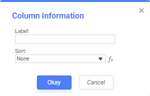
Rows
- To select a group of rows, hold the SHIFT key, then click the top and bottom rows of the area you wish to select.
- Non-contiguous rows can be selected by holding the CTRL key and clicking the desired rows.
- A row can be resized by dragging its bottom edge vertically.
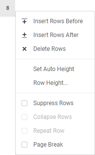
- Clicking on a row (or selected group) will display a menu where you can:
- Insert a new row before or after the currently selected one.
- Delete the selected row.
- Set the row’s height, or choose the height to be automatically controlled.
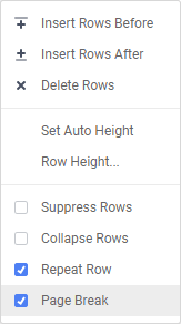
- Suppress the row from appearing on the report.
- Collapse the row
- Repeat a row
- Insert a page break
Indicators
When rows are collapsed, repeated, a page break is added or section shading is added, small indicators will appear in the row number. The indicators may appear together if more than one feature is set on that row.
| Feature | Description of Indicator | Example |
|---|---|---|
| Collapsed Row | Small black arrow pointing down right |  |
| Repeat Row | Two blue lines on the left |  |
| Section Shading | Small colorful boxes |  |
| Page Break | Dashed lines on the top |  |
Cells
Cells are the containers for all the information in a report. Cells may contain data fields, formulas, text, images, charts, or links to other reports.
- To select cells, either click or use the arrow keys.
- Groups of cells can be selected by holding the Shift key and clicking on another cell. All the cells in-between the two will be selected.
- Non-contiguous cells can be selected by holding the Ctrl key and clicking the desired cells.
- To enter text into a cell either:
- double-click the cell, and a text field will appear
- click the cell and enter the the text into the formula bar
- A cell can be copied by holding the Ctrl key, then dragging and dropping it into a new cell.
- Adjacent cells can be merged and unmerged using the Merge Cells and Split Cell icons in the Toolbar.
 and Split Cell
  icons in the
 Indicators
Certain indicators will appear
| Feature | Description of Indicator | Example |
|---|---|---|
| Conditional Formatting | Uppercase letter A in top right corner of the cell |  |
| Linked Report | Chain links in the top right corner of the cell |  |
| Data Field in a Cell | Small colored triangle in top left corner of the cell |  |
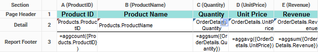
In application v2019.2+ cells containing data fields will have a small color-coded triangle appear in the top-left corner of the cell. Cells containing data fields from the same category will have the same color. In the figure below, the cells with fields from the Products category have a maroon triangle and the cells with data fields from the OrderDetails category have a dark green triangle.
Using Page Breaks
For a Page Break to occur at the beginning of each element of a Data Field, place a page break on the top row of Group Header Section for that Data Field. See Sections for more detail on Group Header Sections.
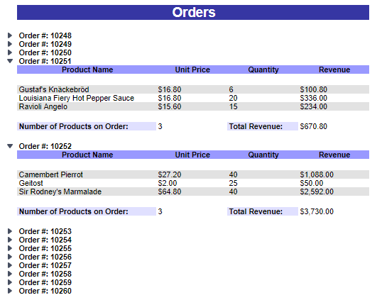
Creating Collapsible Rows
A Group Section can be set to display as collapsed by default on HTML export. This causes the contents of the section to be suppressed and individually expandable for each change in Header. Collapsible rows are supported in the standard or Interactive HTML viewer. Non-HTML export formats will ignore Collapsible Rows.
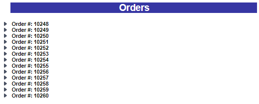
Left-click on an arrow next to a Collapsible Row to expand or collapse the group.
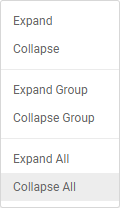
Right-click on an arrow next to a Collapsible Row to see additional display options:
- Expand will expand the selected top-level group. This elicits the same behavior as left-clicking an arrow.
- Collapse will collapse the selected top-level group. The state of the sub-groups is preserved.
- Expand Group will expand the selected top-level group and all sub-groups within that group.
- Collapse Group will collapse the selected top-level group and all sub-groups within that group.
- Expand All will expand every group and sub-group on the page.
- Collapse All will collapse every group and sub-group on the page.
To create a collapsible row, click on the desired row number in a Group Header Section and select Collapse Rows in the dropdown menu.
Properties of a Collapsible Row
Collapsible Rows have the following properties when exported to HTML:
- Collapsible Rows display as collapsed whenever the Report is exported or altered using Interactive HTML.
Note
Collapsed or expanded states cannot be saved to the Interactive HTML User Report preferences.
- Page Breaks below a collapsed row are ignored. Expanding a collapsed group will not alter the Report pagination.
- The contents of a collapsed group are searchable by the HTML search tool.
See Interacting with the Report Viewer for more information on the Interactive Report Viewer.