Chart Data Layout Types
There are several ways to represent this collection of points on a report, and the application must be able to transform them into a chart regardless of the design you’ve chosen. For this reason, the Chart Wizard comes with three Data Layout Types. Understanding the way you’ve designed your report and data will help you select the right Layout Type, which will in turn tell the application how to transform your data into a chart.
Layout One: Cell-Based Chart
Layout One is for building a specific type of single-series chart using a collection of static points on your report. This layout type is cell-based because each point’s labels and values come from a specific cell in the report output.
How do I know this is the right Layout for me?
Take a look at your report design and determine whether the points you’re interested in charting are static or dynamic. In the application, a dynamic data point is one that comes from a field. Fields are denoted by a little triangle in the upper left-hand corner of the cell.

In the example above, any data points coming from this cell will be dynamic because the cell contains a dynamic field (see the triangle in the blue box). The Employees.FullName field is a placeholder for all the employee names that will appear on the report. These names will be added to the report dynamically after you’re done designing it and have clicked the “run” button.
Static data points, by contrast, are defined explicitly in the report design and do not contain dynamic fields.
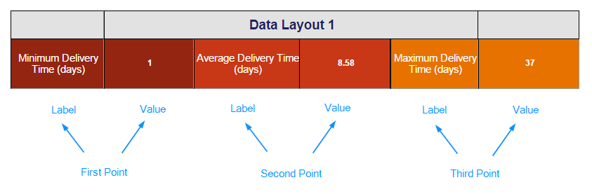
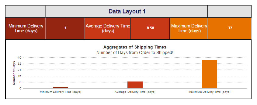
In the above example, every cell contains a static value. The first, third, and fifth cells each contain a string formula that will return the text inside the quote marks. No matter what section these formulas are in, they will only ever return their respective strings of text. The second, fourth, and sixth cells contain calculation formulas returning a static value, in this case the minimum, average, and maximum number of days it takes to ship an order, respectively. When we chart this data, we’ll need to use Layout One in order to pinpoint each of these cells and define them as either data labels or data values. In this case, the string formulas will serve as the labels, and the calculations will be the values. Together, they make up three sets of coordinates on the chart.
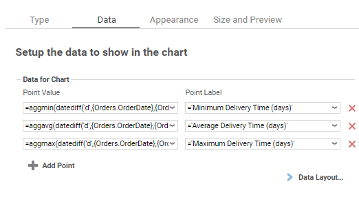
How would that look in the Chart Wizard?
What would the final report design look like?
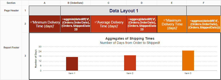
How would the output look?
Layout Two: Column-Based Chart
Both Layout Two and Layout Three are for creating single and multi-series charts, but there are some important differences in the report designs they work with. Layout Two is great if you want to show two or more unrelated values for a single label. Values may be considered “unrelated” if they come from separate fields or columns. This layout is column-based because each column will add a new series of data to the chart.
How do I know this is the right Layout for me?
First, make sure you’re working with dynamic data points. Second, make sure you’re interested in calculations for just one group. If you have two columns representing values you’d like to plot against a column representing your labels, you’re in the right place!
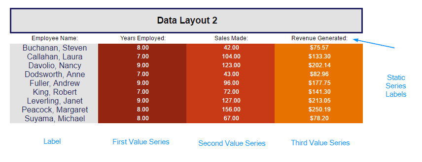
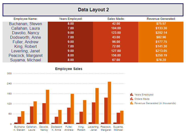
In the example above, each column becomes a new series charted against the label column. Since all the labels come from a single column, we know to use Data Layout 2. Another indication that Layout Two is correct to use in this case is that the series labels are static values rather than dynamic values that are part of the data fields.
How would that look in the Chart Wizard?
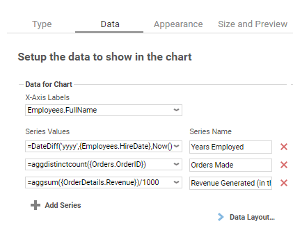
The Chart Wizard makes it easy to see the how this Layout is all about adding values to a given label.
It helps a lot if your calculations are also in the same numeric range. For example, charting tree height (0 – 50 feet) on the same y axis as tree species population in a forest (0 – 50,000 trees) will make it hard to read smaller values. If your values aren’t in the same numeric range, you can add one or more y axes in different numeric ranges on the appearance tab. Note: this feature is only available as of v2016.3; see Charts for more information.
What would the final report design look like?
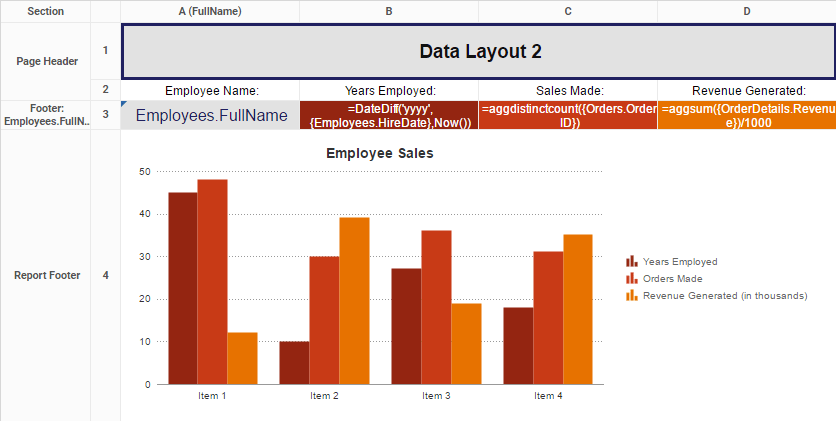
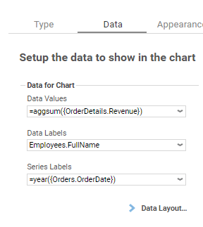
In this example, the label field is in cell A3, and the three value fields are in cells B3, C3, and D3, respectively.
How would the output look?
Layout Three: Row-Based Chart
Layout Three is also for building single and multi-series charts, but when used to create a multi-series chart, it requires a bit more prep on the design end because it compares two or more related values for a given label. Values can be considered “related” when they come from the selfsame column or field. This layout is row-based because all series are coming from the rows of one column of data.
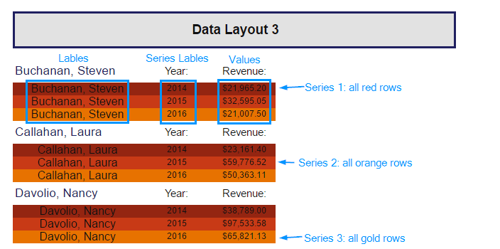
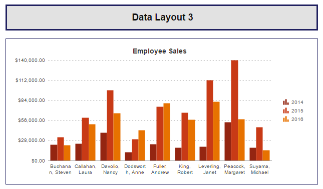
In the above example, the series labels all come from the same column and are dynamic values coming from a data field. Each unique value coming from that field, in this case Year, will become a new series.
How do I know this is the right Layout for me?
First, make sure you’re working with dynamic data points. Second, make sure you have one group nested inside another. (See Understanding Sorting and Grouping for more information.) If you want to create a multi-series chart and you want to show a calculation per a group per another group, Layout Three is the setting you want.
Still unsure? Here’s a simple verbal test to show whether you’re looking for Layout Two or Layout Three when you build your multi-series chart. Which group of statements sounds truest to your case?
Group A
- I want to show income per employee per year.
- I want to show number of ad sales per sales rep per publication.
- I want to show amount donated per donor per month.
Group B
- I want to show the number of staff and students for each school.
- I want to show the sales and expenditures and remaining budget for each store.
- I want to show the average number of sales and the average number of calls for each sales rep.
If your case is more like Group A, you’re looking at Layout Three. If your case is more like Group B, you’ll want to go with Layout Two.
How would that look in the Chart Wizard?
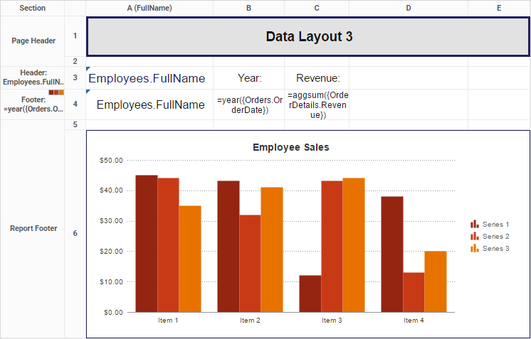
What would the final report design look like?
In this example, I want the report to show revenue per category per year. I’ve made this possible by nesting a Year group inside a Category group. (CategoryName is the primary sort, and Year is the secondary sort.)
How would the output look?